The test prints from Spectrum Photographic were received on 14 January 2021. All images were taken using my smartphone.
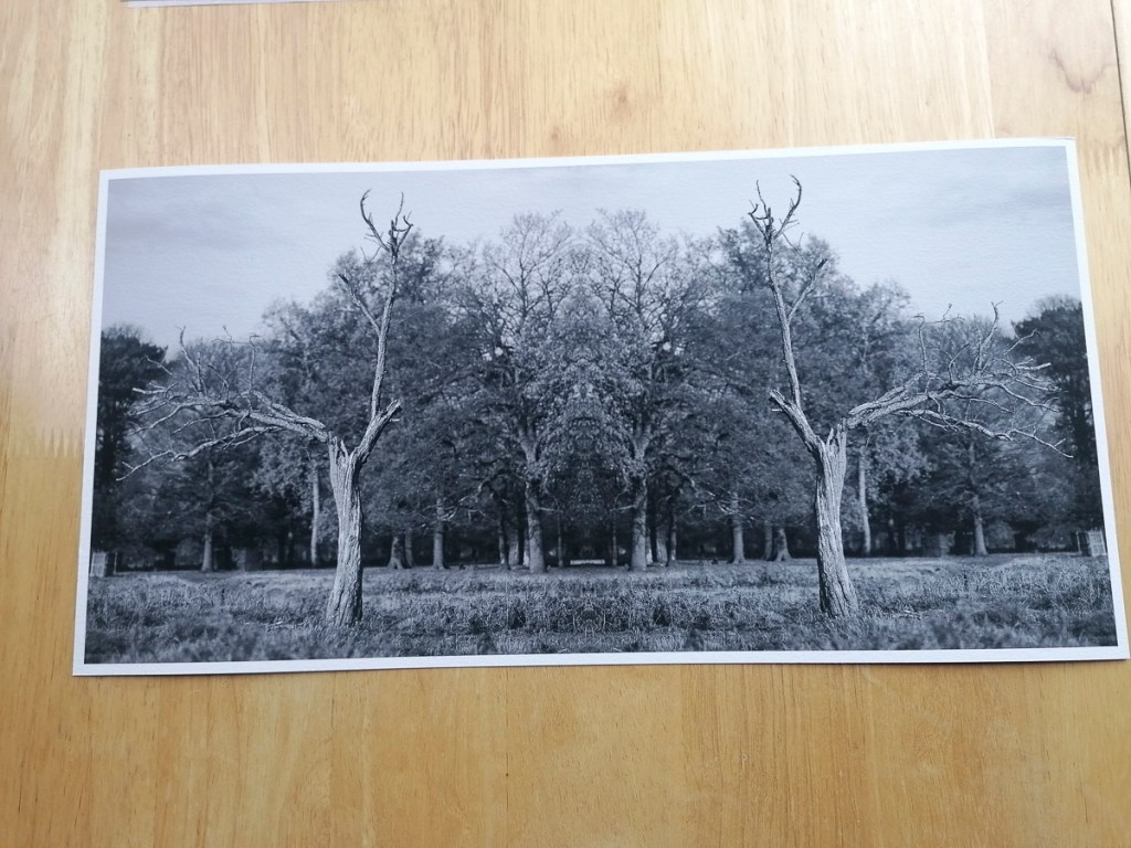
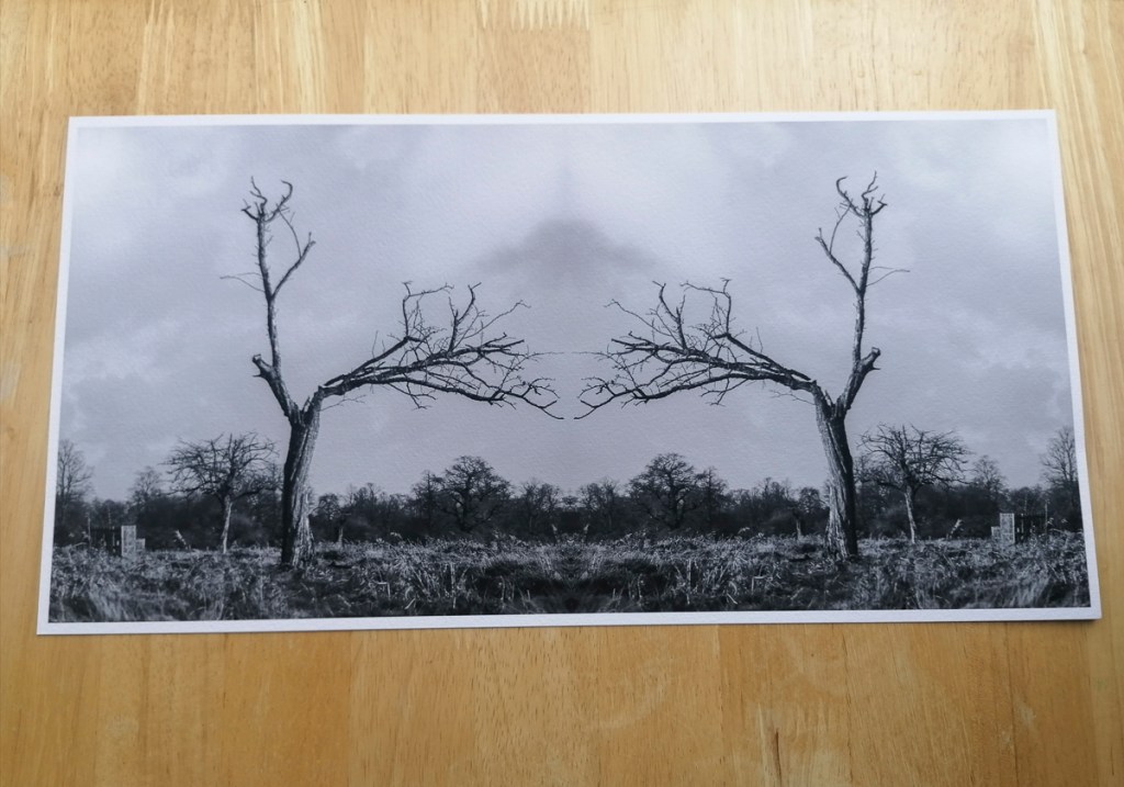
I was very pleased with the results. Each image has characteristics and details that have been brought out by using the Hahnemühle German Etching 310 fine art paper.
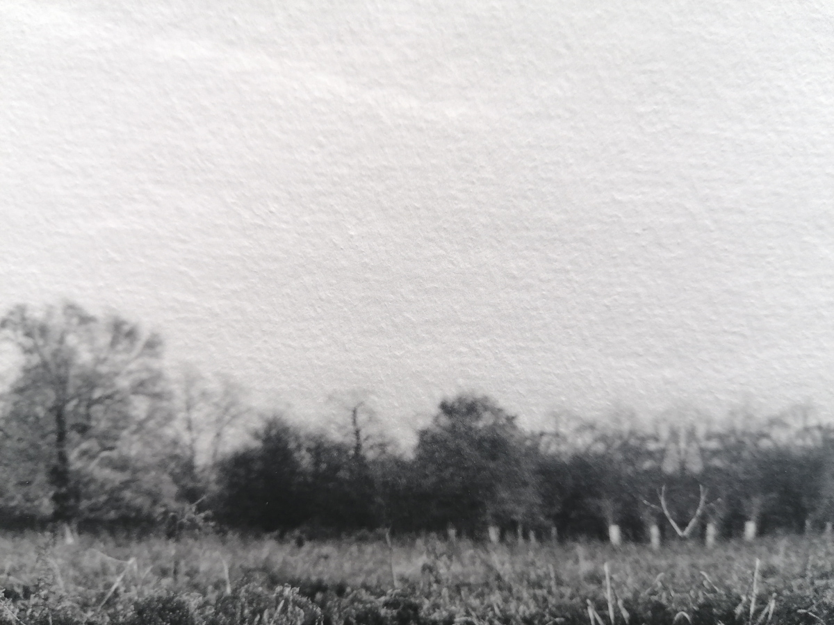
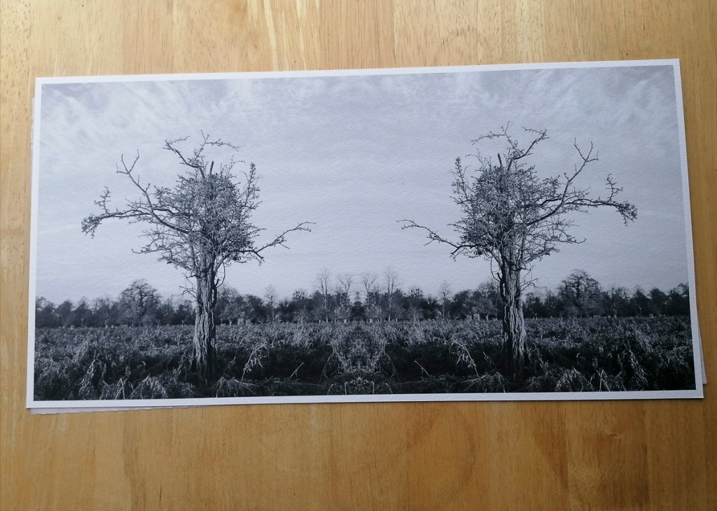
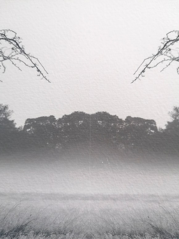
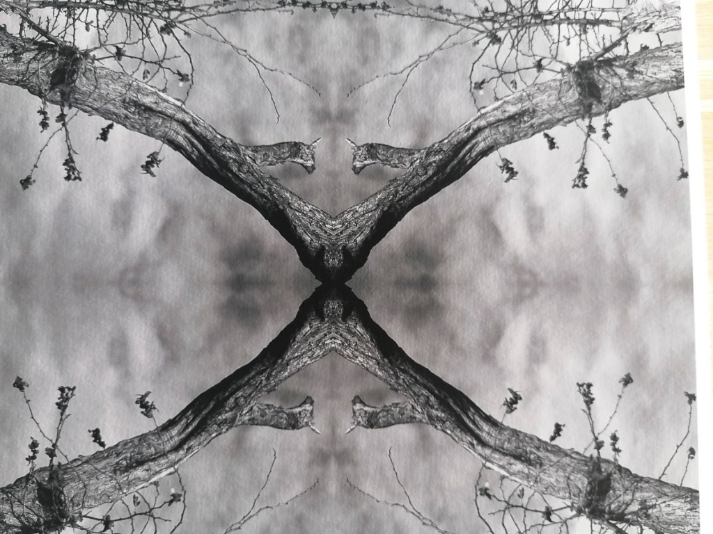
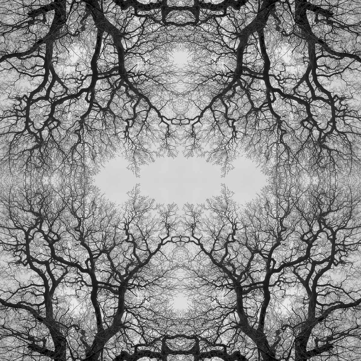
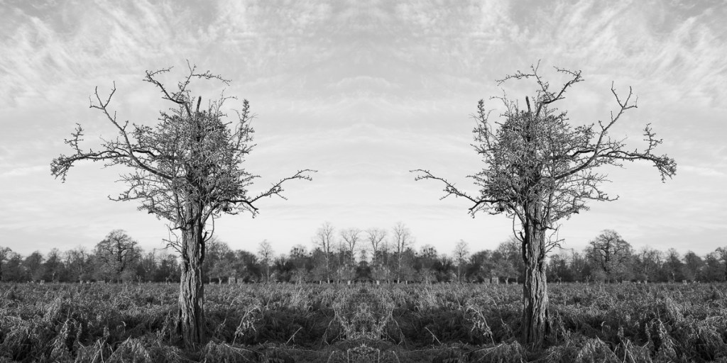
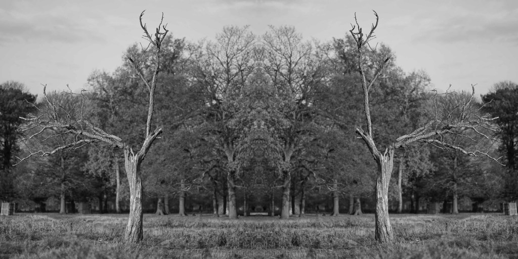
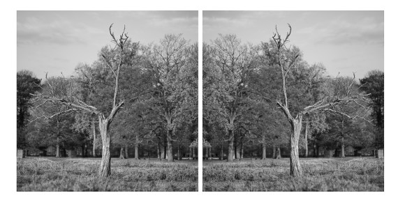
One thing I did notice was a very thin white line running down the middle of this image.
What I had not checked closely enough was when the two mirror images were aligned exactly. This is a reminder to take a bit more care when combining images and zoom in to ensure this doesn’t occur in future. I’ve now updated the file so this the images are totally flush.
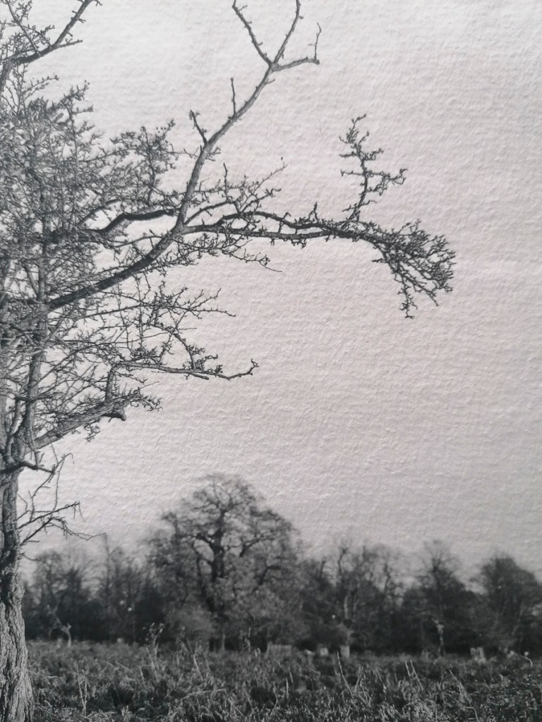
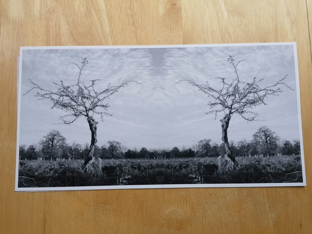
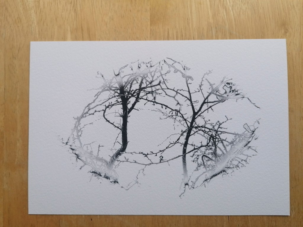
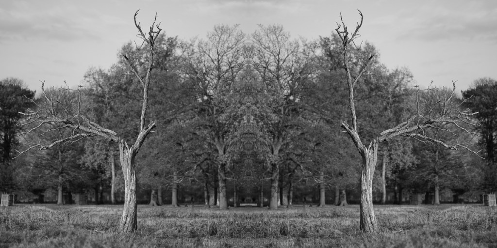
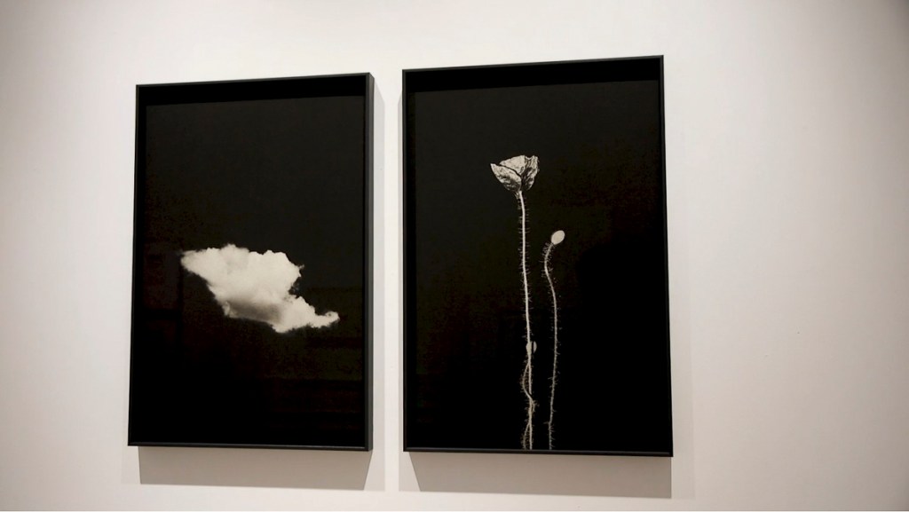
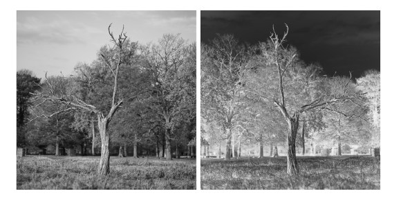
I was also quite pleased with the resulting print of this image. Again, the texture of the paper really adds to the ‘depth’ of the finished print.
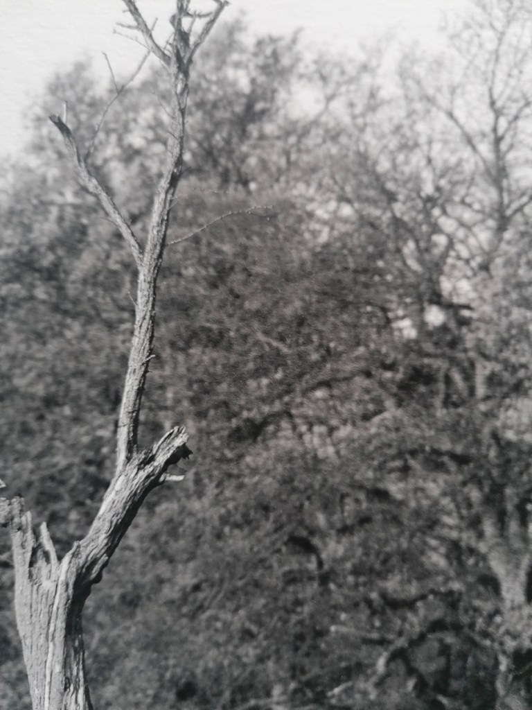
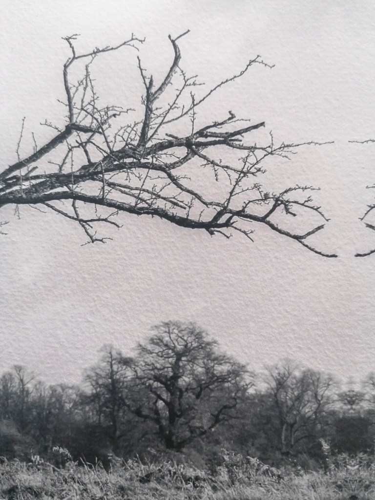
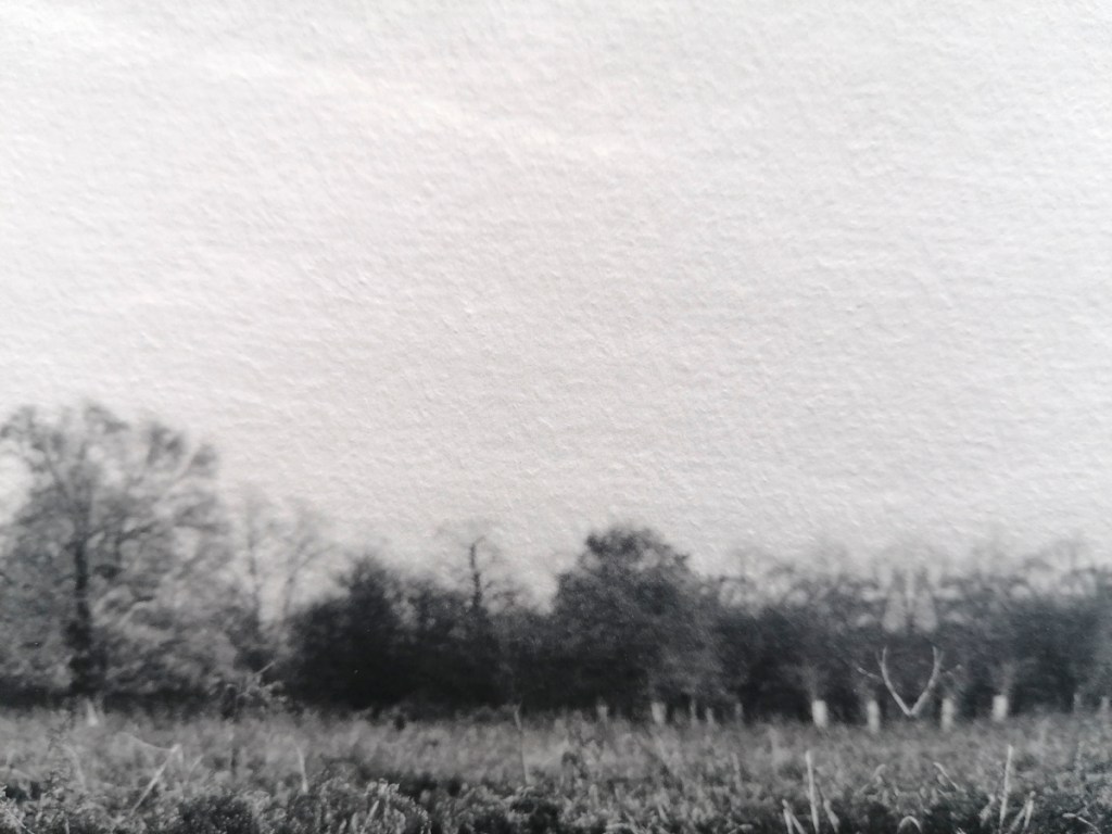
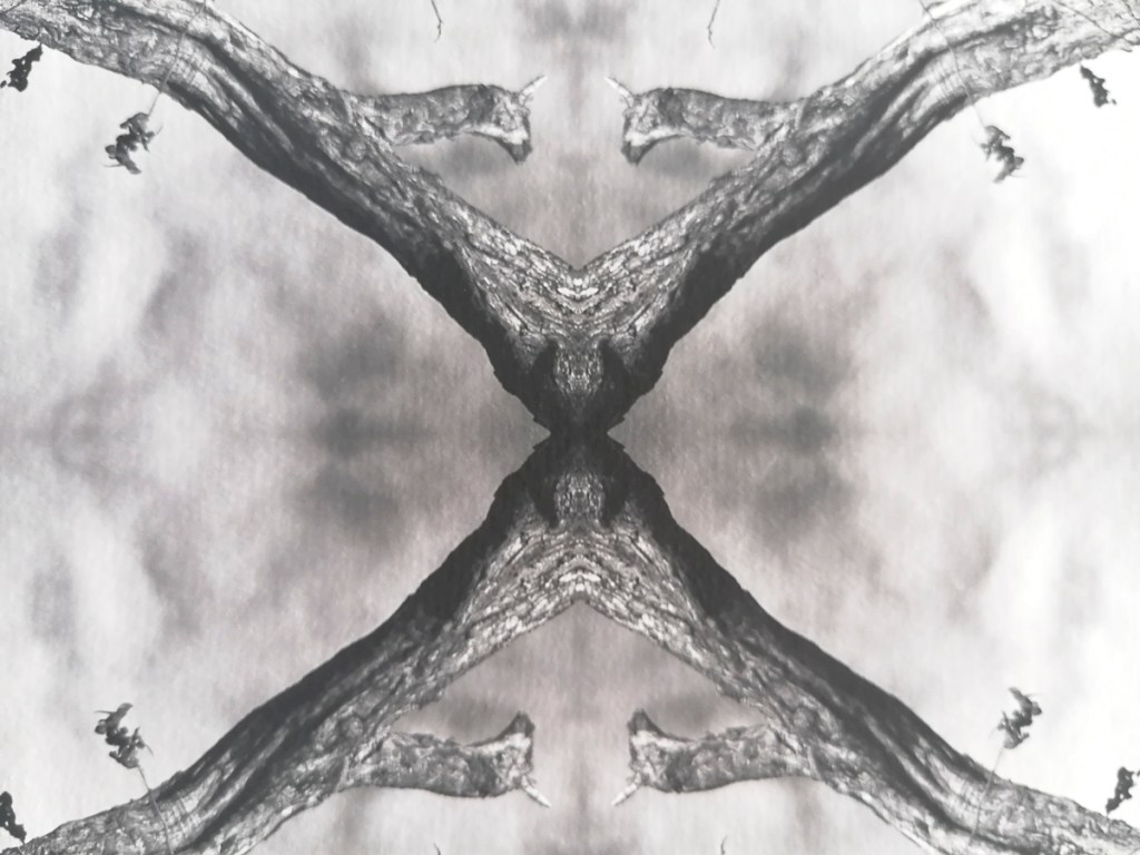
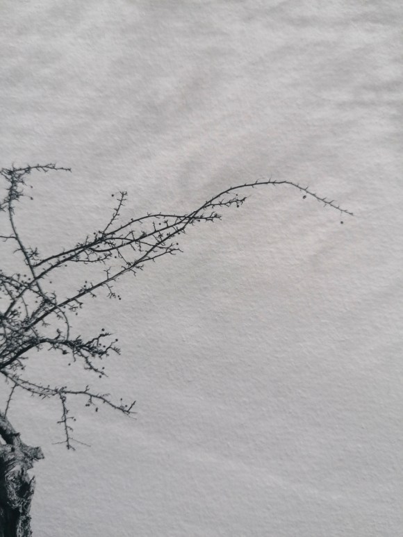
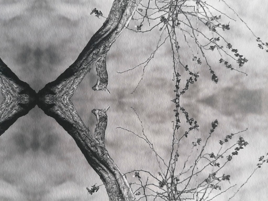
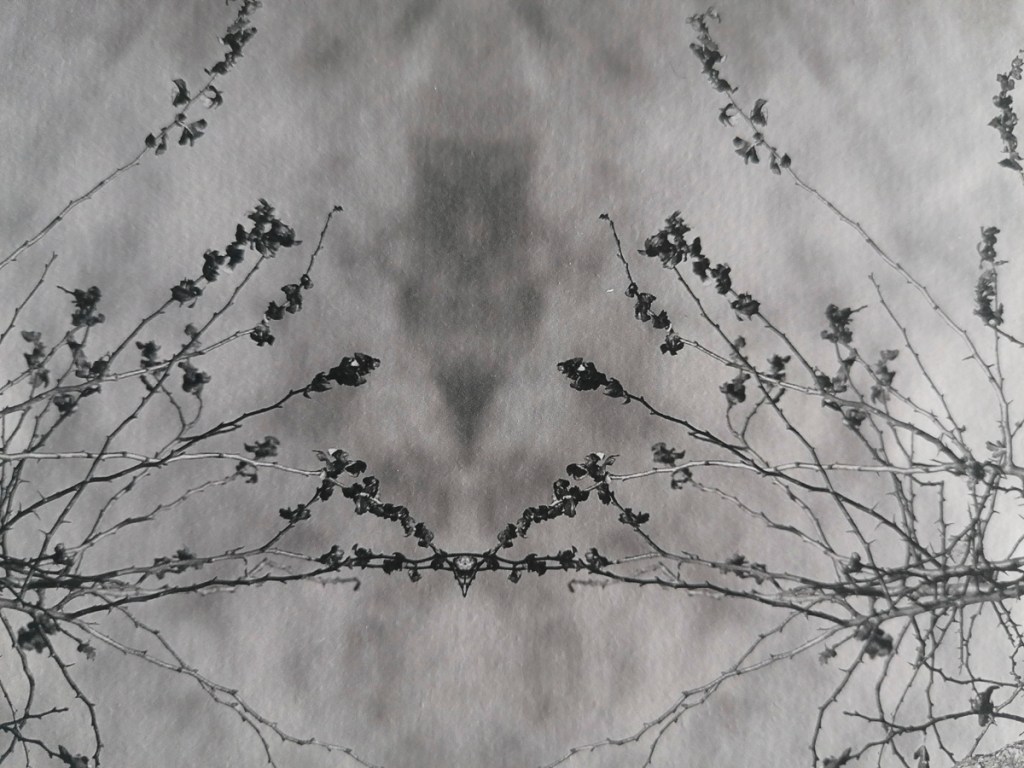
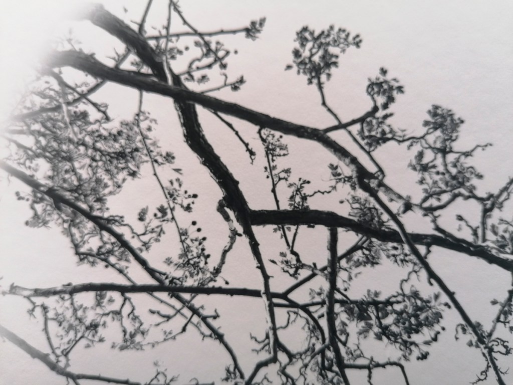
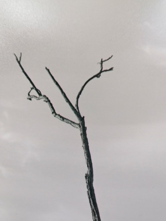
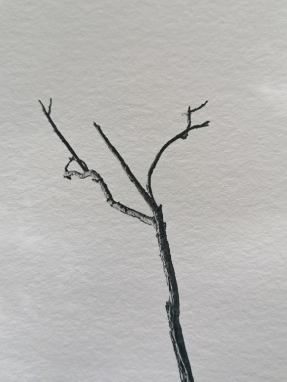
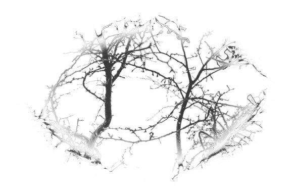
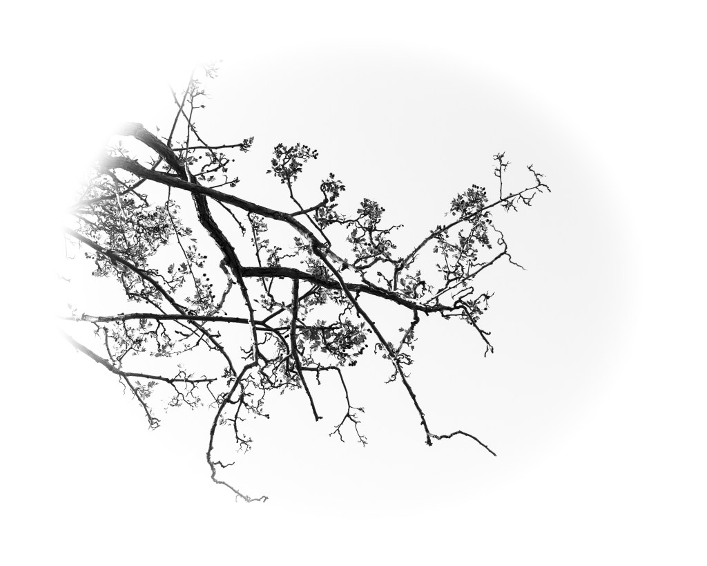
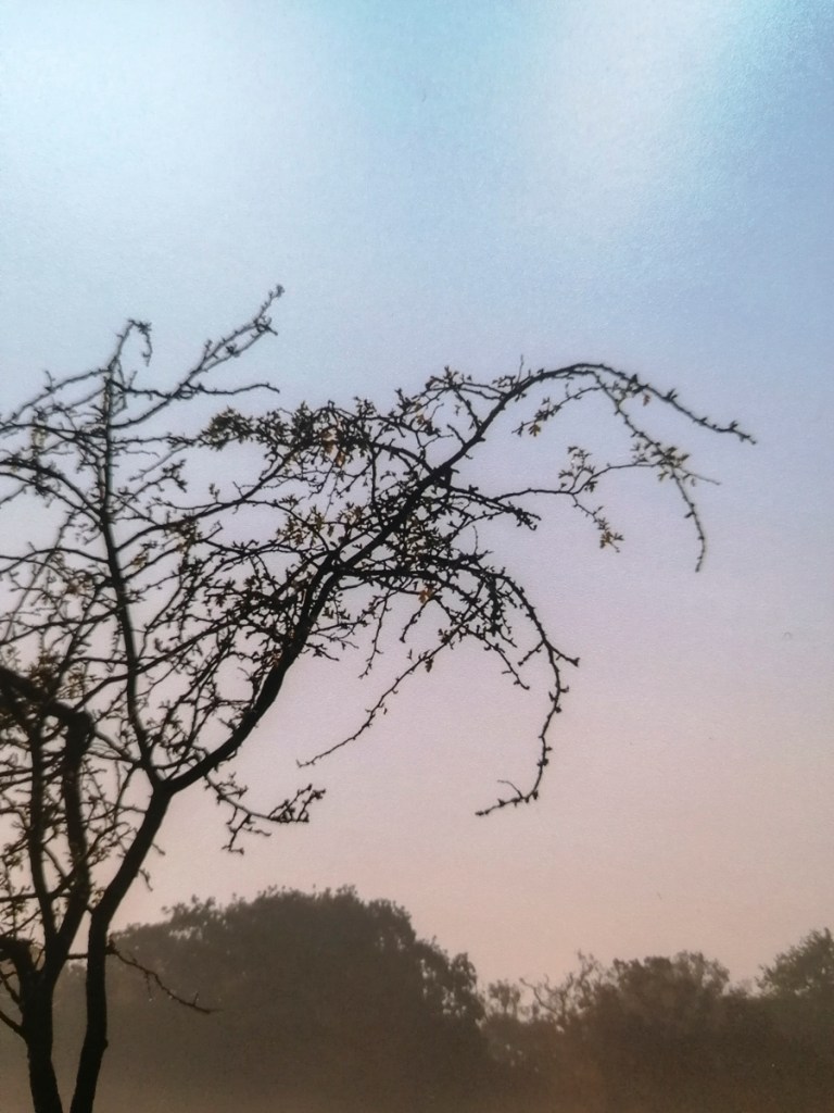
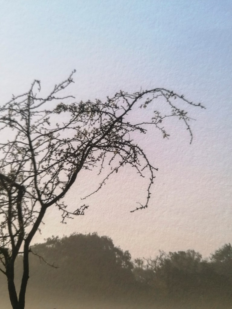
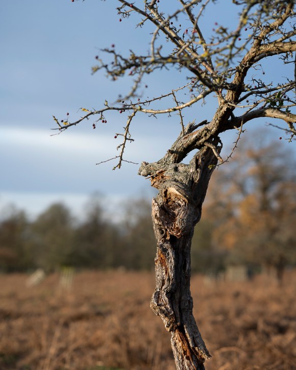
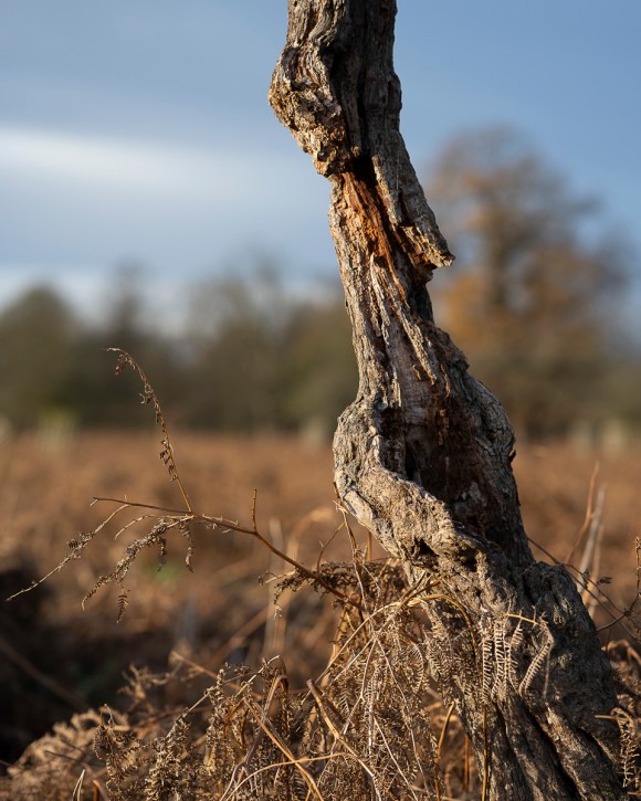
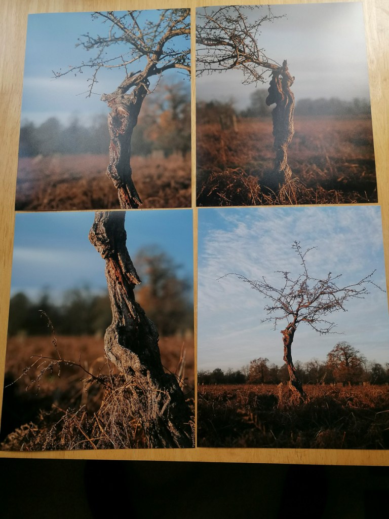
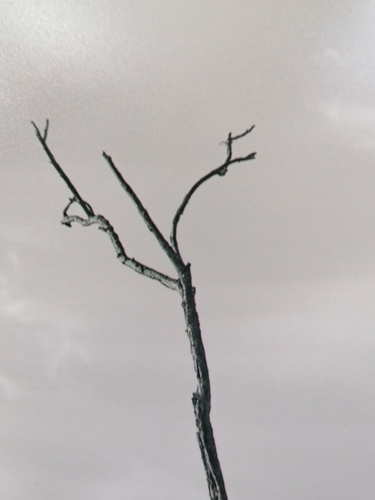
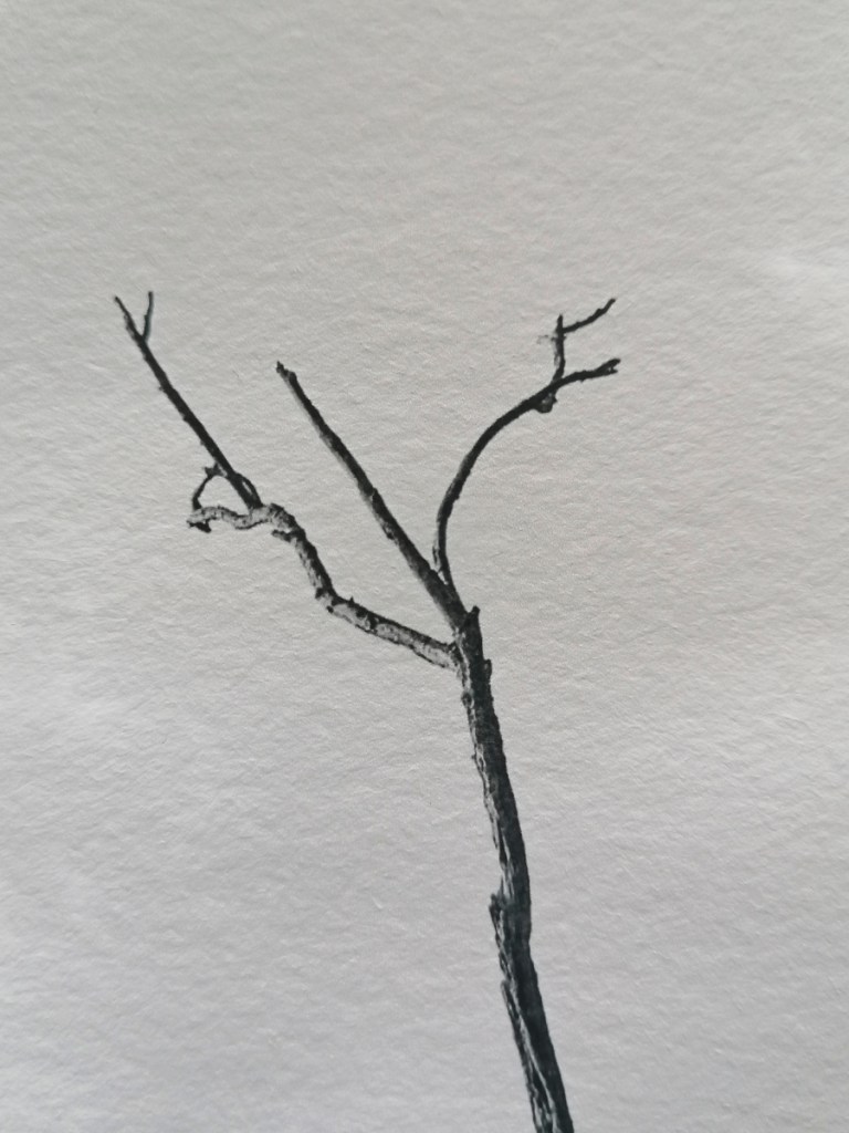
I also took some close up shots so I would have a record of these details.
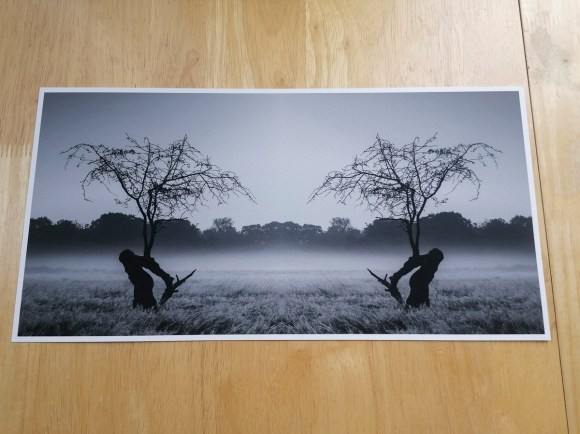
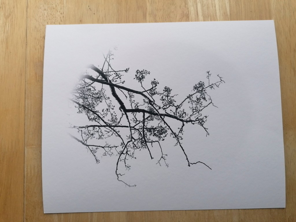
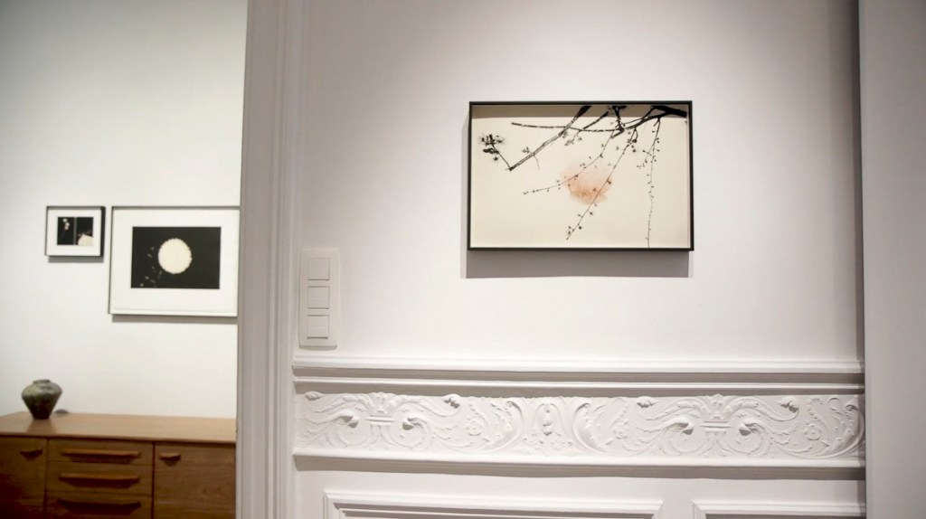
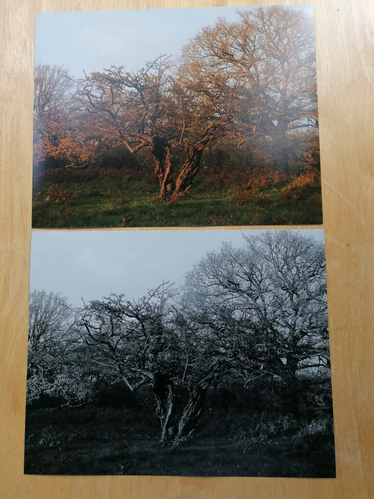
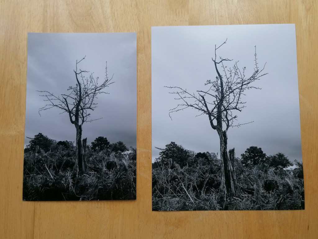
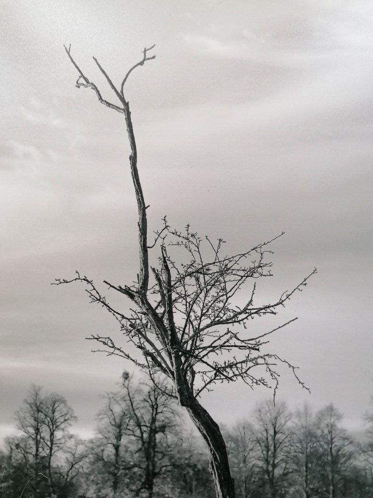
This is how the vignetted image looks printed on the Hahnemühle German Etching 310 fine art paper. What I really liked was how the paper became part of the image further, emulating a Japanese print. This is the effect I was hoping for.
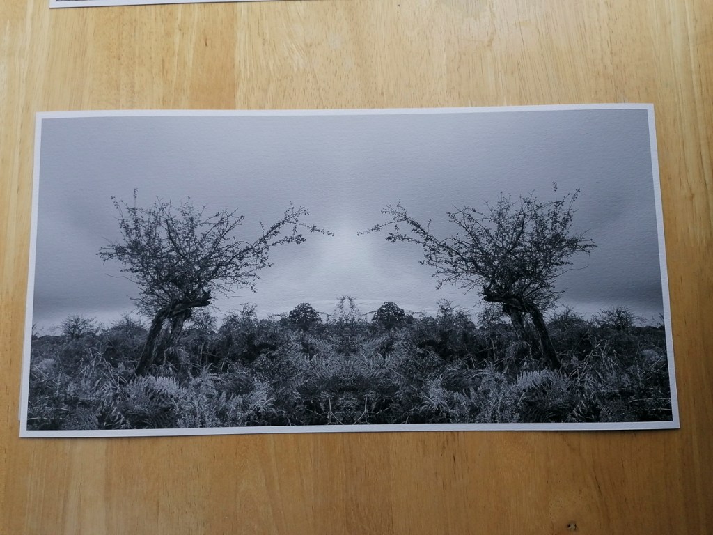
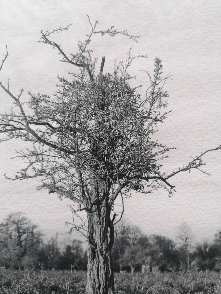
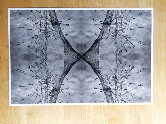
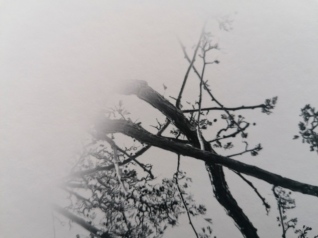
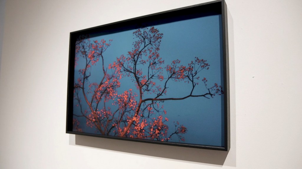
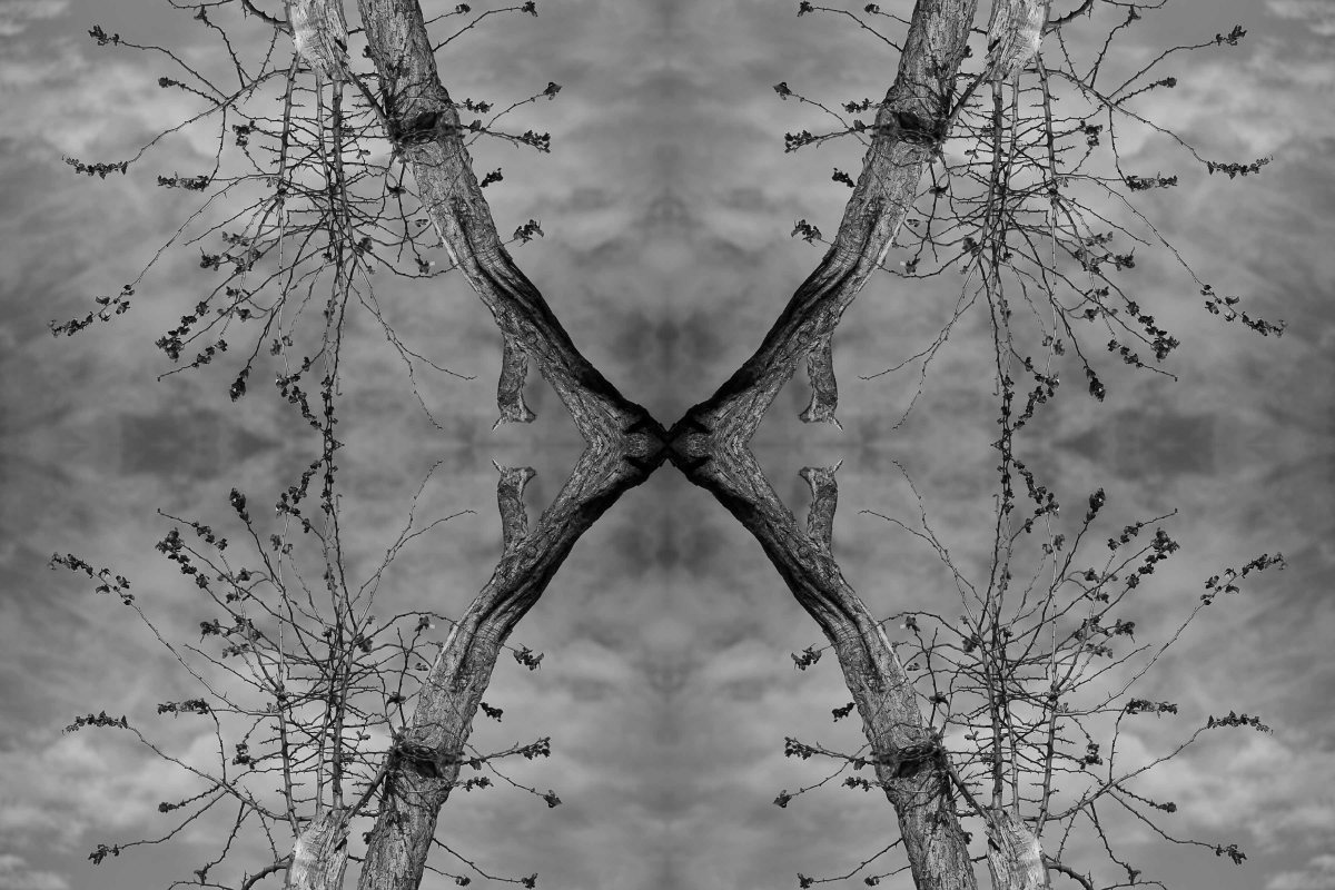
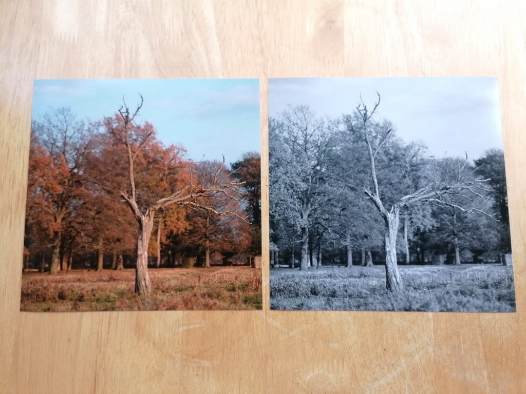
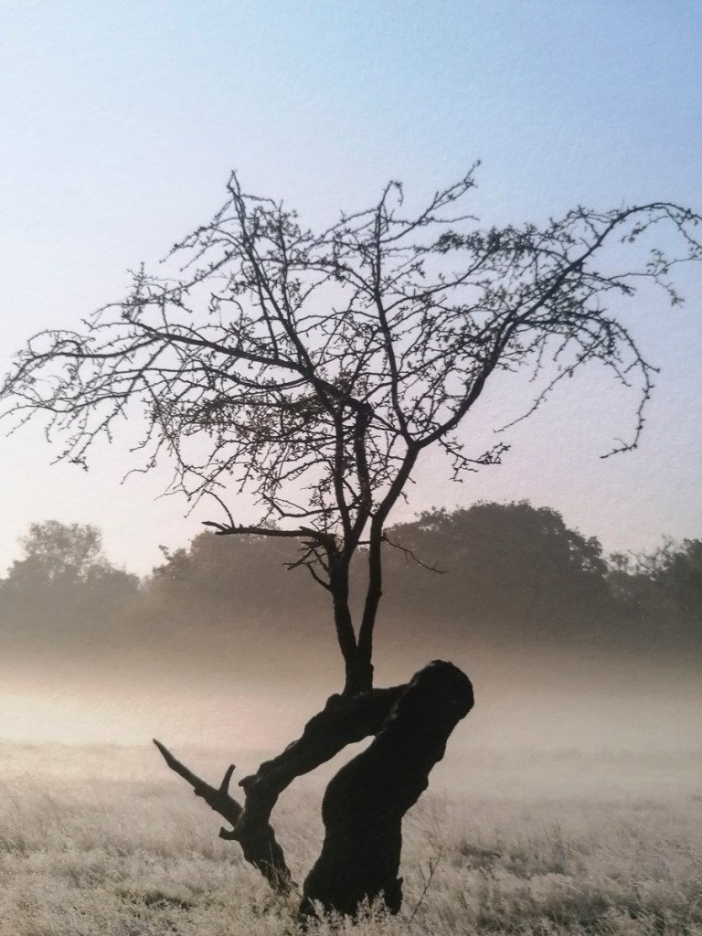
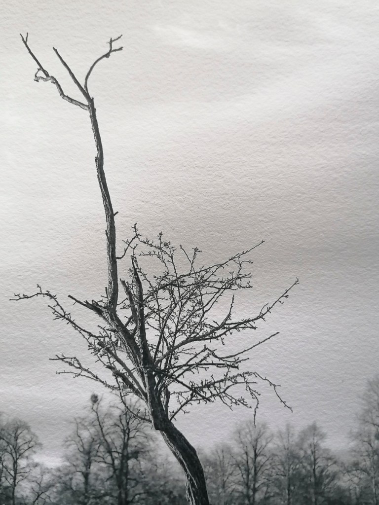
Finally, this is the image that was printed on the Hahnemühle Bamboo 290gsm.
It’s smoother and has a warmer tone than the German Etching. I do prefer this and it was useful having these two examples to compare. In future, I would like to try a test print on all of the different Hahnemühle papers using the same image. This would help guage the best substrate.
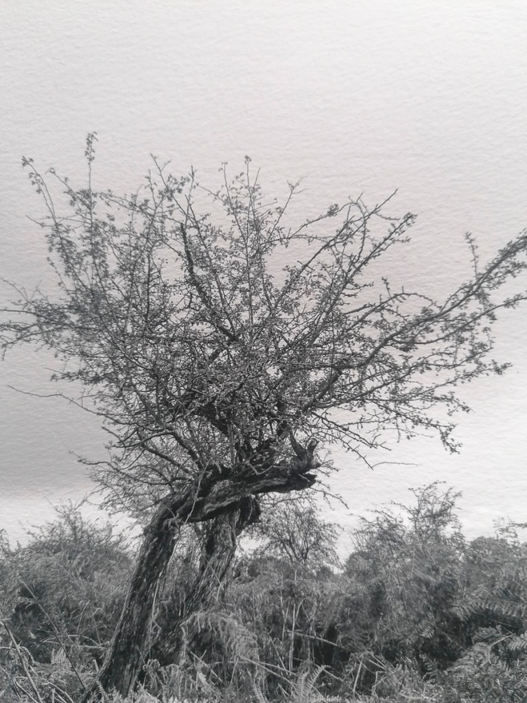
One aspect that did pique my interest was how the close up images appeared on screen.
This could have a couple of implications for future developments. Firstly, if the PG show is solely online, would I take photographs of the prints printed on specific paper then use the images rather than the digital image?
Secondly, could I create montages, print them then re-photograph these prints in a different way to create further work?
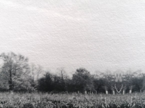
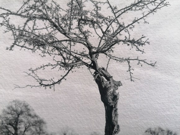
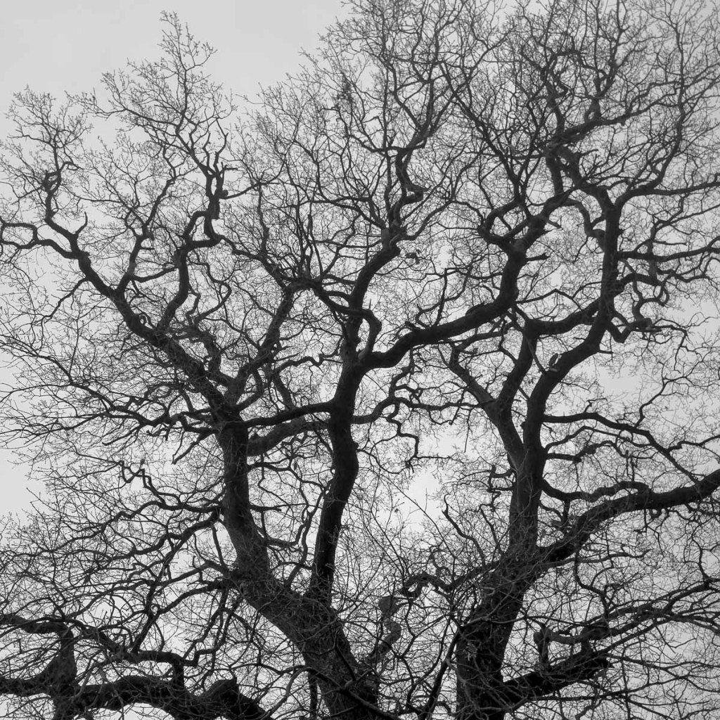
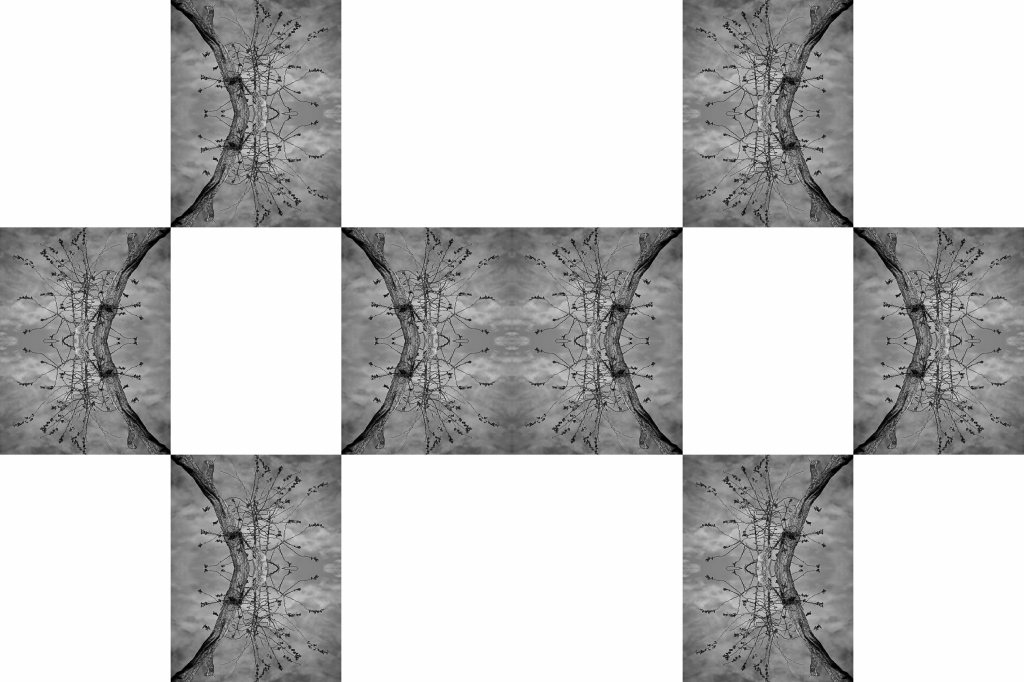
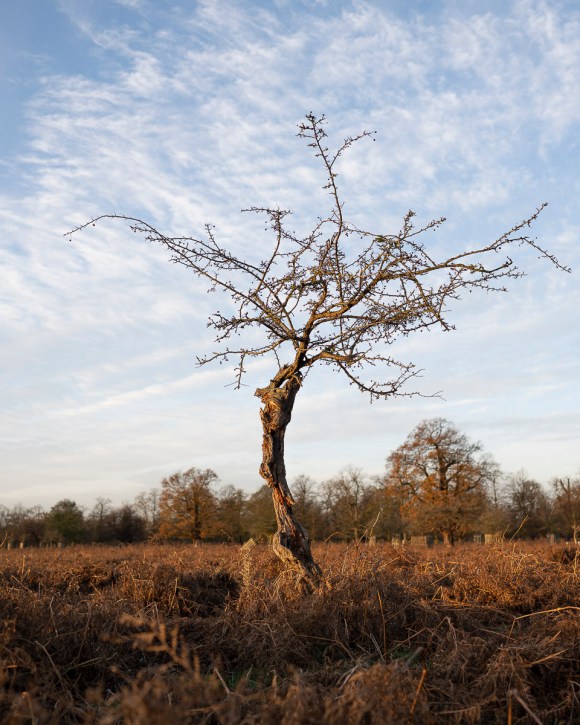
With the potential threat of not being able to take photos during the current national lockdown hanging over my head, I ventured to Bushy Park for some fresh air.
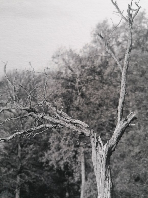
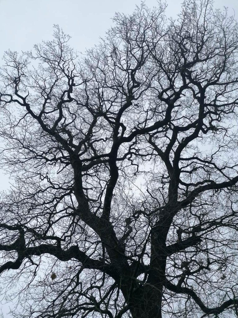
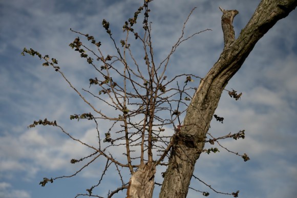
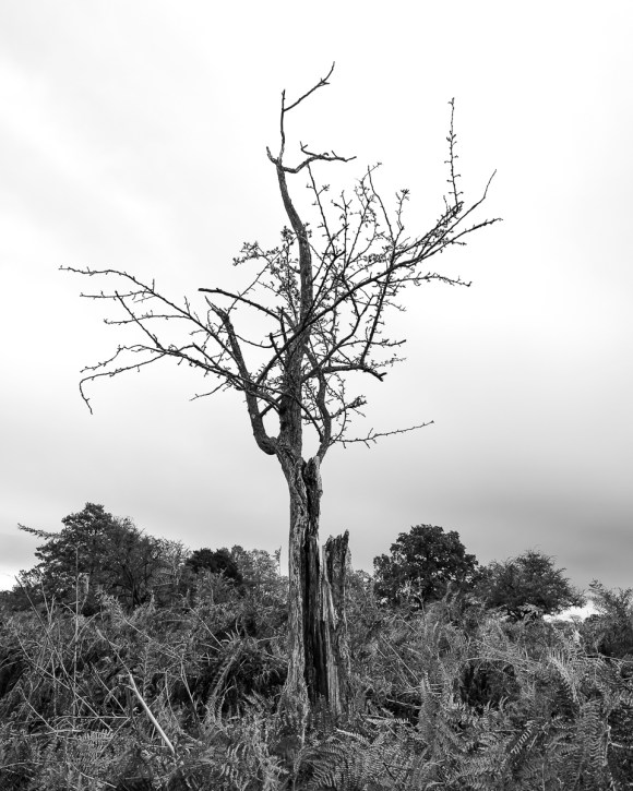
While walking in the park, I took the following shot of an oak tree on my smartphone.
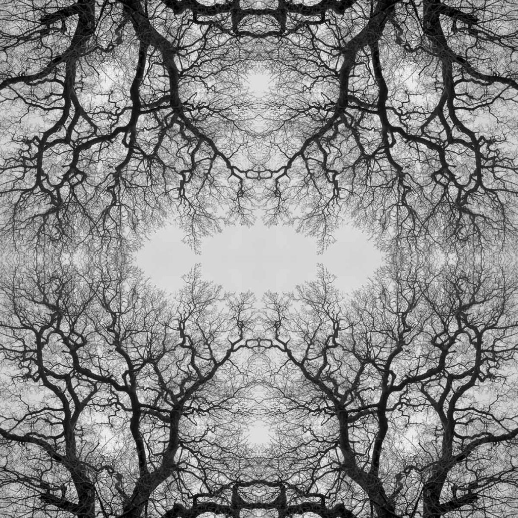
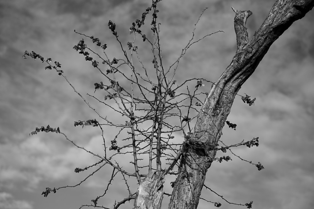
Once back at home, I made a Black & White conversion then created a 1:1 crop.
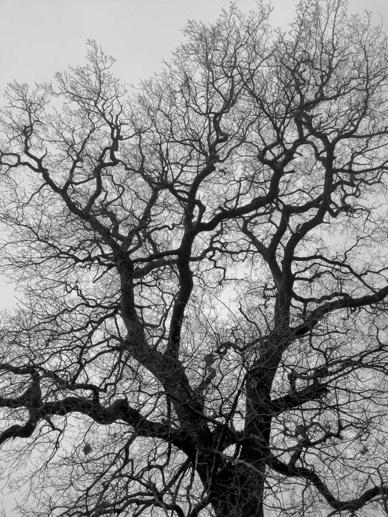
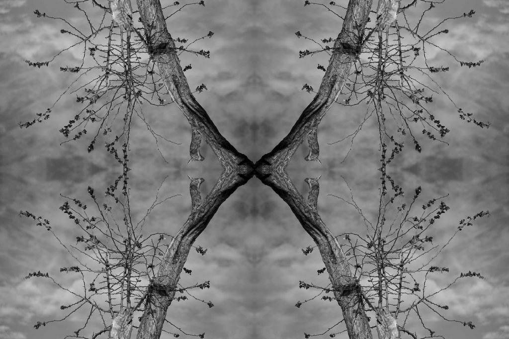
The final step was to create a quarters montage using Adobe Photoshop.
This was initially created at 8″ x 8″ 300 dpi. What this does show me is that work using my smartphone is possible. I just need to be creative, both visually and technically.
This document is to demonstrate my understanding of the issues and principles underpinning my photographic practice. It includes an annotated portfolio of visual resources/artworks, etc. an initial bibliography and list of research resources and a project proposal for Photography Research Project Stage 2.
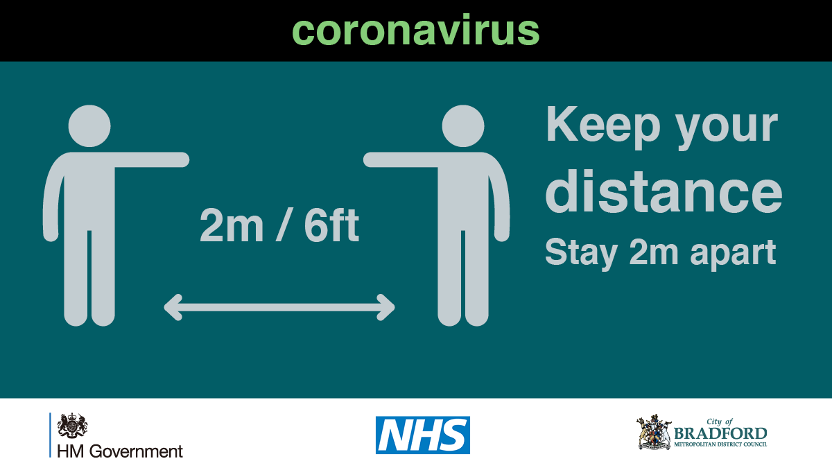
With the recent strengthening of importance of social distancing, I came across the above image. It certainly resonated with the images of the two trees. It seems there is no escaping the cultural influence of Covid-19
At this stage of the project, it was now time to consider the options for printing and presenting the final Body of Work. The intial submission, as confirmed in December 2020 and per the Module Handbook, was to present a physical portfolio of work at the Final Review on 27th January. Unfortunately, with the nationwide lockdown and related restrictions now in place and the university facilities closed, the submission of the final Body of Work would have to be made digitally.
Despite this change of circumstances, I wanted to continue with physicalising my work. This part of the process, when using purely digital means, is just as essential as taking the initial imagery. Also, by doing so, this makes the work more ‘real’ in what is increasingly becoming a virtual existence.
These developments have also resulted in all teaching being online until mid-February at the earliest. This meant the Group Tutorial scheduled for the 20 January, the Final Review on 27 January and the Feedback and Forward Planning Tutorial on 3 February would be conducted via Microsoft Teams.
In addition to this change in circumstances, as of 8 January 2021, it has been directed by the School of Media and School of Art at University of Brighton that no off-site working can be undertaken or authorised during this lockdown until further notice. Students have been asked to not draw, film or photograph on location, or work in any other way outside our homes. As such, until the circumstances change I am unable to take further images in Bushy Park. Luckily, I have got to the stage of this project with a cohesive Body of Work, a set of subworks, further experimentation concepts and an extensive collection of tree images that could be utilised for Stage 2 of my Photography Research Project.
Print Decisions
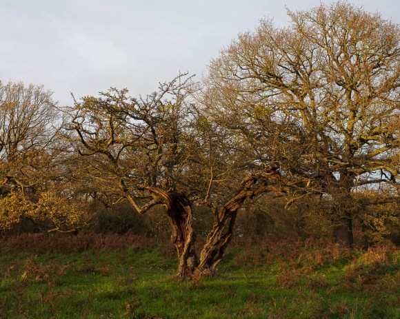
Having produced a test print using Hahnemühle German Etching 310 fine art paper, I knew that this would be my substrate of choice.
So I could affordably test and present the six final selected images printed in this way, I planned to order these at these at 16″ x 8″ on this paper with a 5mm white border. This border helps keep the print in good condition when handling. As the fine art requires the ink to be sprayed onto the paper’s surface (hence the term Giclée – French for spray) it makes the print susceptible to being damaged or smudged.
Also, if a print is framed using a mount it gives a margin of paper. This means the there is less likely to be a gap between the print and edge of the mount.
In addition I planned to order a 12″ x 8″ print of this image on the same paper.
I also planned this one in 9″ x 6″, again on Hahnemühle German Etching 310.
The bureau I chose to produce these prints was Spectrum Photographic. I hadn’t used this company before, but thought I should take a look at their offerings. When comapared to my regular printers (DS Colour Labs and Print Foundry), they had the edge for these test prints. In addition to a speedy turnaround, they also have have a 20% student discount. As such, this made the total price cheaper and/or quicker than the other two. However, the downside is that they do not have a framing service so I need to take that aspect into consideration when producing work for exhibition.
While placing my order I also noticed that Spectrum Photographic had a wider range of Hahnemühle papers available, all of which are acid free and archival.
The following details were taken from the Spectrum Photographic website that I can use for quick reference.
NEW Hahnemühle Hemp 290gsm
This ink jet media is made of 60% hemp fibre and thanks to the bright white colour of the hemp fibres, no optical brighteners are required. The lightly textured surface gives the paper a pleasant, silky feel. Colours and details are brilliantly reproduced, the depth of the black truly stands out and contrasts are reproduced with stunning effect.
NEW Hahnemühle Agave 290gsm
70% of this unique, environmentally friendly inkjet paper is made from sisal fibres. The rough, yet delicately defined surface texture gives the subject a captivating sense of depth. A premium coating guarantees outstanding print results with excellent reproduction of colour and detail, deep black and optimum contrasts.
Hahnemühle Photo Rag® 308gsm
A popular paper for re-producing high quality for graphic, illustrations and fine art images. This paper type has a fibrous finish, much like a smooth watercolour paper.
Hahnemühle German Etch 310gsm
This heavyweight paper with a fibrous finish, perfect for re-producing watercolour and ink re-productions.
Hahnemühle Fine Art Pearl 285gsm
This coated paper type reproduces impressive pictorial depth and is ideal for punchy black and white images. We would also recommend this paper type as digital alternative to the traditional Baryrta prints.
Hahnemühle Bamboo 290gsm
The first ink jet paper made from 90% bamboo fibres and 10% cotton. This warm base paper has a smooth surface texture, which is perfect for matt warm tone black and white images.
Hahnemühle Photo Rag® Pearl 320gsm
This coated paper types has a warm base white and is recommend for warm tone black and white images and another great digital alternative to warm tone traditional Baryrta.
Hahnemühle Photo Rag® Metallic 340gsm
This is a silvery-shimmering FineArt inkjet paper with a specially formulated inkjet coating for FineArt use. The natural white cotton paper contains no optical brighteners and has the characteristic Photo Rag® surface structure and sumptuous feel. Please note this paper is only available for Studio printing.
Hahnemühle Bamboo 290gsm
The first ink jet paper made from 90% bamboo fibres and 10% cotton. This warm base paper has a smooth surface texture, which is perfect for matt warm tone black and white images.
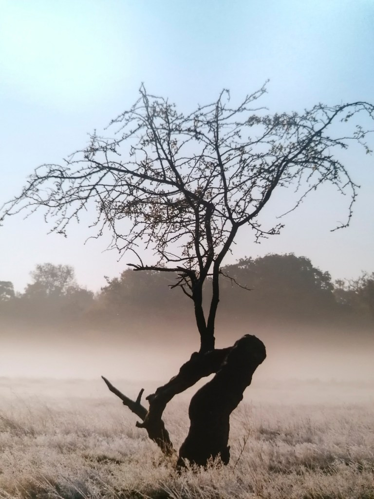
The paper that caught my eye was the Hahnemühle Bamboo 290gsm. In order to test this paper, I created the following image at 10″ x 8″ and ordered a print in that size.
Print Sizing
When considering the maximum size of a print of the images (which I now consider Tree Twosomes), I realised that I needed to make a note of the dpi count of each original file. I had cropped some of the initial images for aesthetics, which meant there was a variance in the sizes of each one.
I noted the following sizes:
5504 x 5504 dpi
4897 x 4897 dpi
5439 x 5439 dpi
4689 x 4689 dpi
5296 x 5296 dpi
5056 x 5056 dpi
This meant that the largest print option at 300 dpi (based on the smallest size) could be 9912 x 4945 dpi, which is just under 32″ x 16″. If I wanted to have the exact measurement, the resolution sacrifice would be negligible based on previous research.
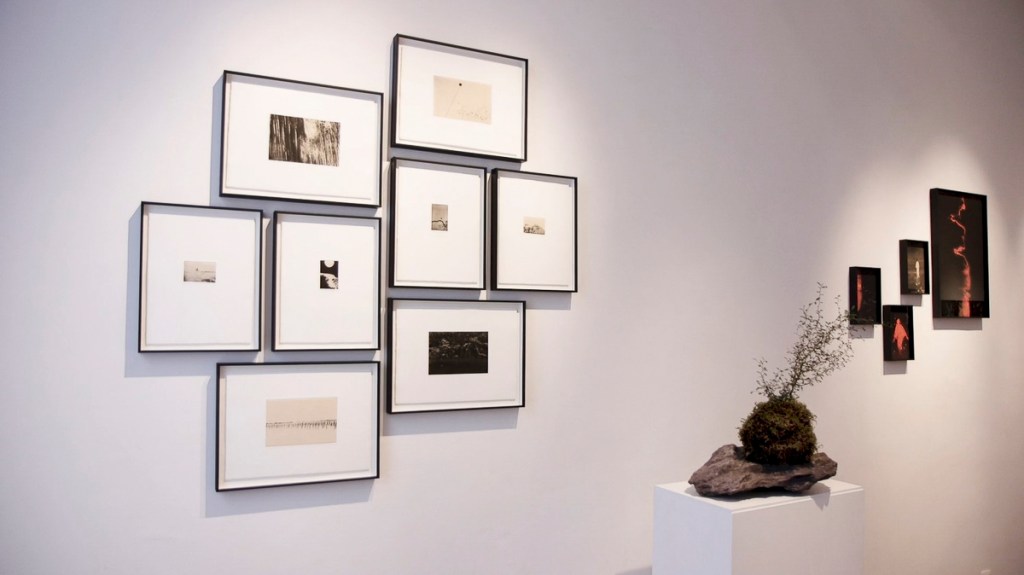
Potential Exhibition Pieces
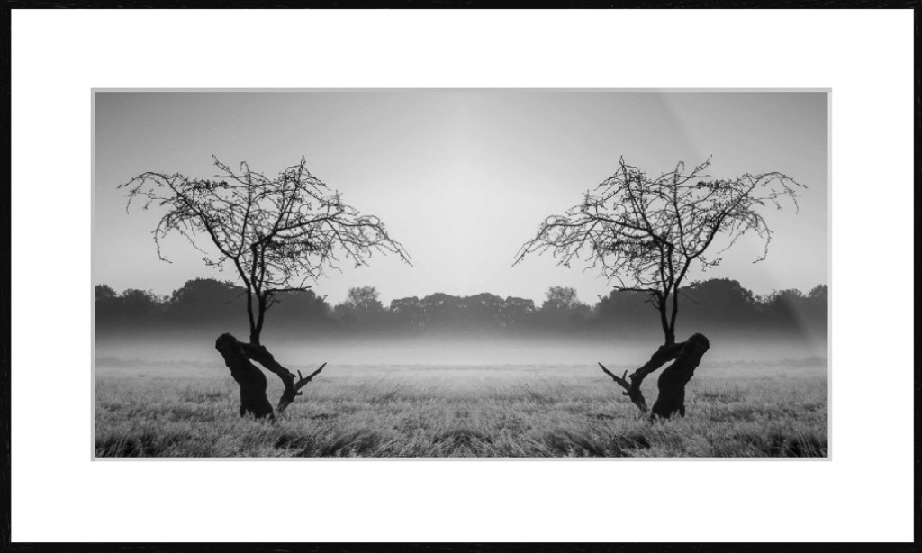
There was one particular issue with using Hahnemühle German Etching 310, which I discovered during the AGM60 Module. This paper can’t framed and mounted using the Framed Pro Mount. Then I recalled seeing a float mount. This is when the fine art print appears to ‘float’ within a frame with the edges are slightly elevated and the edge of the paper can be seen.
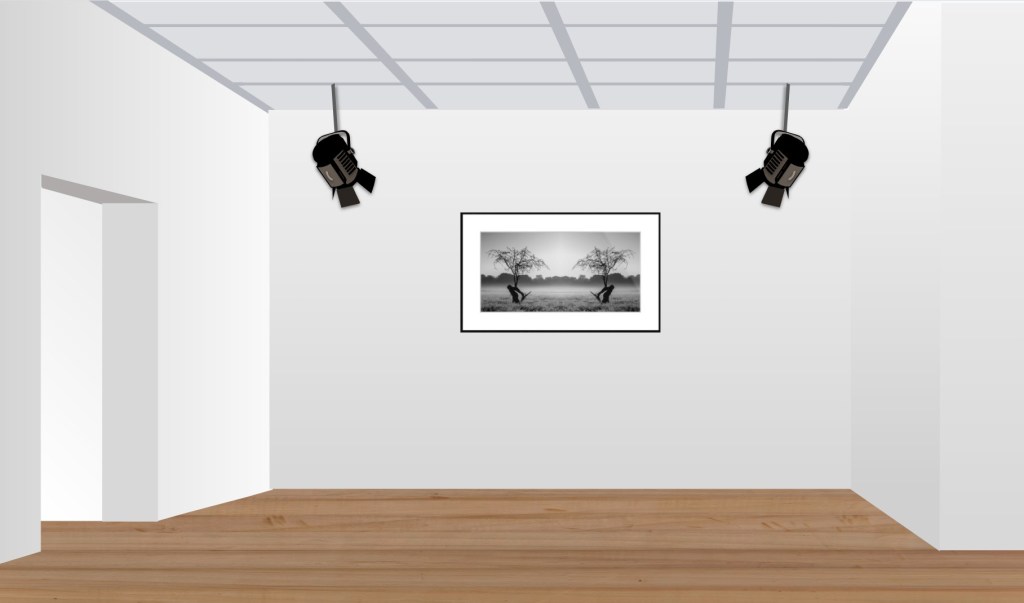
My bureau of choice for this was Print Foundry Lab. My intention at this stage was to order one image as a float mount print sized at 24″ x 12″ set within a Gallery S Black Woodgrain Finish frame as shown above. To reduce the refletions, I chose museum glass. The border around the frame would be 2″ wide, so the finished piece would be 28″ x 16″.
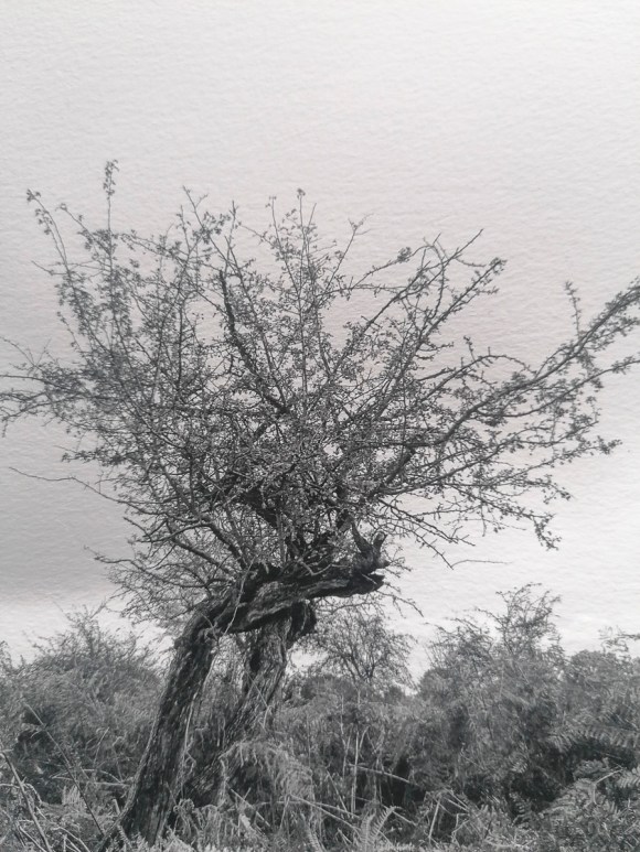
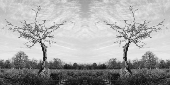
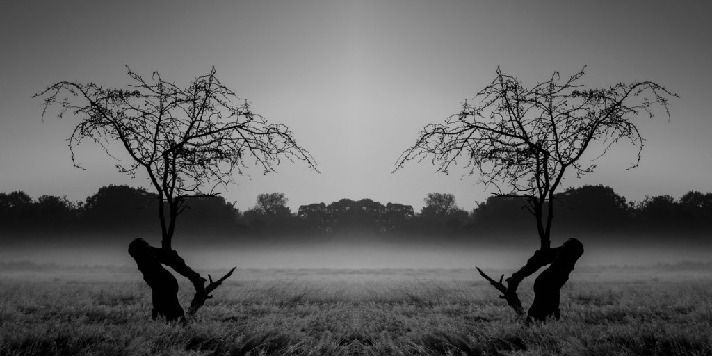
I chose the following image for this test. It is my favourite of the images that I would happily have on my wall at home. This is, potentially, how it will look.
The lead time would be 7-10 days, so potentially I could have this before the Group Tutorial on 20 January 2021.
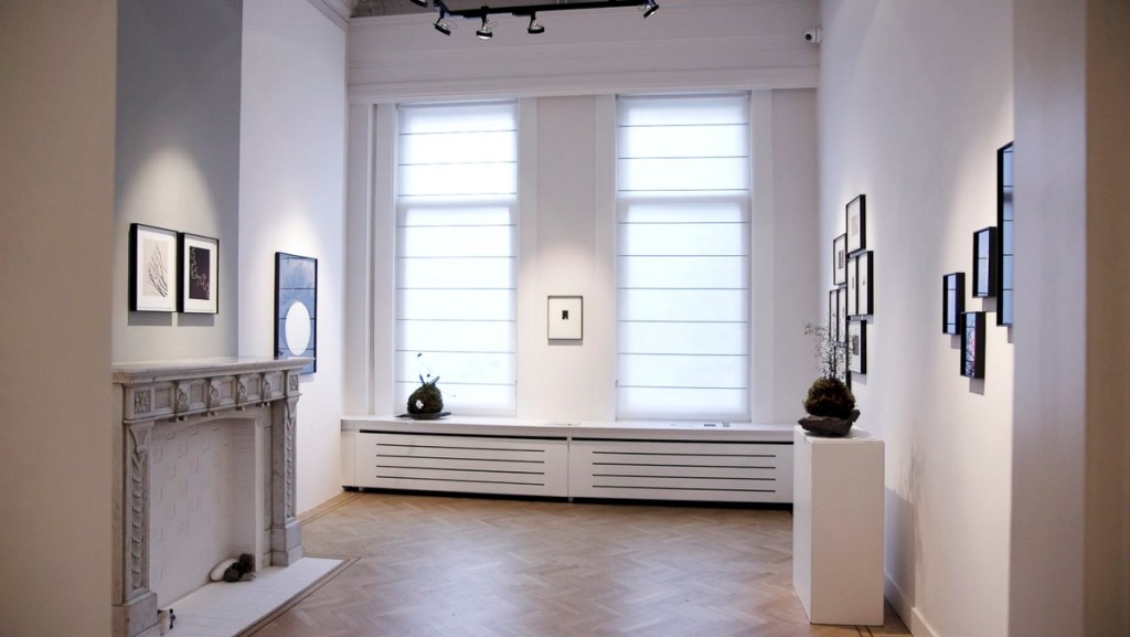
Presentation Options
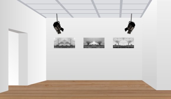
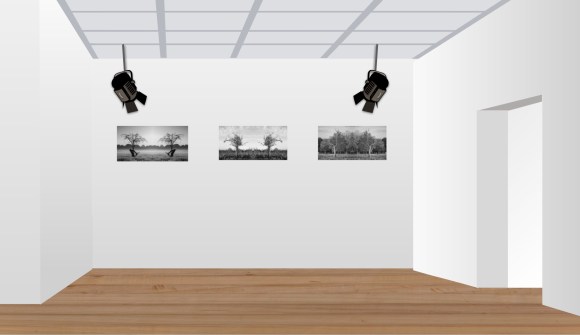
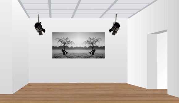
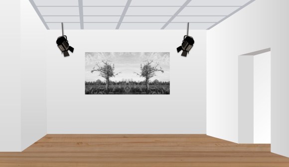
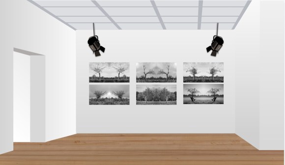
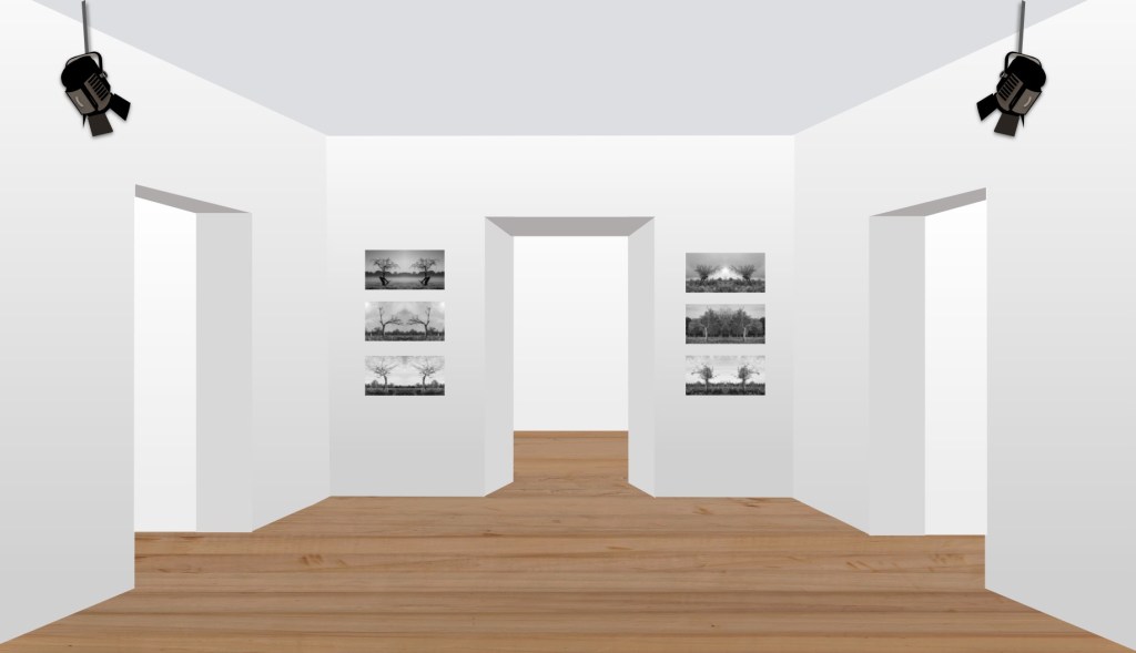
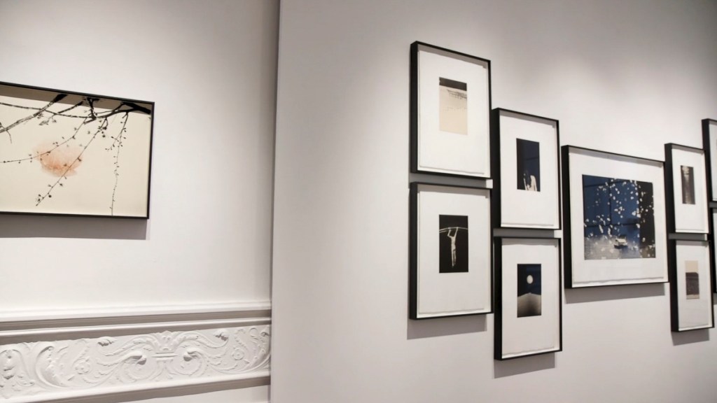
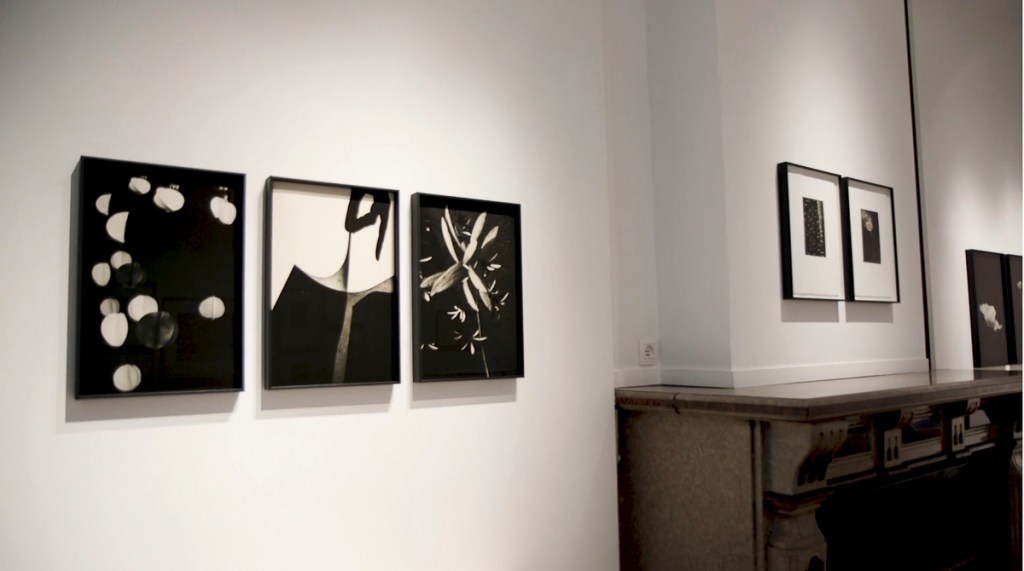
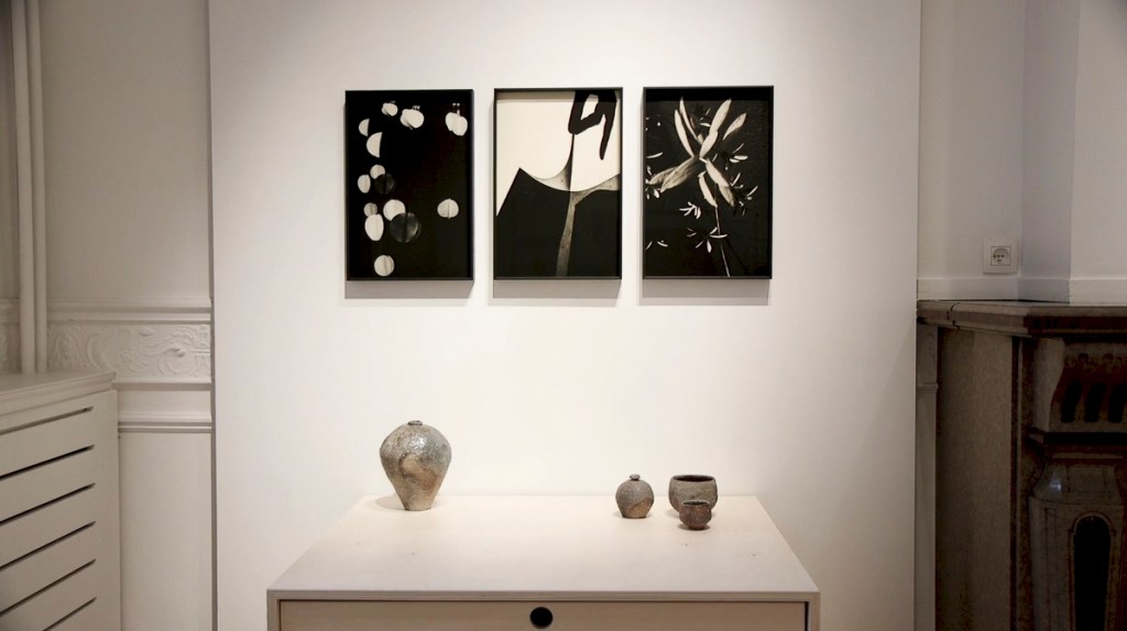
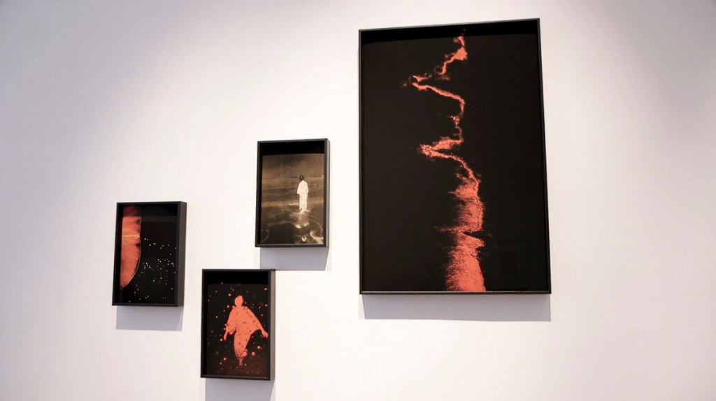
With regards to presentation, I created the following gallery mock ups to get a sense of how these images could work in groups or as individual images. This is one the assumption the final pieces would be exhibited within a traditional ‘whitewall’ environment.
These images were created using an interactive slide template of a virtual gallery. This template is available using Slidemania, a free online resource.
SlidesMania. 2021. Slidesmania | Free Google Slides Themes And Powerpoint Templates.. [online] Available at: <https://slidesmania.com/> [Accessed 8 January 2021].
“I see my work as little visual haikus, echoing the emotion that is behind, triggering feelings in the same way music can. I find real meditation within photography, to walking to get into a rhythm and from there begin to play and learn. I like to share the process, turning the invisible into a momentary snapshot and then go on.”
(Cupido, P. 2020)
I came across Paul Cupido’s work and was intrigued by his images and the ethos behind them. Cupido’s words above echo my own way of experiencing photography. Walking with my camera in Bushy Park is a form of meditation for me and one that has kept me going during these interesting times.
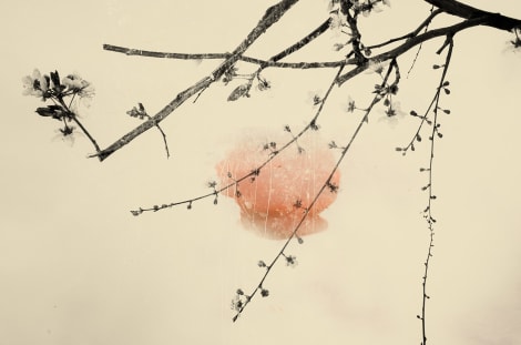
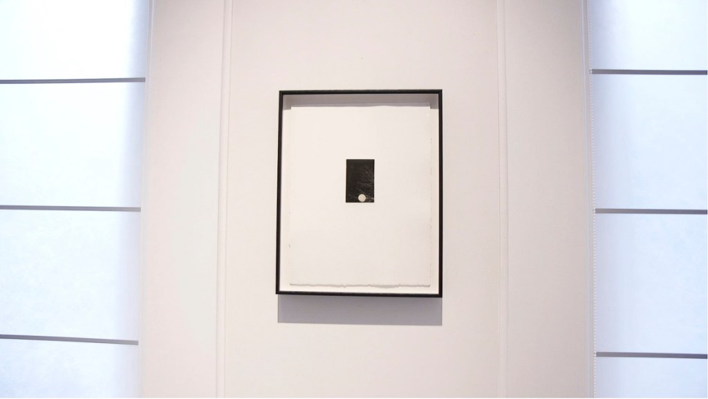
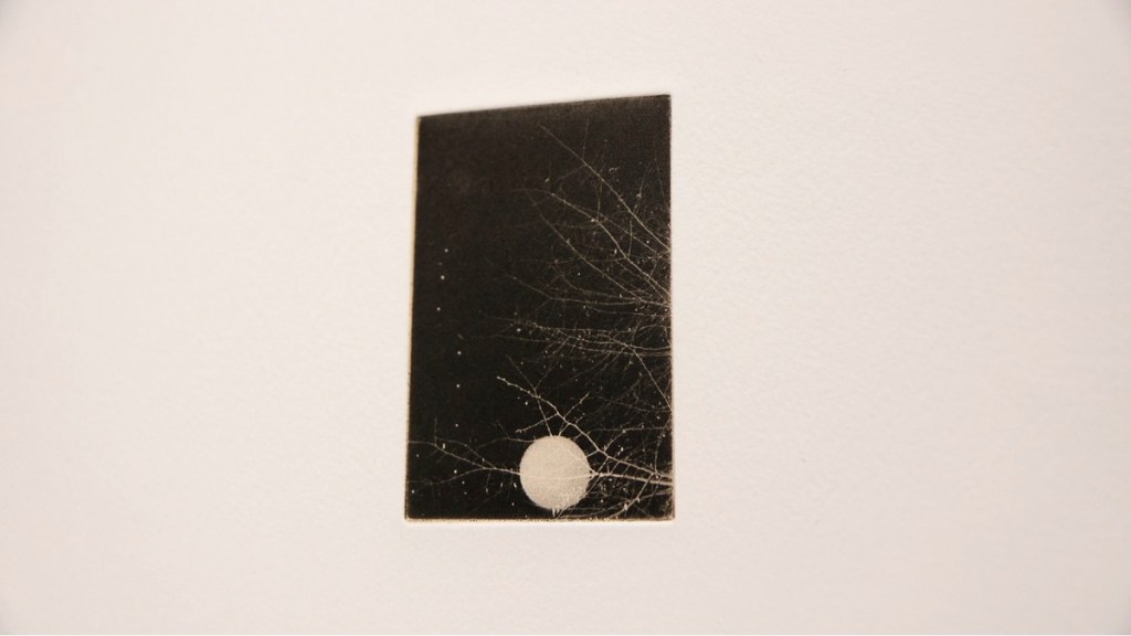
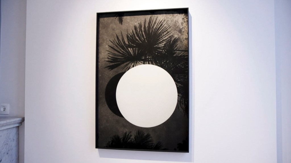
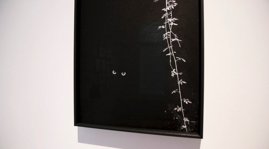
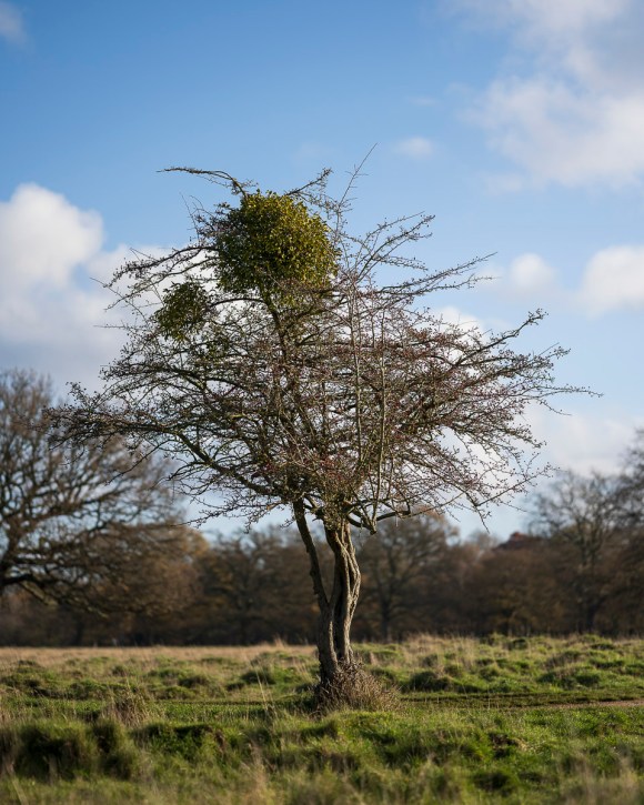
The piece that led me to research Cupido further was this image:
The following is taken from Cupido’s website, which I have noted for future reference.
Synopsis
The photographic work of Paul Cupido (b. 1972, Terschelling, the Netherlands) revolves around the principle of mu: a philosophical concept that could be translated as ‘does not have’, but is equally open to countless interpretations. Mu can be considered a void, albeit one that holds potential.
Cupido’s ongoing photographic and cinematic experiment ‘Searching for Mu’ is at once a personal and universal odyssey of our fleeting existence in relation to the profound emotional experiences of love, time, and death. Instead of presuming to be documents, his photographs point to transcendent reflections of the soul and of the intermingling of the microscopic and macroscopic.
Artist Statement
I aim to engage with the world with wide-open senses. My work is about the magic moments of life as well as its inconveniences. I want to take pictures, while forgetting about the process of photography, until I’m saturated with an existential sense of life. Every step I take begins with the notion of ‘mono no aware’: the transience of everything, the gentle melancholy of things, being sensitive to ephemera.
(Paul Cupido, 2021)
According to Cupido’s gallery’s website, the concept behind Mu, makyu, is explained:
‘In a quote by the famous Chinese philosopher Zhuangzi, who lived 2,300 years ago: “An empty room will be filled with light because of its emptiness.” Mukayu also refers to ‘non-existence’, ‘not having a purpose’, or ‘things as they are’.’
‘Mukayu is part of the larger framework of Mu, a philosophical concept that could be translated as ‘does not have’, but is equally open to countless interpretations. Mu can be considered a void, but one that is full of potential.’
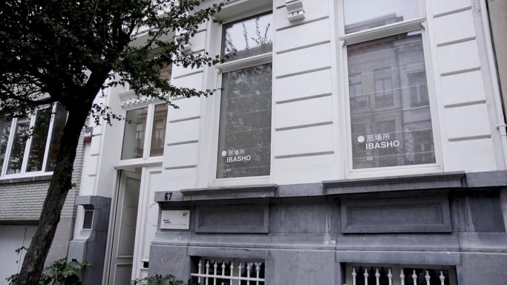
‘These concepts have been the spiritual guideline of the Dutch photographer Paul Cupido during his most recent travels to Japan, resulting in his latest series to be exhibited at IBASHO from 29 october 2020 to the 17th of January 2021.’
‘IBASHO means ‘a place where you can be yourself’ in Japanese. IBASHO is a gallery in Antwerp that opened her doors in March 2015, showing fine art Japanese photography ranging from works by well-known Japanese photographers to younger contemporary Japanese artists as well as works from Western photographers who were inspired by Japan. IBASHO hopes to show the versatility and beauty of Japanese photography in its many guises, from the raw and unpolished to the minimalist and still. As photo books are an important medium for presenting photography in Japan, IBASHO also deals in new and antiquarian Japanese photo books. Recently IBASHO has started publishing its own photo books together with Paris-based publisher the(M) éditions.’
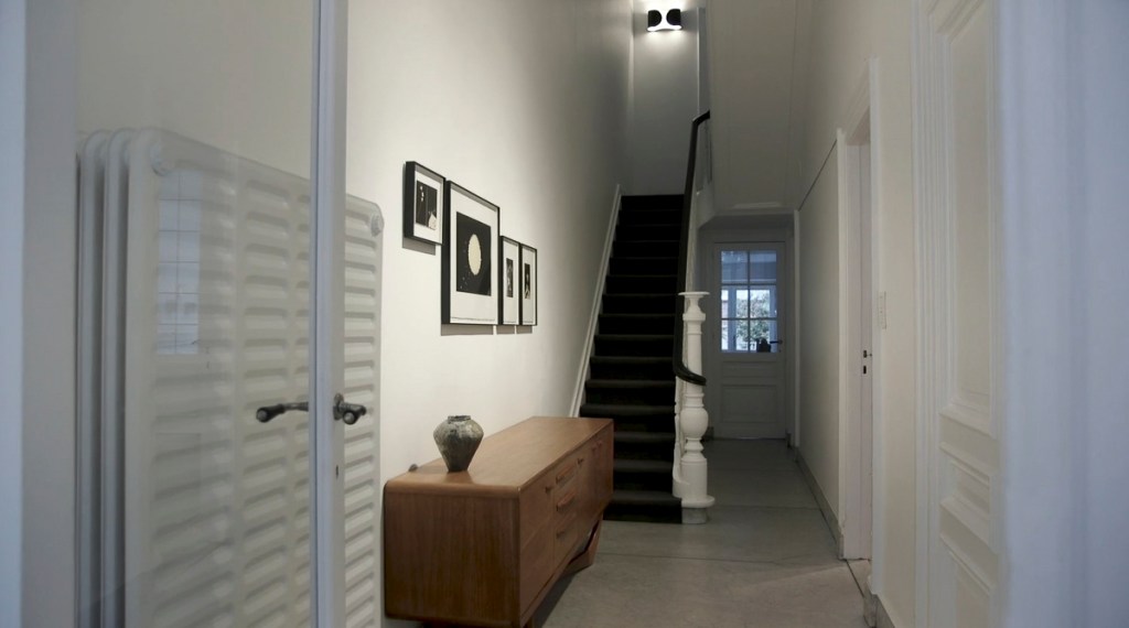
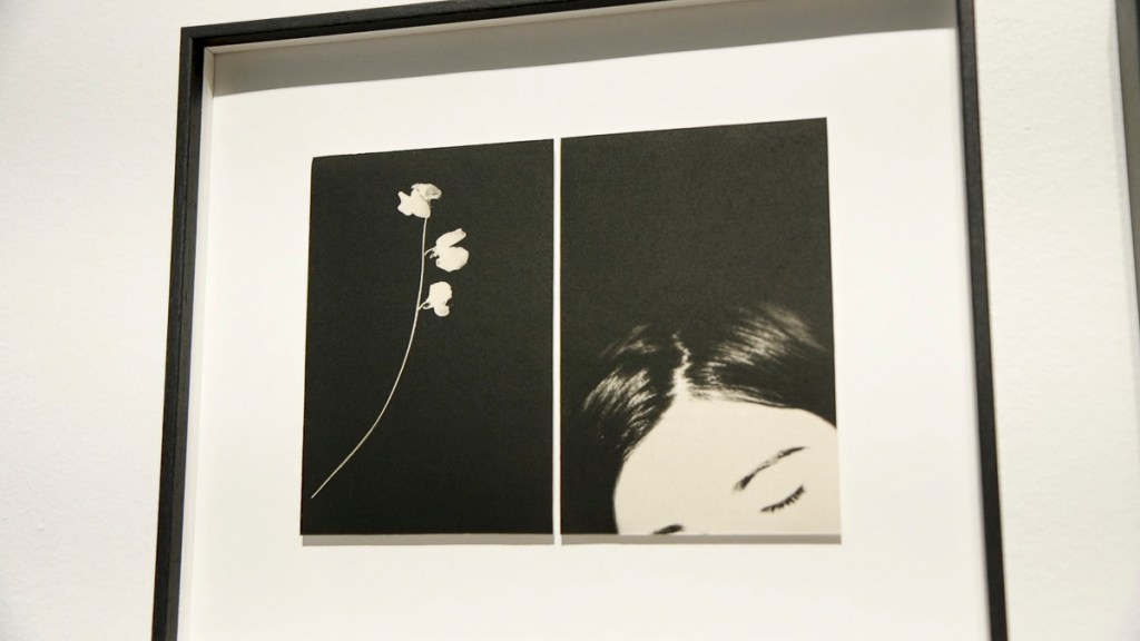
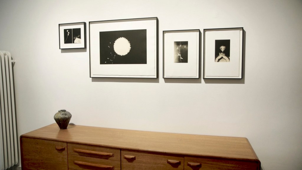
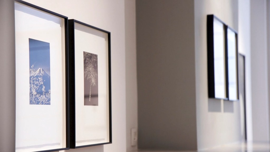
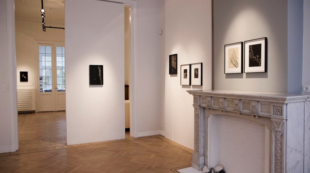
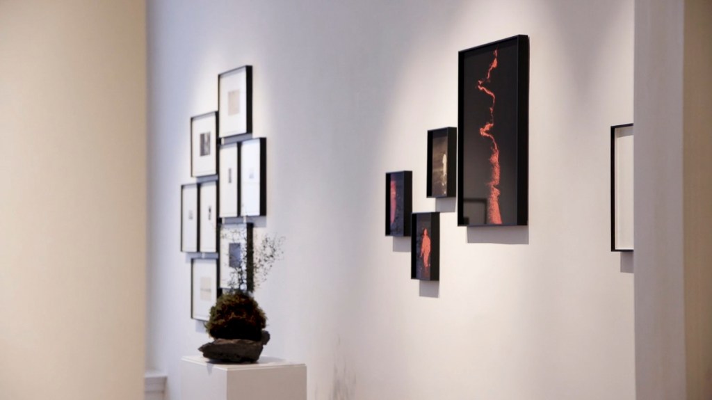
Unfortunately, I wasn’t able to visit this exhibition due to the travel restrictions at the time. I very much appreciated the video that was made of the exhibition and uploaded to the gallery’s website. The following are stills of the installations and pieces on display.
Cupido’s work had a strong bearing on my Invisible Trees images. The way in which they were printed and framed contributed in my choice of framing, mounting and the paper (Hahnemühle German Etching 310 fine art paper).
The concept of having blank space (gaps) is becoming a potential theme in my work. What isn’t there is just as important as what is shown.
The other significance of this exhibition highlighted how important producing work is. Seeing and experiencing printed and framed pieces in a gallery environment is so superior to just seeing it on a back-lit screen.
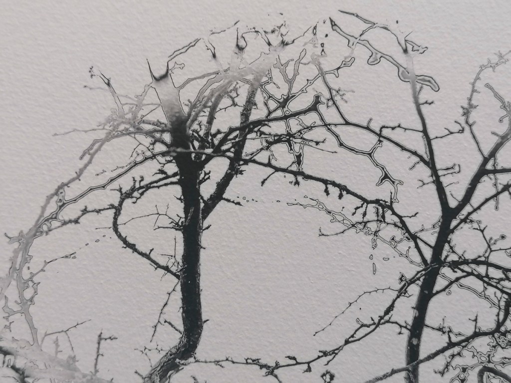
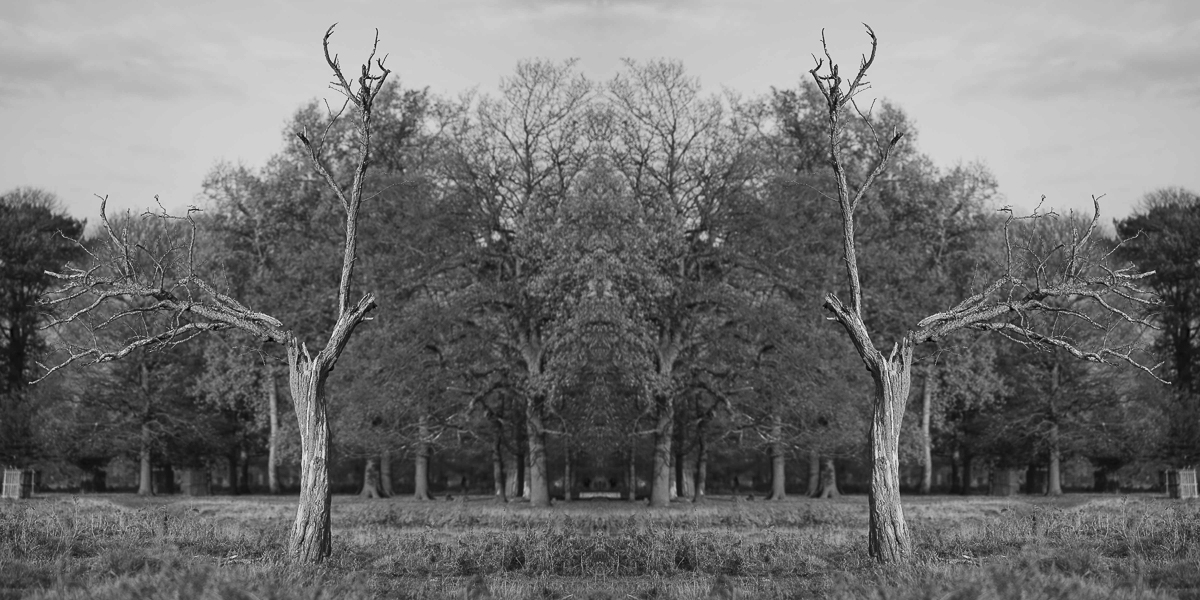
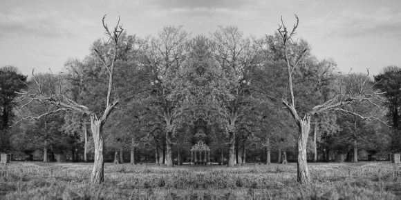
Before embarking on the Winter break, I tried something different with an image taken on 15 November. I wanted to experiment with a technique I used with the ‘twosome’ images and have tried with other previous projects.
Intially, I made a Black & White conversion.
I then created the following image using Adobe Photoshop.
Finally, I produced the following configuration, again in Adobe Photoshop.
Not sure if this works exactly, but is something I could revisit in Stage 2.
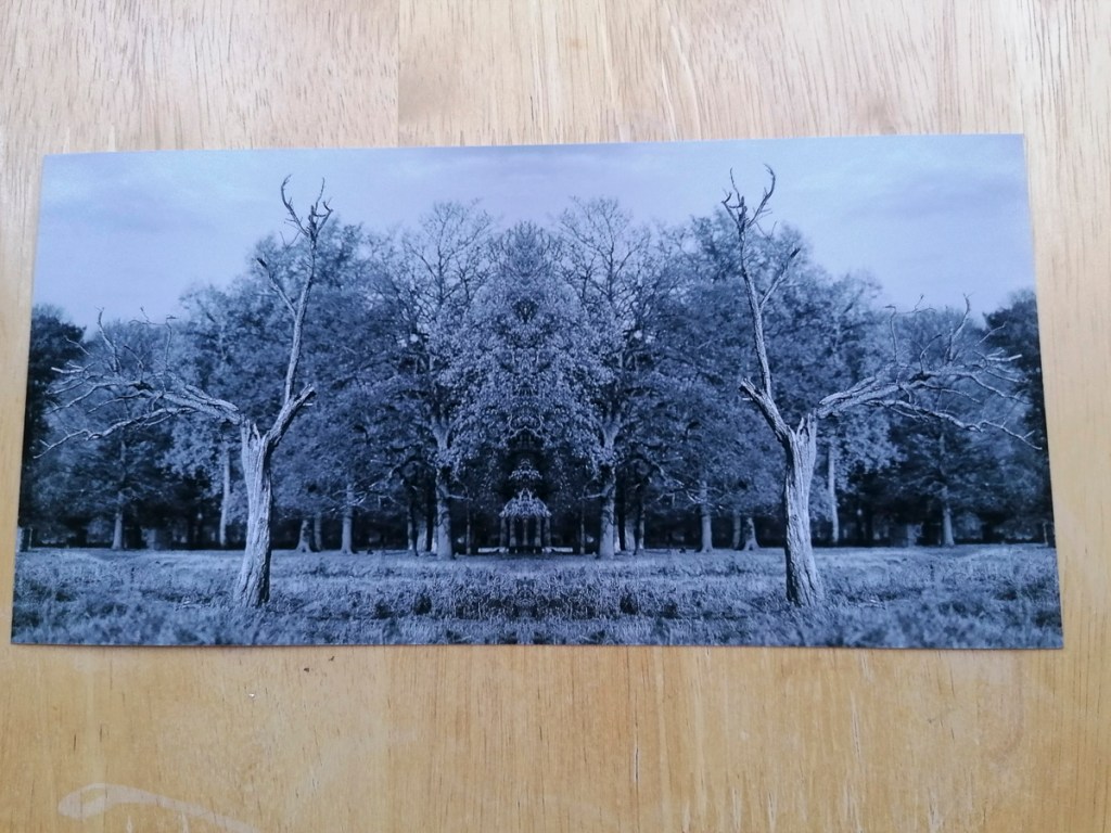
During the 1:1 Tutorial on 16 December, Åsa thought this image had further potential.
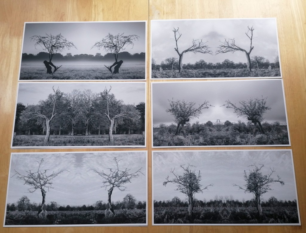
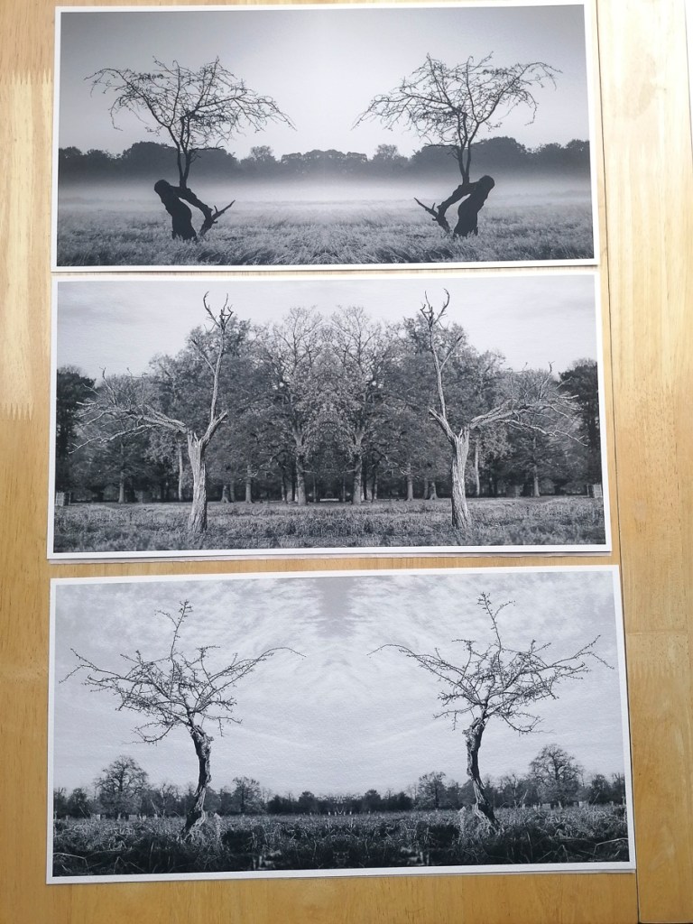
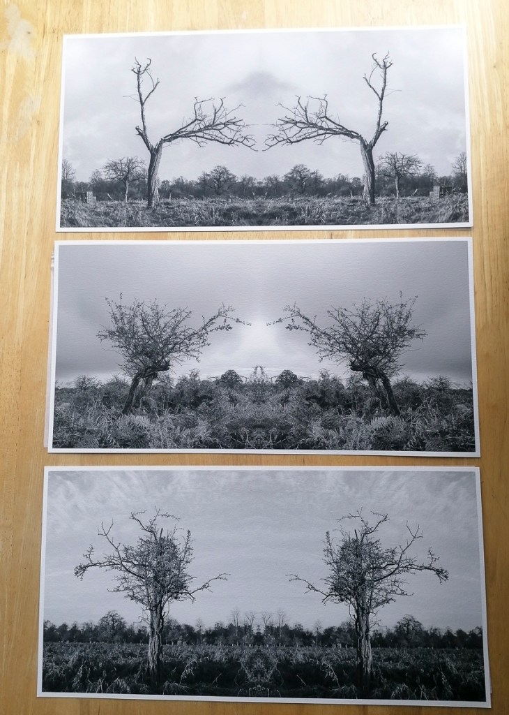
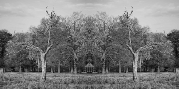
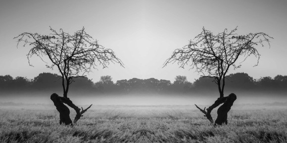
As such, I revisited all of the images taken so far to see if I could repeat the process. Also, to see what works and what doesn’t. These are the results and what I am considering to be the final Body of Work at this stage.
Each image has been edited on Adobe Camera Raw then completed on Adobe Photoshop. I’ve also re-edited the initial image as I think this composition works better.
The following is the editing process for each image. I will be amending this post when I have collated the images.
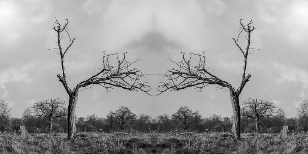
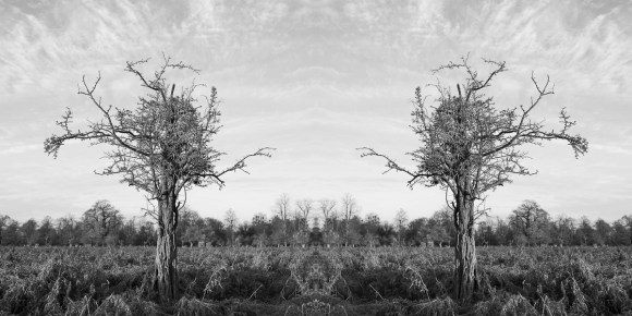
Invisible Trees 1
Original Image
Colour Edit
Black & White Edit
Crop
Intial Image
Paired Image
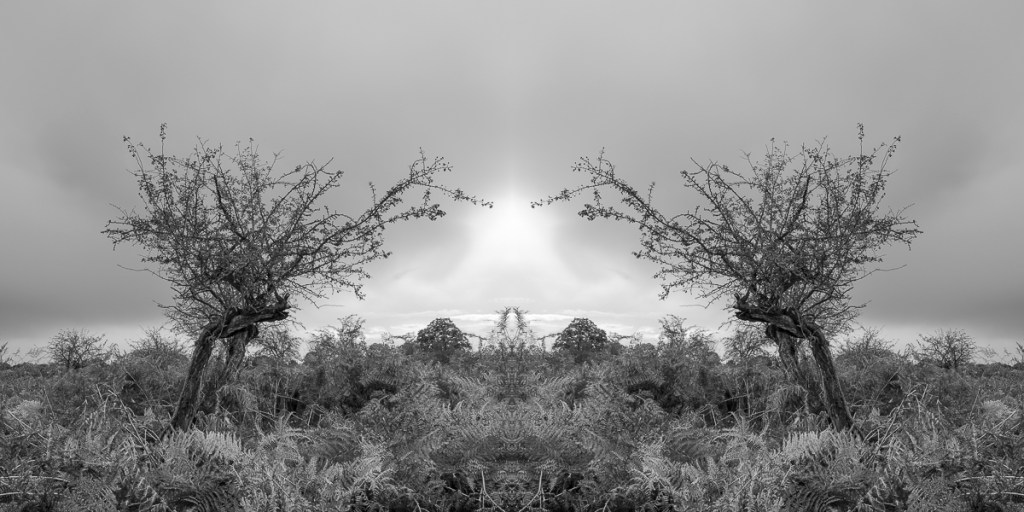
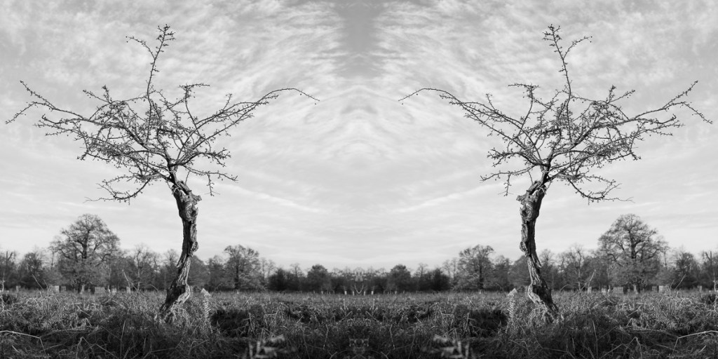
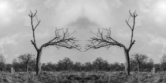
Invisible Trees 2
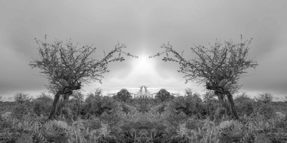
Invisible Trees 3
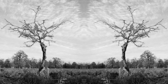
Invisible Trees 4
Invisible Trees 5
Invisible Trees 6
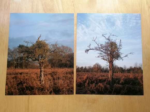
The initial file size is 16″ x 8″. I would also print these on Hahnemuhle German Etching 310gm fine art paper. At this point of the project, I had received my prints from DS Colour Labs. The difference this paper makes to an image compared with the Pearl C-prints is quite marked.
Unfortunately, the prints ordered via DS Colour Labs on 10 December 2020 arrived after my 1-1 tutorial with Åsa. This meant I was unable to show them and discuss these during this tutorial on the 16 December 2020. Despite this, it did give me a much better idea as to how the printing process affected the images.
In general, both the Black & White and colour Pearl C-Prints were ok, but I don’t think they did justice to the images themselves. The sheen on the prints ‘flattened’ the details compared to how they appeared on screen.
8″ x 8″ Prints
These are two of the original images next to the Pearl C-Prints.
The difference the substrate makes is marked when comparing the Pearl C-Print with Hahnemuhle Photo Rag 308.
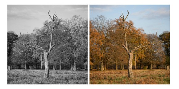
Original JPG
Pearl C-Print on Left, Hahnemuhle Photo Rag 308 on Right
The following images are close-up comparisons. For, me the fine art print paper gives the image a texture that creates an artistic effect rather than provide a ‘documentation’ of a tree and its environment.
Pearl C-Print
Hahnemuhle Photo Rag 308
Pearl C-Print
Hahnemuhle Photo Rag 308
10″ x 8″ Prints
JPG
JPG
Pearl C-Prints
JPG
JPG
JPG
JPG
Pearl C-Prints
JPG
JPG
JPG
JPG
Pearl C-Print
Pearl C-Print
JPG
JPG Revised
JPG Comparison
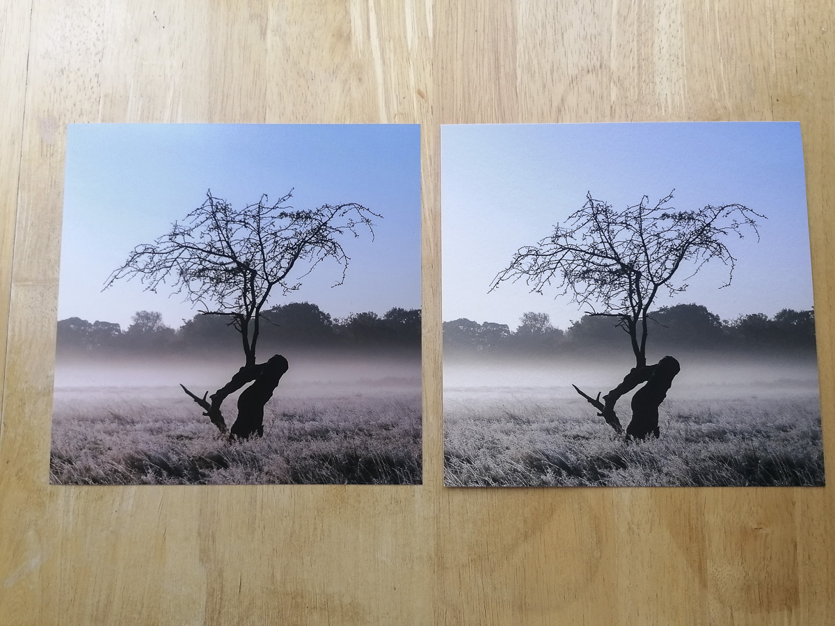
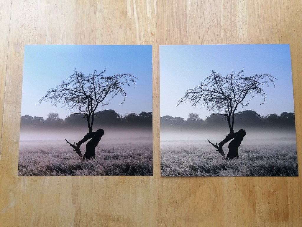
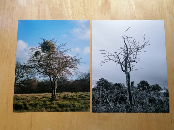
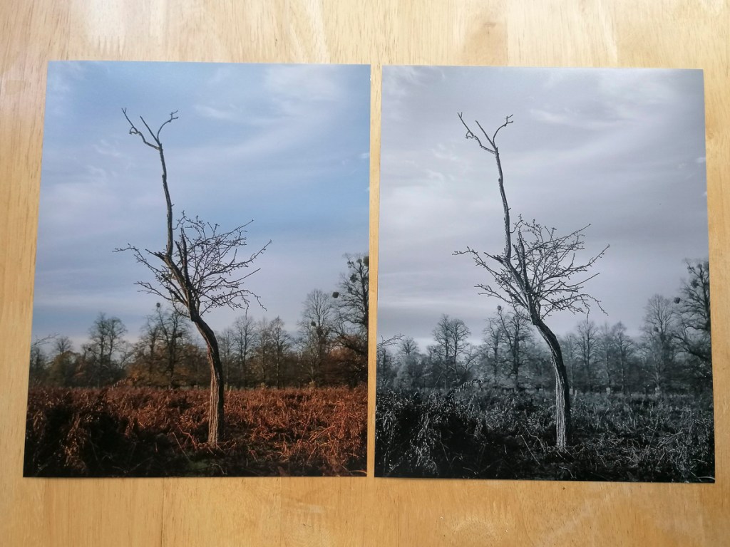
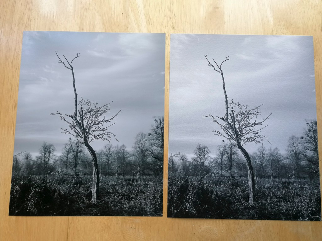
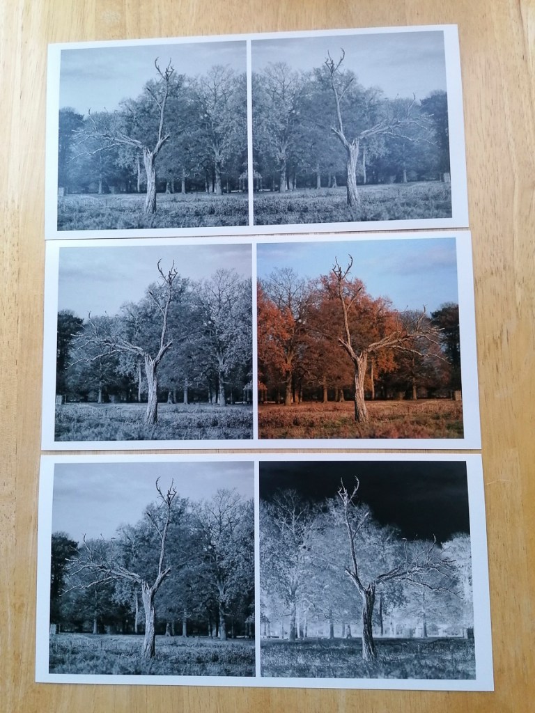
As with the Hahnemuhle Photo Rag 308, the following shows the differences between the Pearl C-Print and fine art paper – Hahnemuhle German Etching 310.
Pearl C-Print Colour and B&W
Pearl C-Print & Hahnemuhle German Etching 310
Pearl C-Print
Hahnemuhle German Etching 310
Pearl C-Print
Hahnemuhle German Etching 310
10″ x 5″ Prints
Again, the Pearl C-Print was disappointing. I do prefer the adjoined image rather than having the split in the middle. However, I do still like the pairing of the negative and positive images.
Going forwards, I would need to work out the best way of printing and presenting the final Body of Work. This would involve researching which fine art printing and/or framing bureau would be able to produce exactly what I would want.