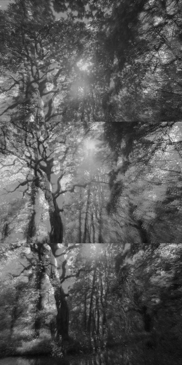
After processing the images from 21 May and the class seminar on 26 May, a change of approach was required. The general feedback from the class was for the images to be in Black & White and to be arranged in columns of three related images. The grid was thought to be too confusing to the viewer.
Also, by presenting the trees as a single column of three images with space between each, it would give the images ‘breathing space’. I also had to balance the exposure so that it was equal in all images.
With this feedback in mine and my dissatisfaction with the initial in-camera Black & White conversions, I took a leap of faith to use two ways of converting images using Adobe Photoshop. I had learned these techniques during my HNC and thought they would be appropriate for this current project. For full details, please visit: https://photoaquarius.wordpress.com/2019/03/25/unit-110-pt-20-digital-effects-recipes-t-3/
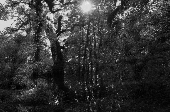
The first technique I used was a digital lith print effect. This effect approximates a wet/analogue photographic technique called Lith Printing. This technique involves the analogue processing of exposed photographic print paper in a very dilute lithographic film developer.
Lith Printing is:
- Often used in portraiture
- A repeating trend in fashion photography
- Suits images that contain a shallow depth of field or have a ‘vintage’ feel
- A technique reminiscent of early processes in photography, particularly of those during Pictorialism
The recognisable effects of Lith Printing are:
- Very dark and contrasted shadow areas
- Very bight and light highlight areas
- Very pronounced grain, mainly restricted to the shadow and mid-tone areas
- A peach-pink or mauve-pink colour in the mid-tones
My own use of this recipe doesn’t include the last stage of the process, which results in a monochrome image.
I had already experimented with Set 5 of the Woodland Gardens images already, so I chose these to use for this new approach. By doing this, it would show the differences between the two techniques and the previous Black & White conversion.
This is the image I edited using the Digital Lith Print recipe (Shot 1A).
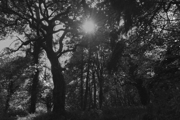
The second technique I applied to the corresponding multi-exposure image was Digital Infrared (IR) in Black & White. This effect gives an approximate effect of a wet/analogue photographic technique that utilised Kodak IR (Infra-Red) film.
Characteristics of Black & White IR are:
- A very fine, but noticeable grain
- Pale/paler, extremely smooth skin texture (portraits)
- Halation – a faint glow, particularly around the highlight areas
- Slightly watery eyes (sometimes noted as blood-shot, but grey tone) (portraits)
Traditionally, IR film exposure was usually combined with using orange, red or very deep red filters (practically black), colours were often tonally interpreted to render ‘warm’. Also:
- Red-coloured objects as pale to very pale blue
- Blue-coloured objects as very deep grey
- Gives an ‘unearthly’ and ‘ethereal’ interpretation to the subject
This is how the corresponding image (Shot 1B) to the one above look using this technique:

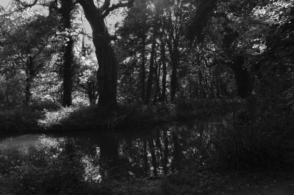
I then combined the two images (Shot 1A & 1B) in a further Adobe Photoshop file:

This, for me, had a palpable and ethereal effect. By fusing the two images together, it gives a very unsettling viewing experience. I found that it took a while for my eyes to focus and the images to reveal their individual details.
These are the two images together for comparison.
My next step was to apply the same technique to the other four shots of this set:
Shot 2A – Digital Lith Effect
Shot 2B – Infra Red Black & White Effect

Shot 2A & 2B Combined

Shot 3A – Digital Lith Effect

Shot 3B – Infra Red Black & White Effect

Shot 3A & 3B Combined

I then saved each complete image at 6″ x 9″ then combined them in Adobe Photoshop on a 9″ x 18″ canvas.