The main point that came from this Group Tutorial was that I had to include presentation options as part of the Task 1 submission. The elements that I had not considered in greater depth was adding the measurements of both the gallery and the pieces as they were to be displayed. Other considerations were the adding of a business card holder and Artist Statement. Also, I need to add a list of materialities in bullet points. These details were added to my final submission document for Task 1.
Other aspects I had to consider were:
Clarification of the underpinning concept
How do I articulate the work?
Connations of Black & White vs colour
I also was pointed to further research in relation to:
“I see my work as little visual haikus, echoing the emotion that is behind, triggering feelings in the same way music can. I find real meditation within photography, to walking to get into a rhythm and from there begin to play and learn. I like to share the process, turning the invisible into a momentary snapshot and then go on.”
(Cupido, P. 2020)
I came across Paul Cupido’s work and was intrigued by his images and the ethos behind them. Cupido’s words above echo my own way of experiencing photography. Walking with my camera in Bushy Park is a form of meditation for me and one that has kept me going during these interesting times.
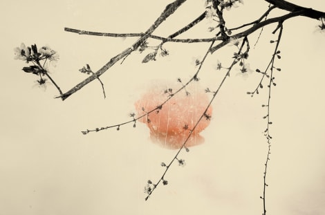
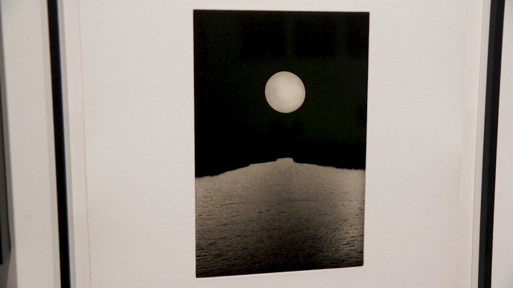
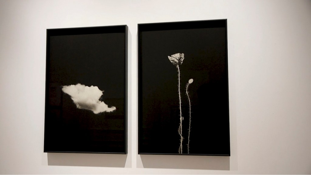
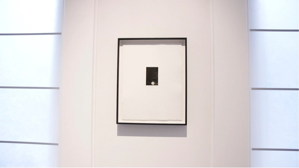
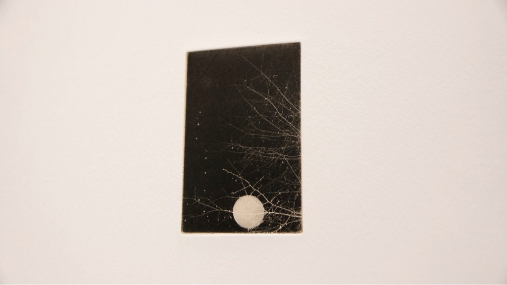
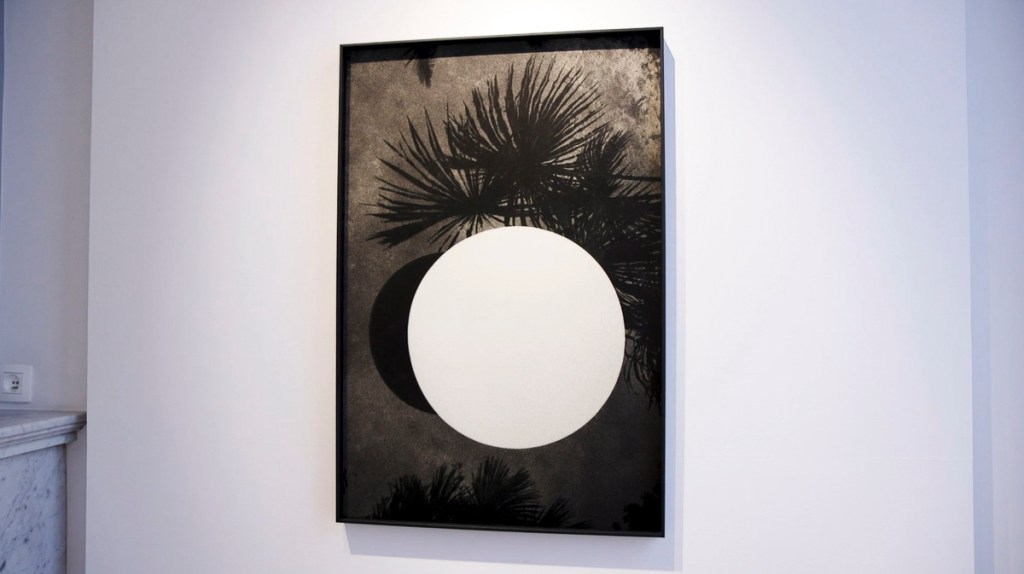
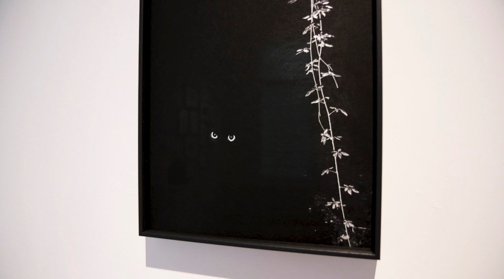
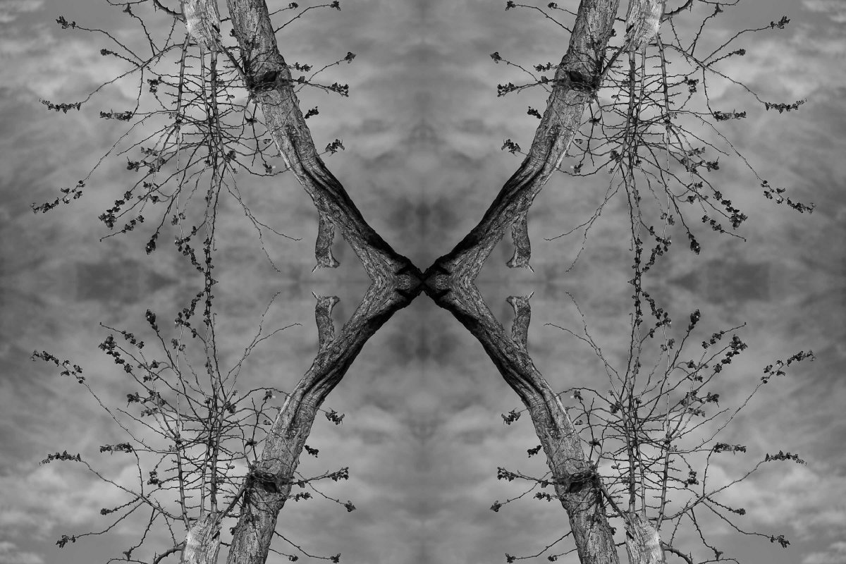
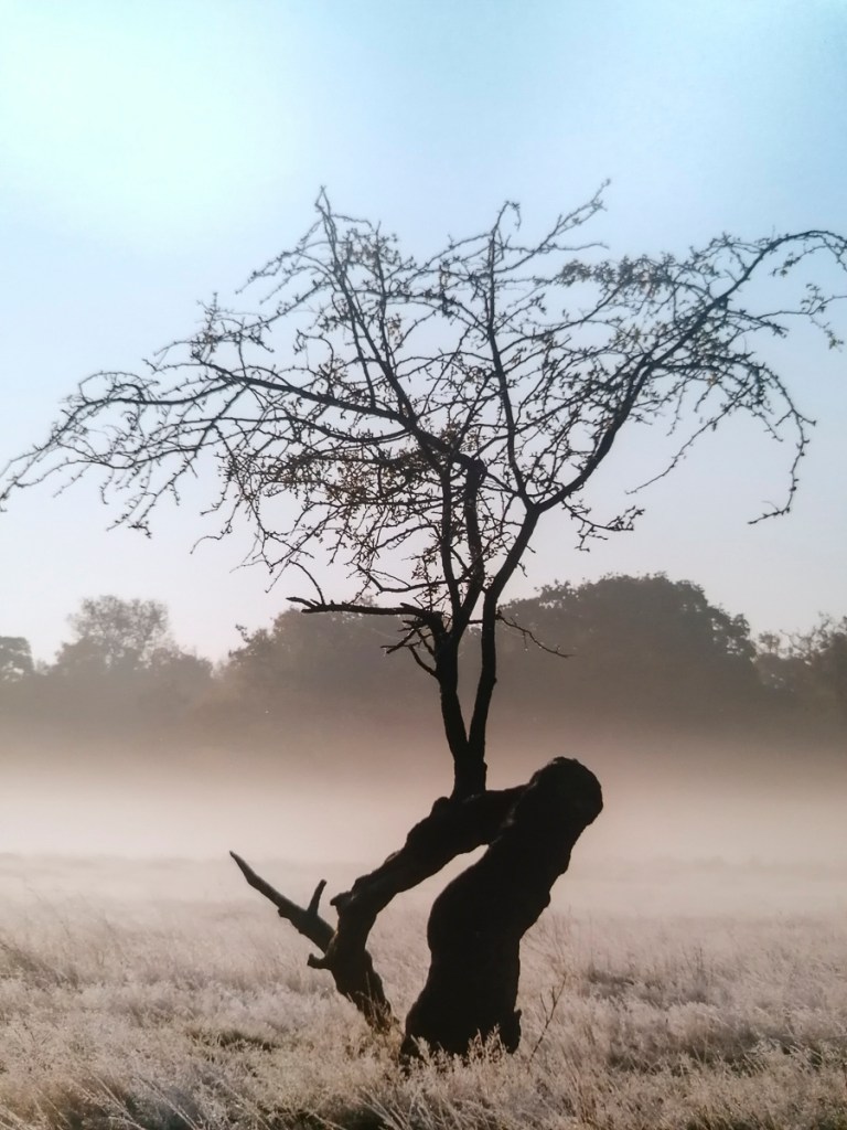
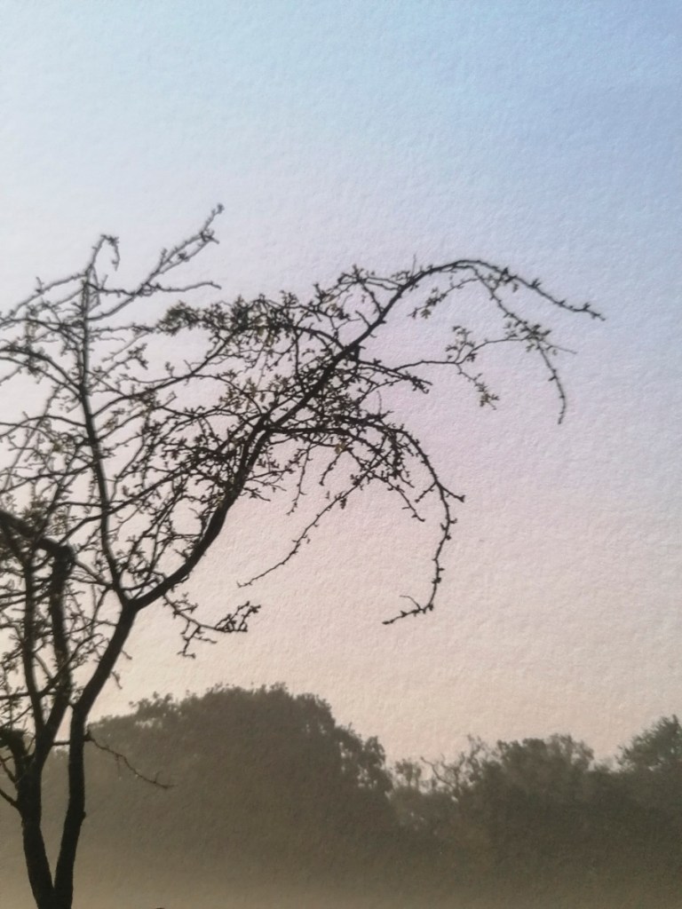
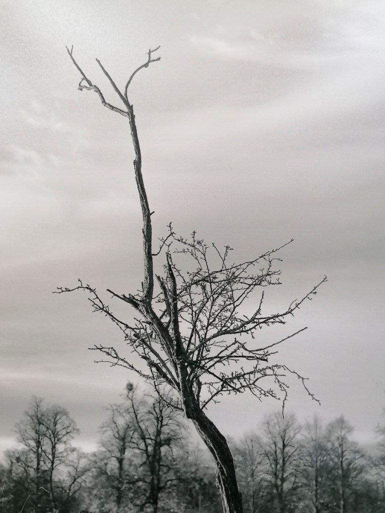
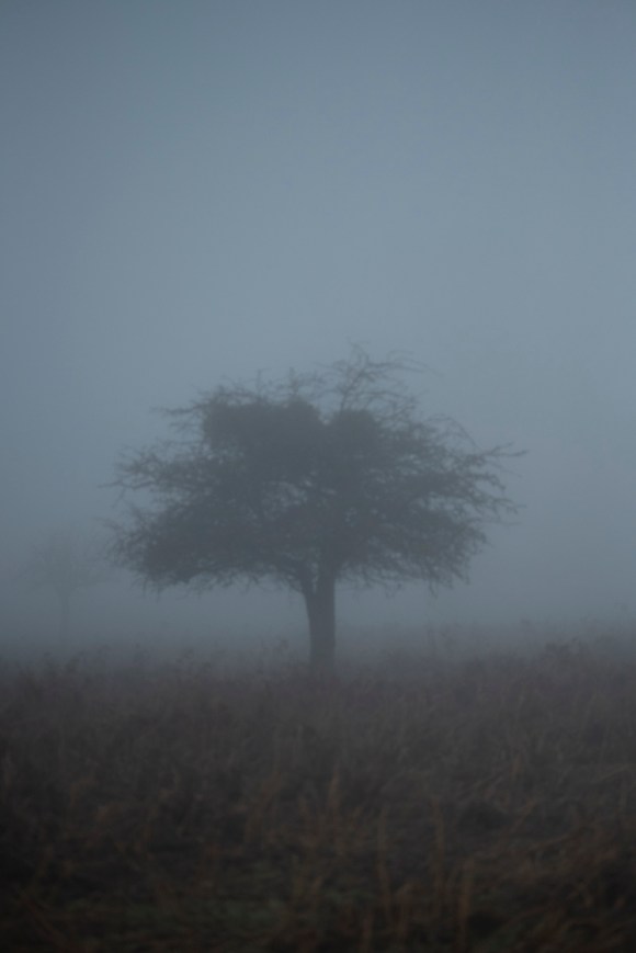
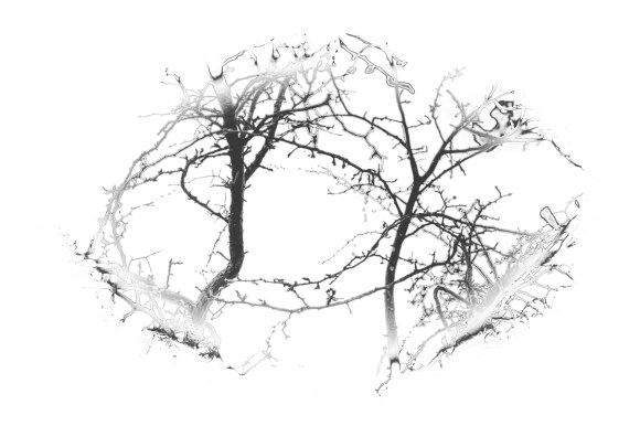
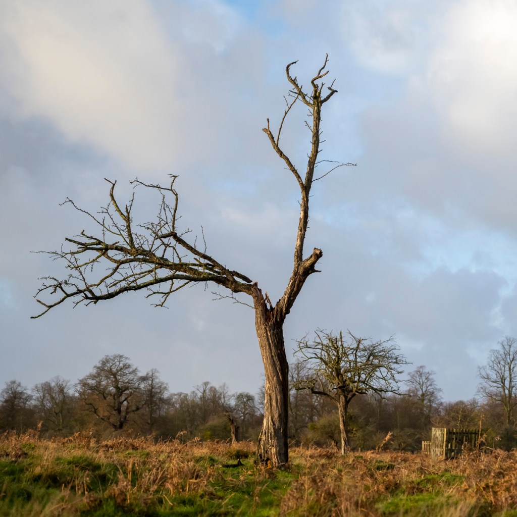
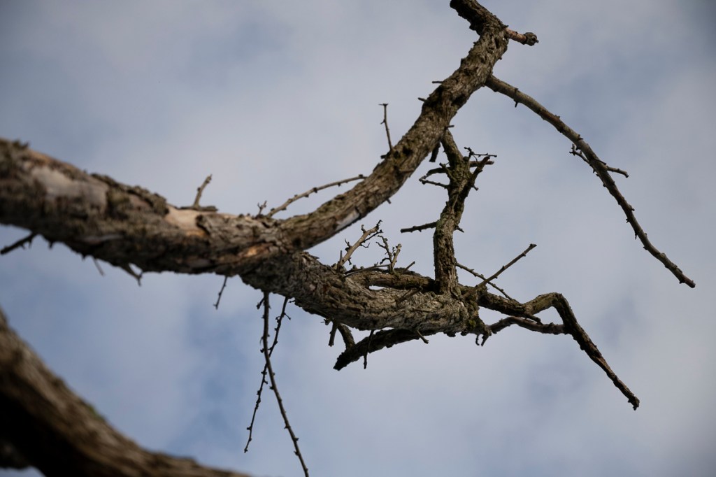
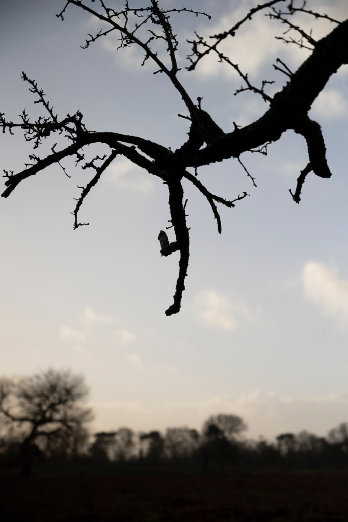
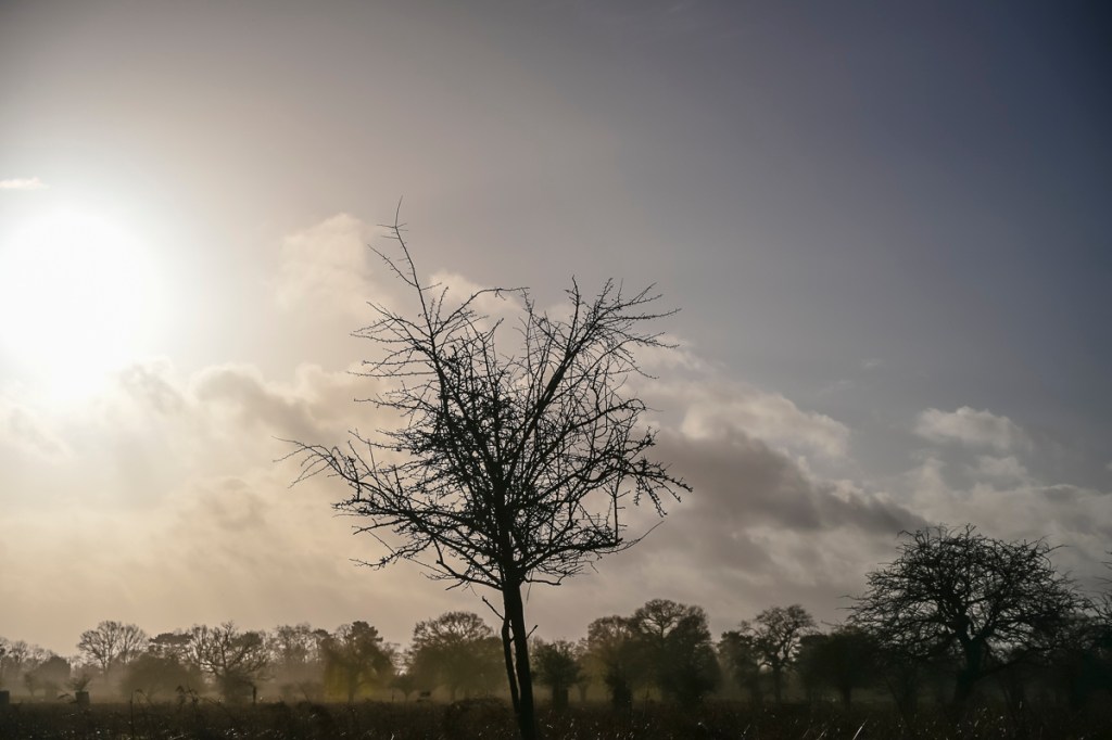
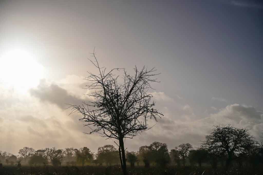
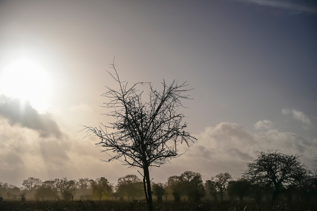
The piece that led me to research Cupido further was this image:
The following is taken from Cupido’s website, which I have noted for future reference.
Synopsis
The photographic work of Paul Cupido (b. 1972, Terschelling, the Netherlands) revolves around the principle of mu: a philosophical concept that could be translated as ‘does not have’, but is equally open to countless interpretations. Mu can be considered a void, albeit one that holds potential.
Cupido’s ongoing photographic and cinematic experiment ‘Searching for Mu’ is at once a personal and universal odyssey of our fleeting existence in relation to the profound emotional experiences of love, time, and death. Instead of presuming to be documents, his photographs point to transcendent reflections of the soul and of the intermingling of the microscopic and macroscopic.
Artist Statement
I aim to engage with the world with wide-open senses. My work is about the magic moments of life as well as its inconveniences. I want to take pictures, while forgetting about the process of photography, until I’m saturated with an existential sense of life. Every step I take begins with the notion of ‘mono no aware’: the transience of everything, the gentle melancholy of things, being sensitive to ephemera.
(Paul Cupido, 2021)
According to Cupido’s gallery’s website, the concept behind Mu, makyu, is explained:
‘In a quote by the famous Chinese philosopher Zhuangzi, who lived 2,300 years ago: “An empty room will be filled with light because of its emptiness.” Mukayu also refers to ‘non-existence’, ‘not having a purpose’, or ‘things as they are’.’
‘Mukayu is part of the larger framework of Mu, a philosophical concept that could be translated as ‘does not have’, but is equally open to countless interpretations. Mu can be considered a void, but one that is full of potential.’
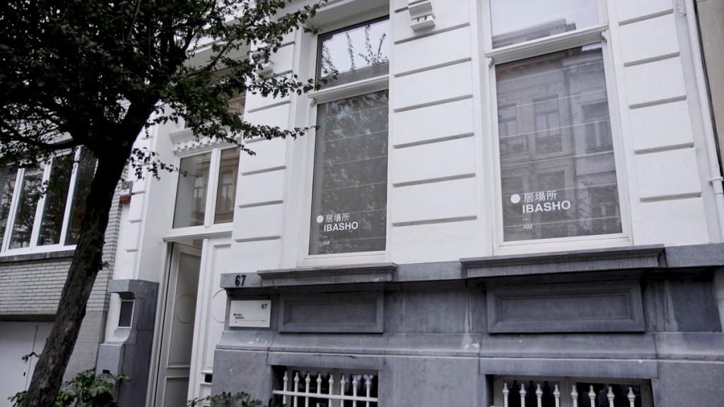
‘These concepts have been the spiritual guideline of the Dutch photographer Paul Cupido during his most recent travels to Japan, resulting in his latest series to be exhibited at IBASHO from 29 october 2020 to the 17th of January 2021.’
‘IBASHO means ‘a place where you can be yourself’ in Japanese. IBASHO is a gallery in Antwerp that opened her doors in March 2015, showing fine art Japanese photography ranging from works by well-known Japanese photographers to younger contemporary Japanese artists as well as works from Western photographers who were inspired by Japan. IBASHO hopes to show the versatility and beauty of Japanese photography in its many guises, from the raw and unpolished to the minimalist and still. As photo books are an important medium for presenting photography in Japan, IBASHO also deals in new and antiquarian Japanese photo books. Recently IBASHO has started publishing its own photo books together with Paris-based publisher the(M) éditions.’
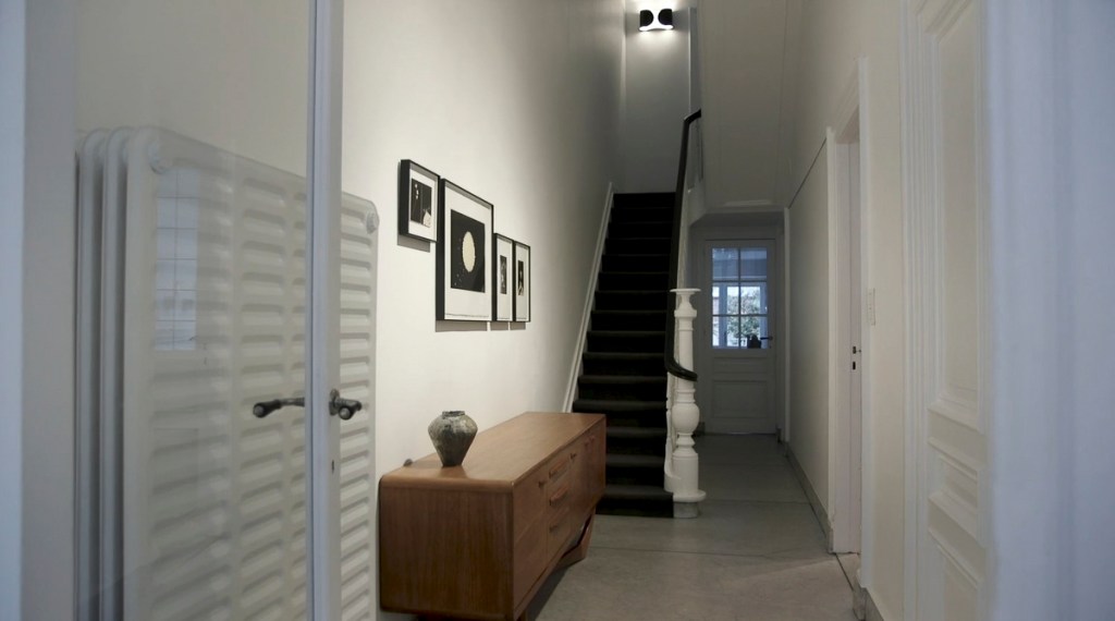
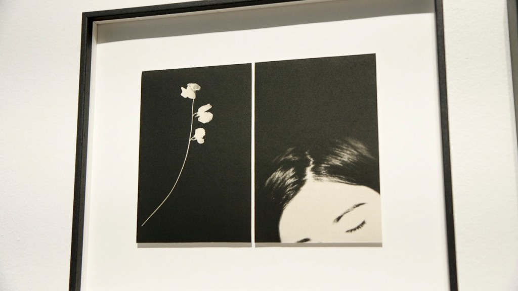
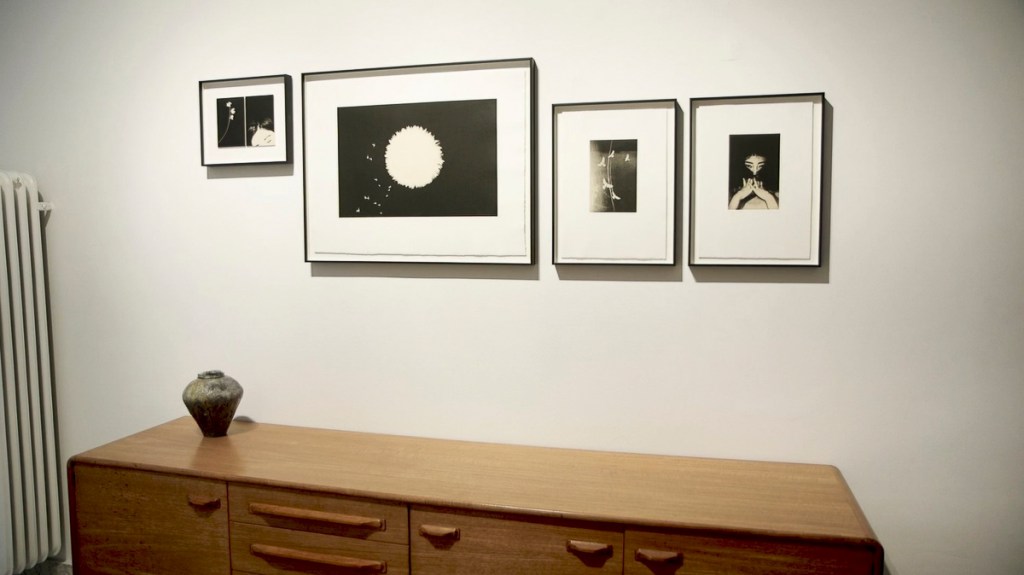
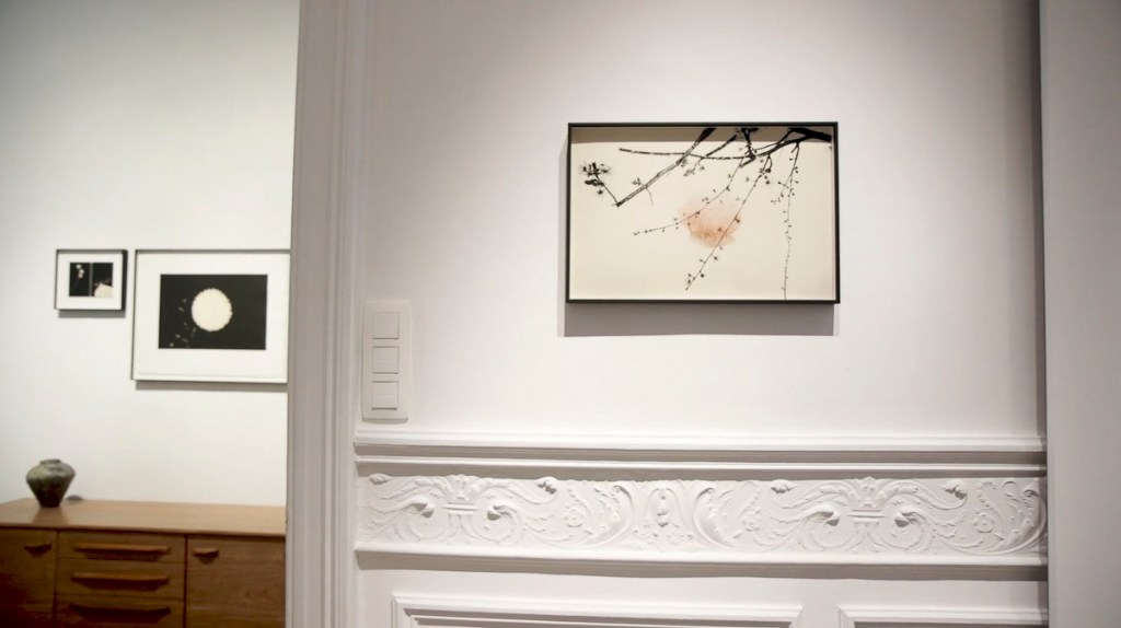
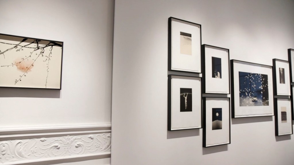
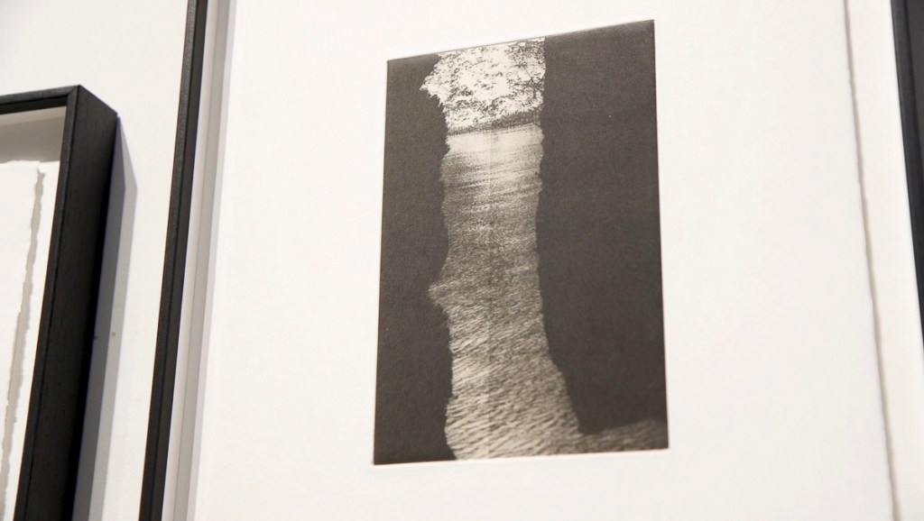
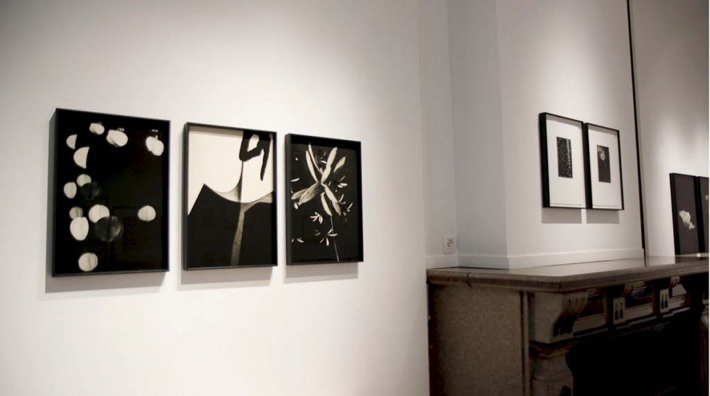
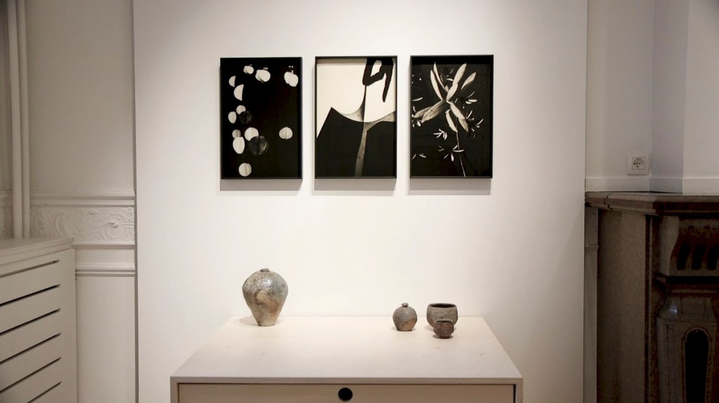
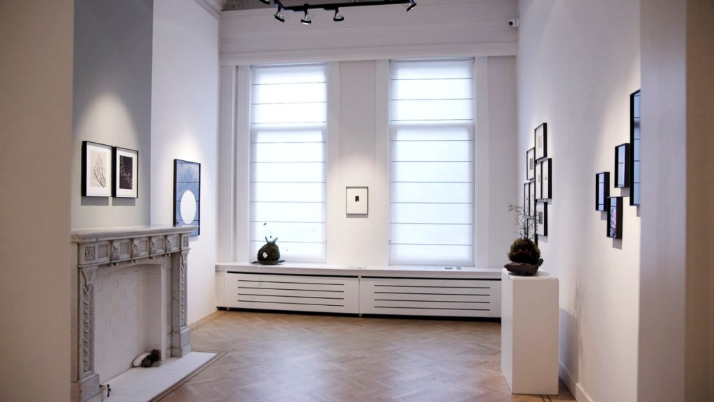
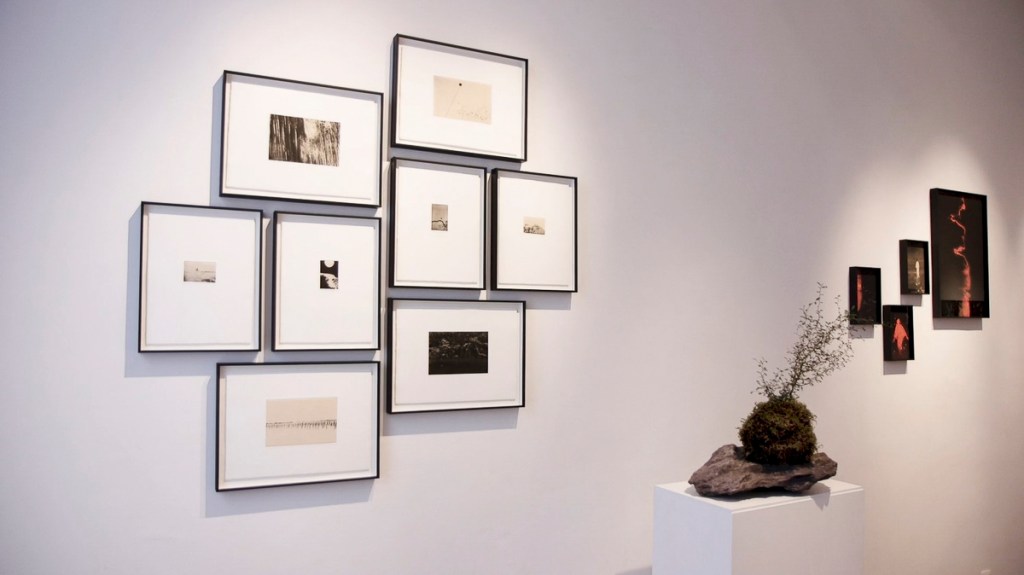
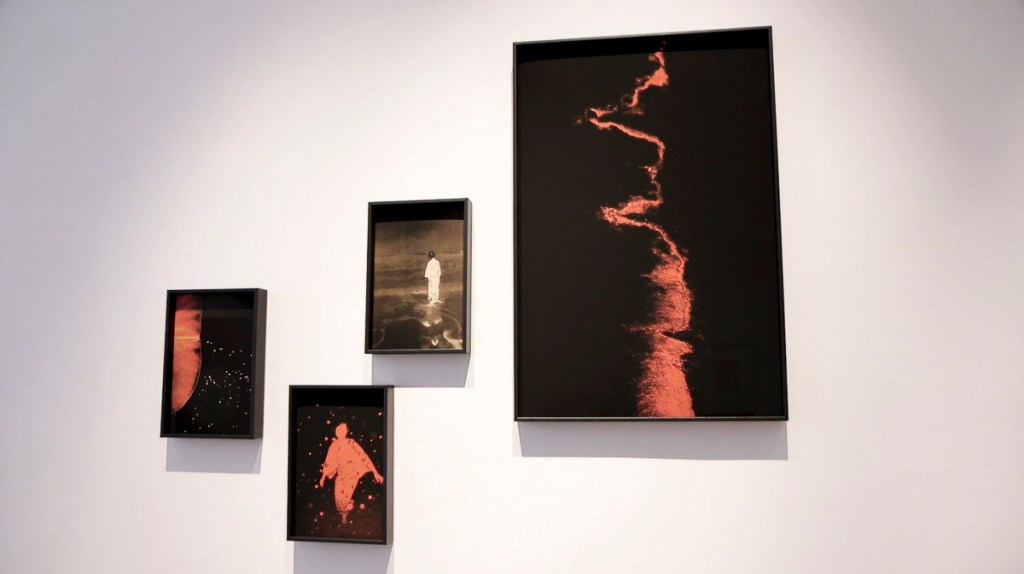
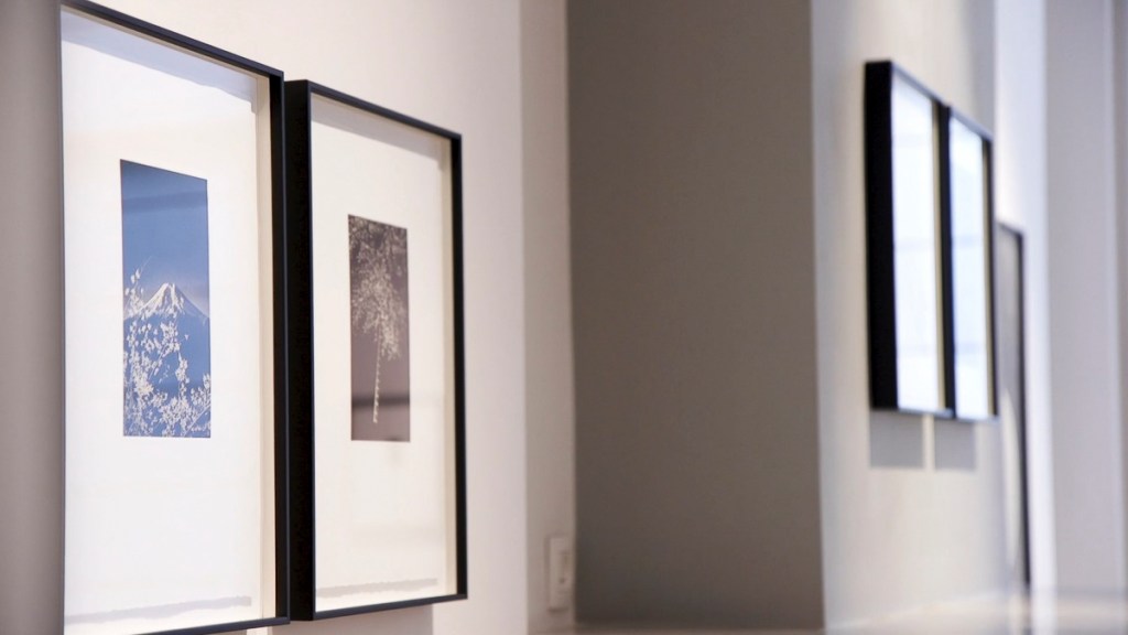
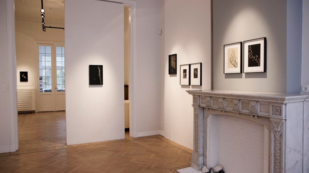
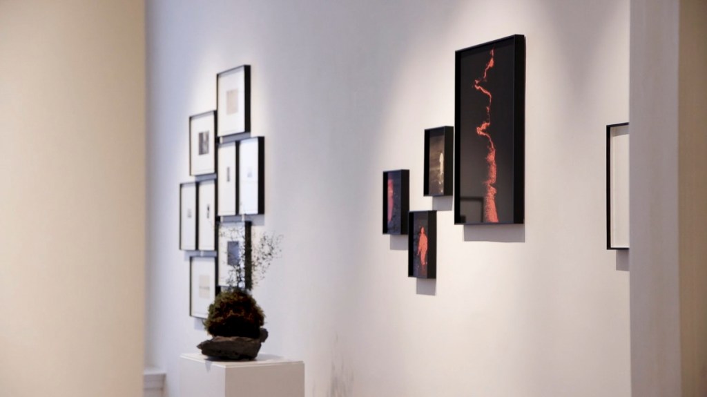
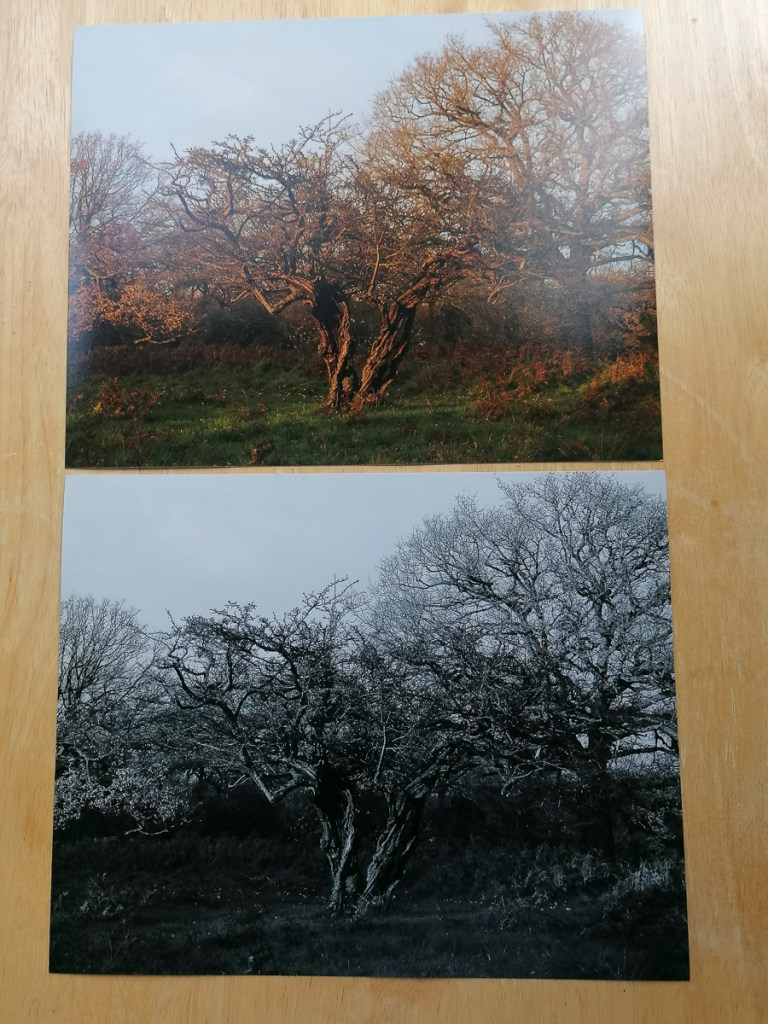
Unfortunately, I wasn’t able to visit this exhibition due to the travel restrictions at the time. I very much appreciated the video that was made of the exhibition and uploaded to the gallery’s website. The following are stills of the installations and pieces on display.
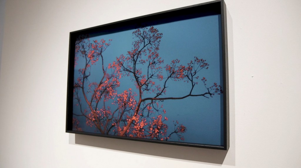
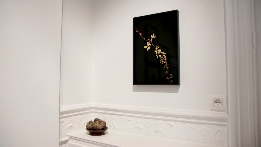
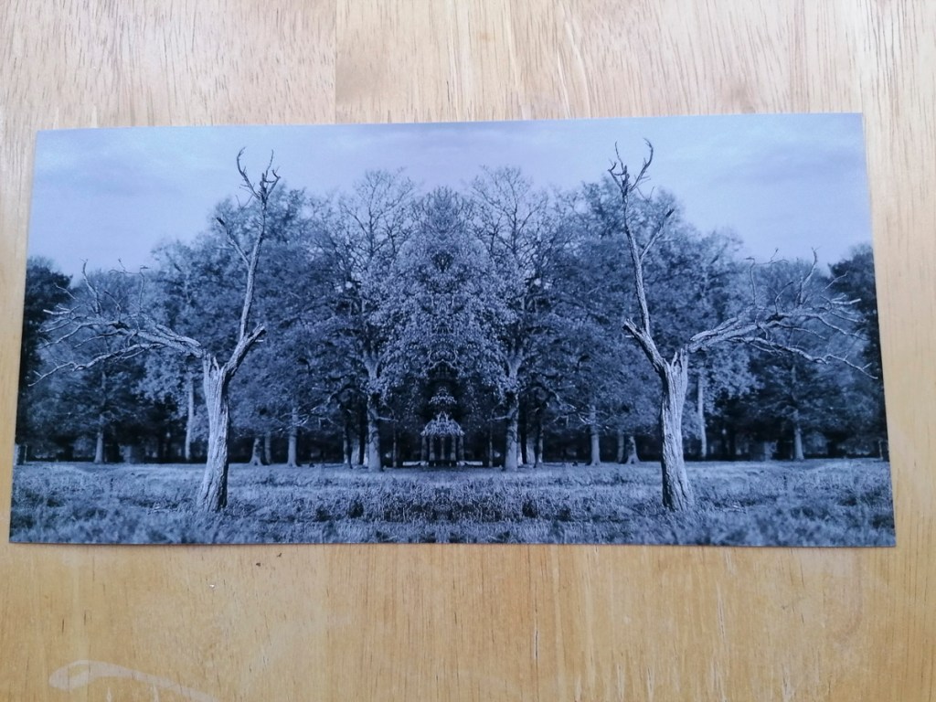
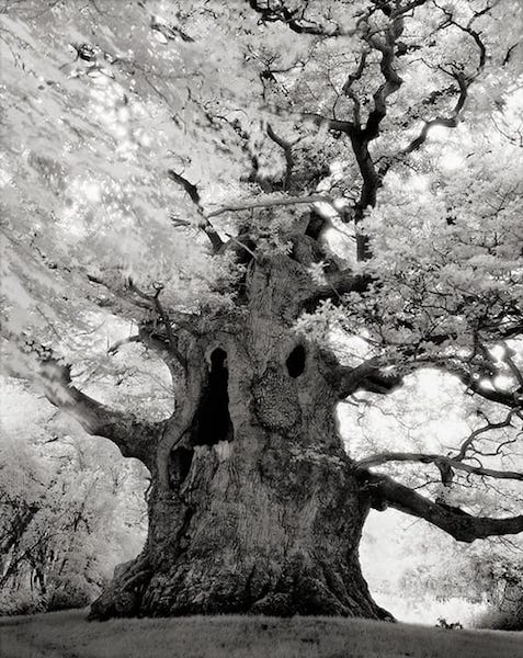
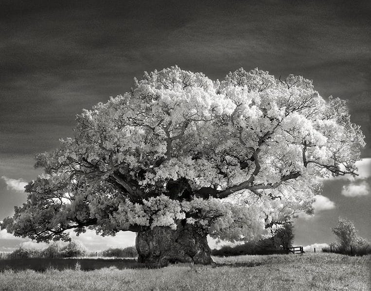
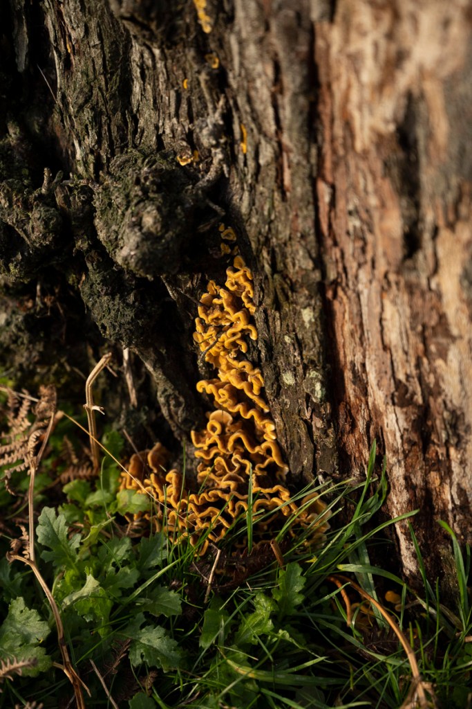
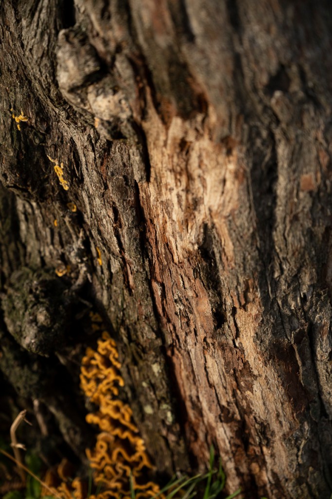
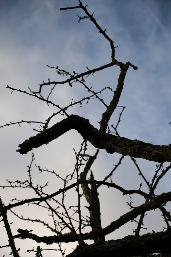
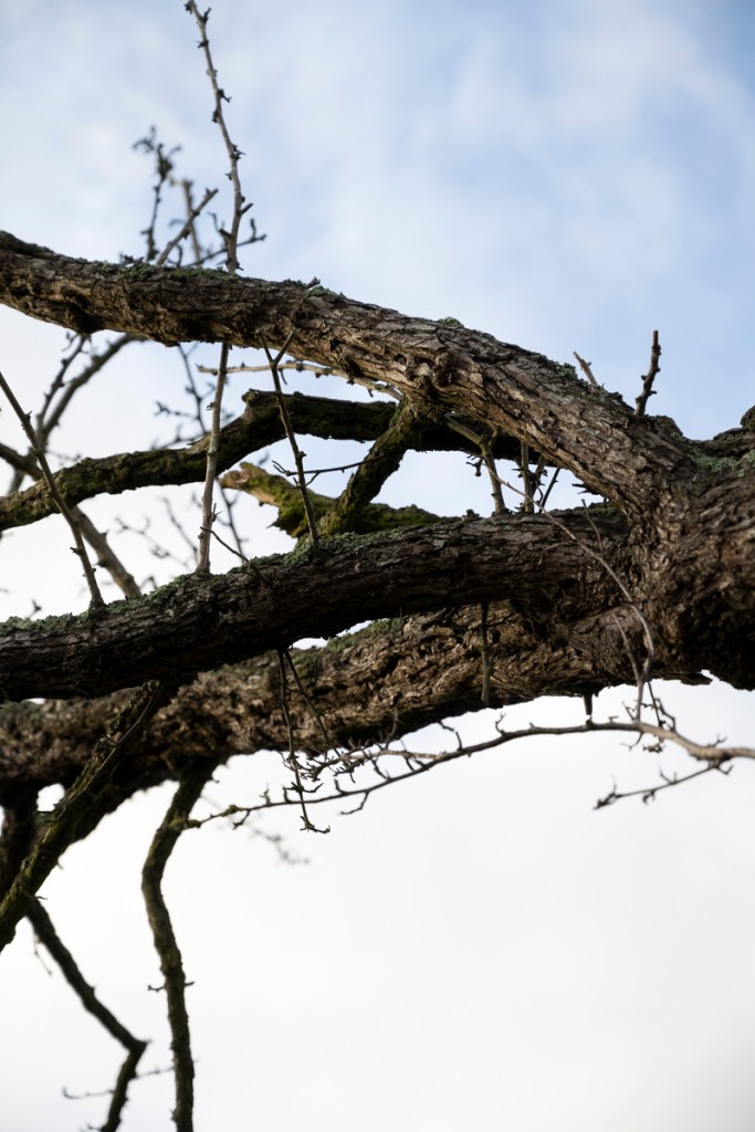
Cupido’s work had a strong bearing on my Invisible Trees images. The way in which they were printed and framed contributed in my choice of framing, mounting and the paper (Hahnemühle German Etching 310 fine art paper).
The concept of having blank space (gaps) is becoming a potential theme in my work. What isn’t there is just as important as what is shown.
The other significance of this exhibition highlighted how important producing work is. Seeing and experiencing printed and framed pieces in a gallery environment is so superior to just seeing it on a back-lit screen.
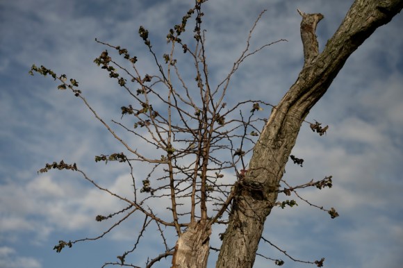
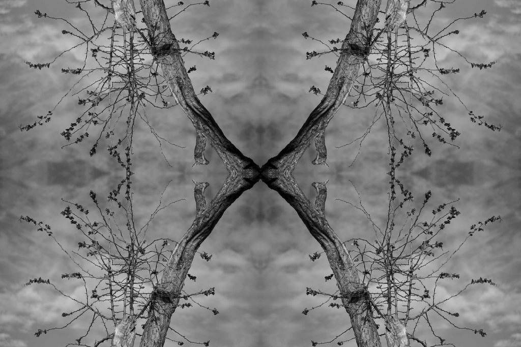
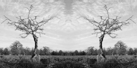
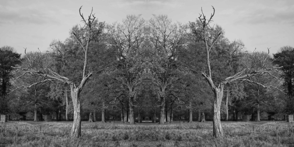
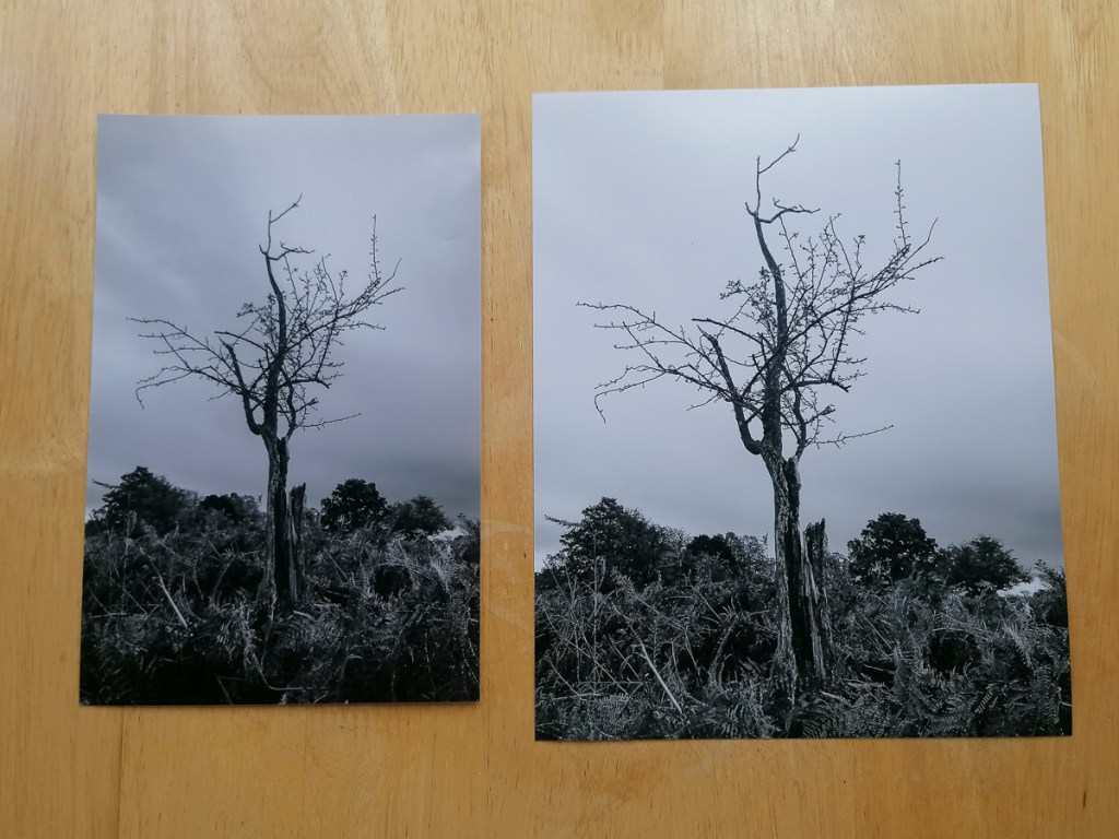
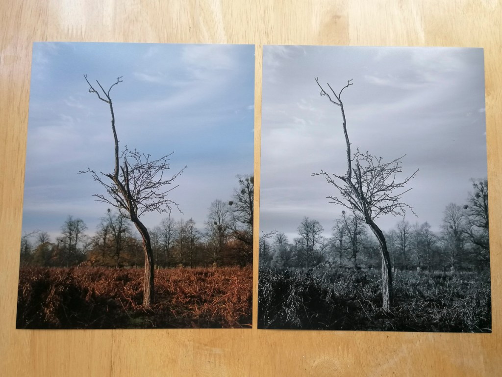
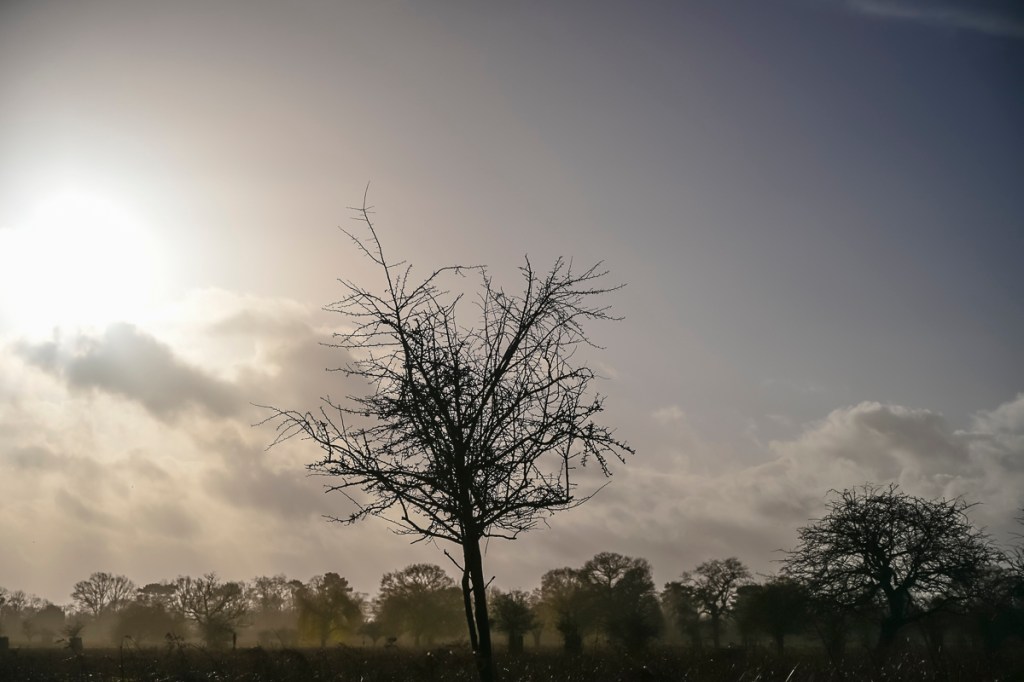
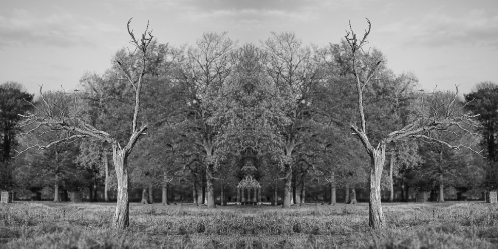
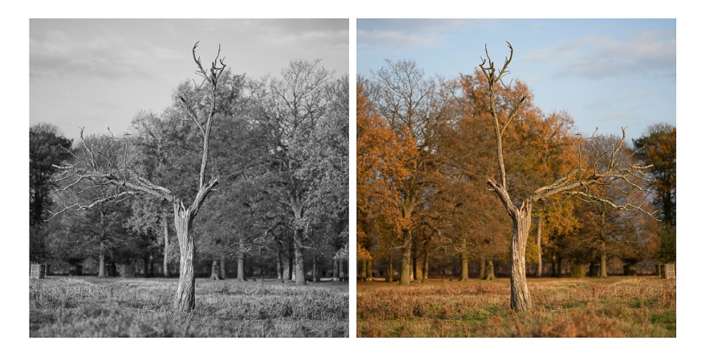
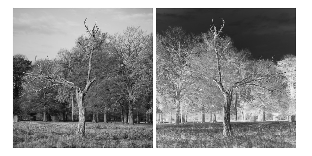
Before embarking on the Winter break, I tried something different with an image taken on 15 November. I wanted to experiment with a technique I used with the ‘twosome’ images and have tried with other previous projects.
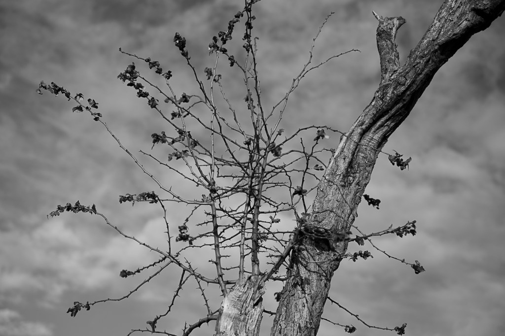
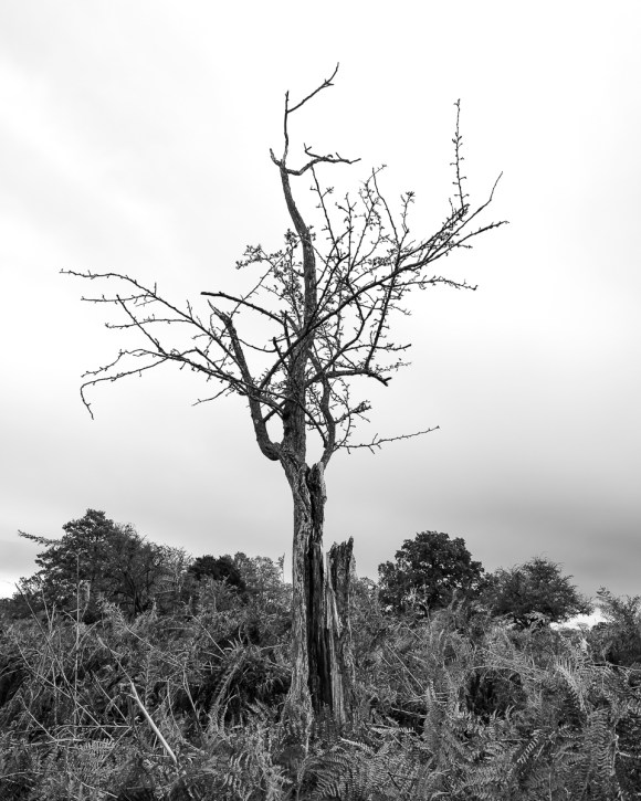
Intially, I made a Black & White conversion.
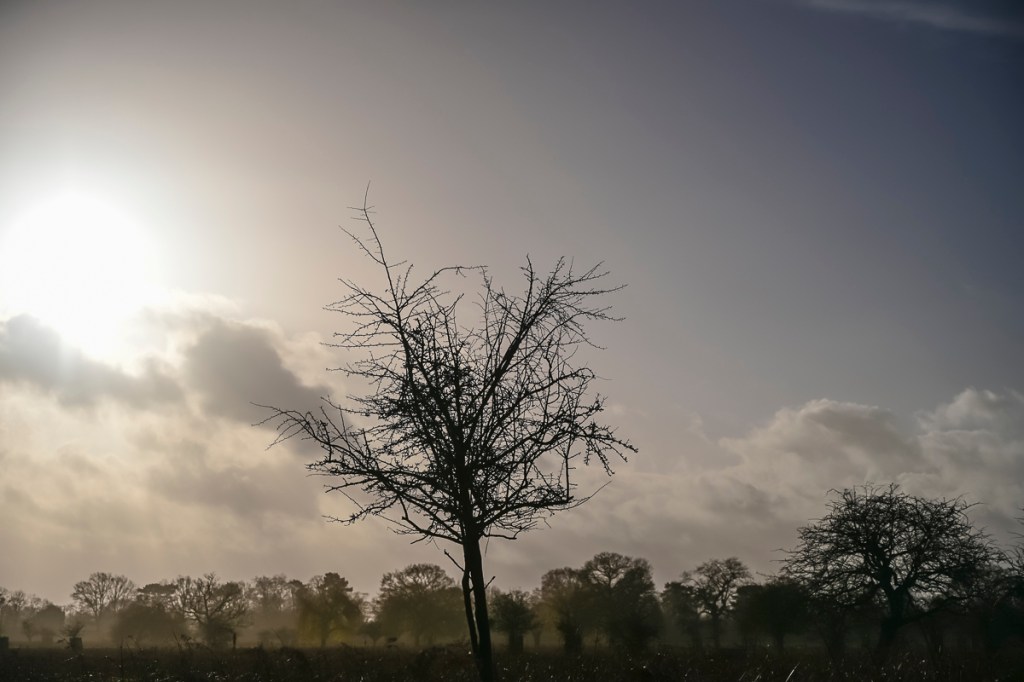
I then created the following image using Adobe Photoshop.
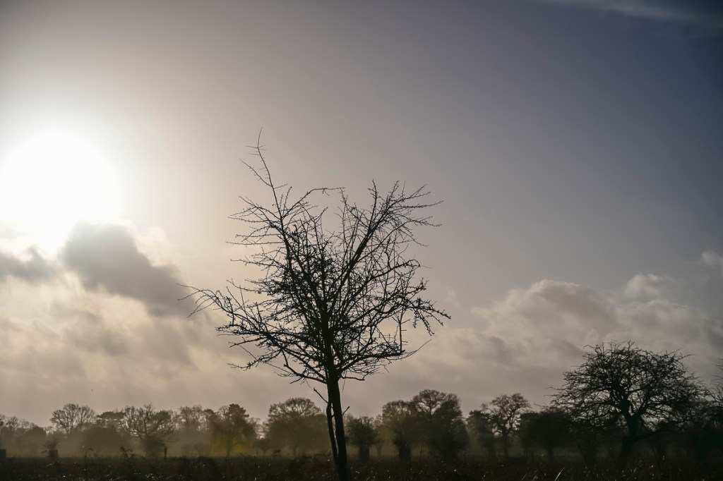
Finally, I produced the following configuration, again in Adobe Photoshop.
Not sure if this works exactly, but is something I could revisit in Stage 2.
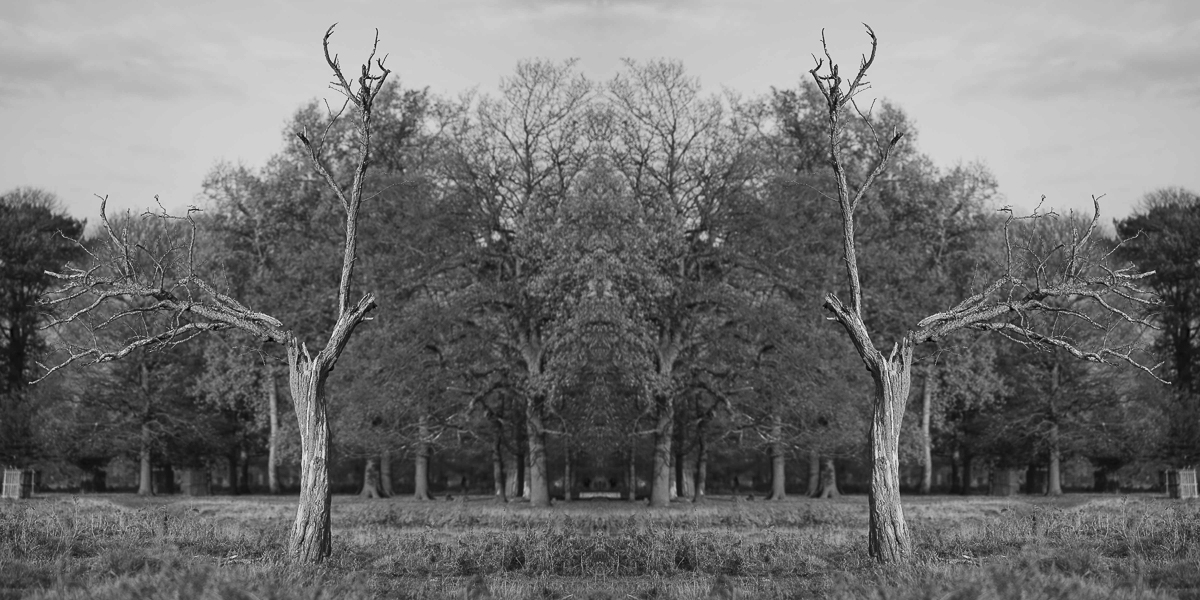
During the 1:1 Tutorial on 16 December, Åsa thought this image had further potential.
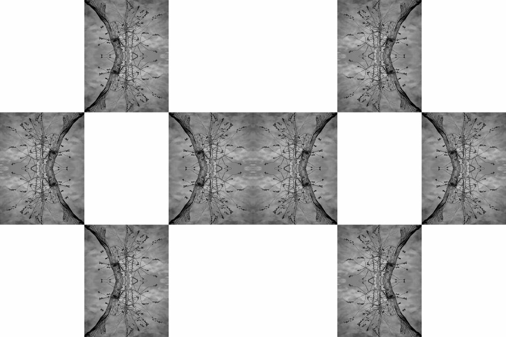
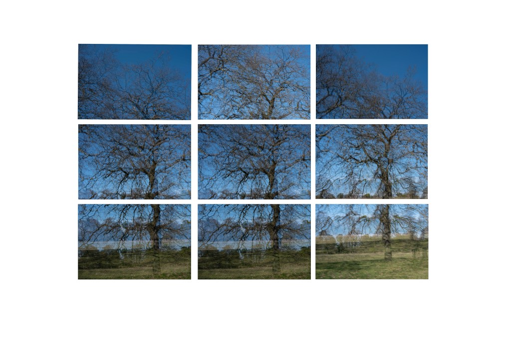
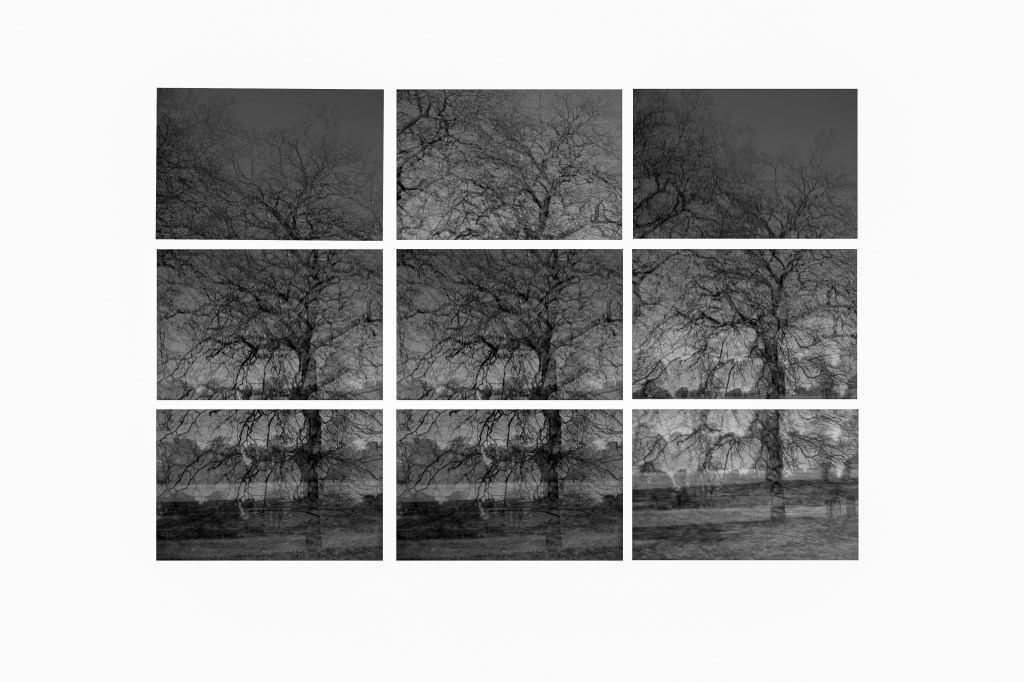
As such, I revisited all of the images taken so far to see if I could repeat the process. Also, to see what works and what doesn’t. These are the results and what I am considering to be the final Body of Work at this stage.
Each image has been edited on Adobe Camera Raw then completed on Adobe Photoshop. I’ve also re-edited the initial image as I think this composition works better.
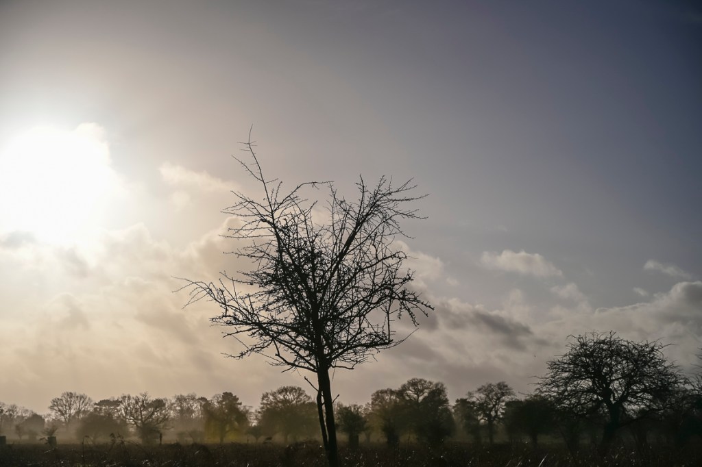
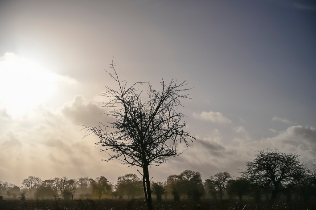
The following is the editing process for each image. I will be amending this post when I have collated the images.
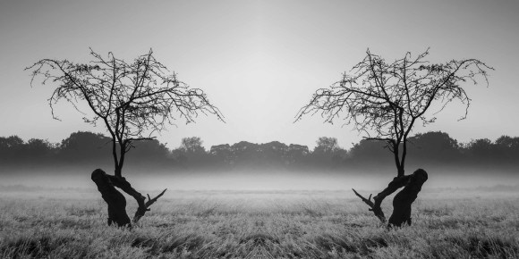
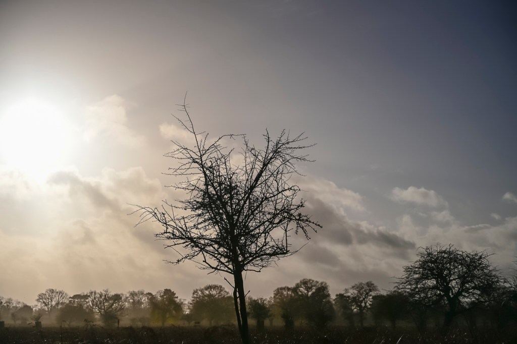
Invisible Trees 1
Original Image
Colour Edit
Black & White Edit
Crop
Intial Image
Paired Image
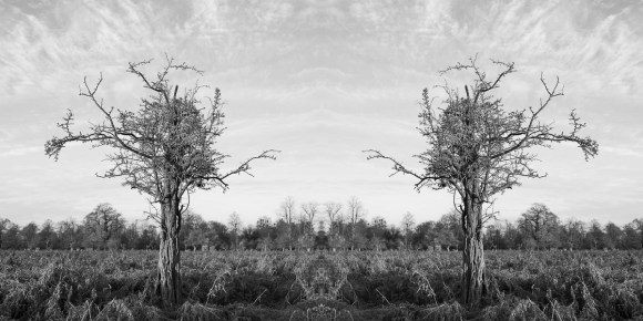
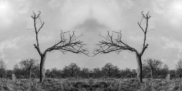
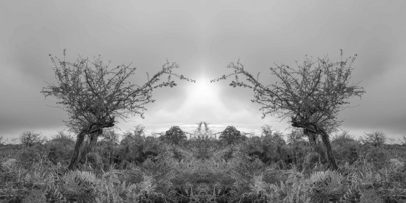
Invisible Trees 2
Invisible Trees 3
Invisible Trees 4
Invisible Trees 5
Invisible Trees 6
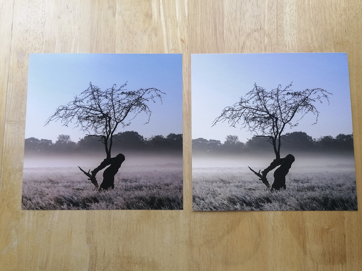
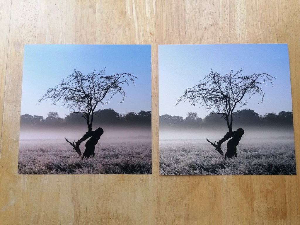
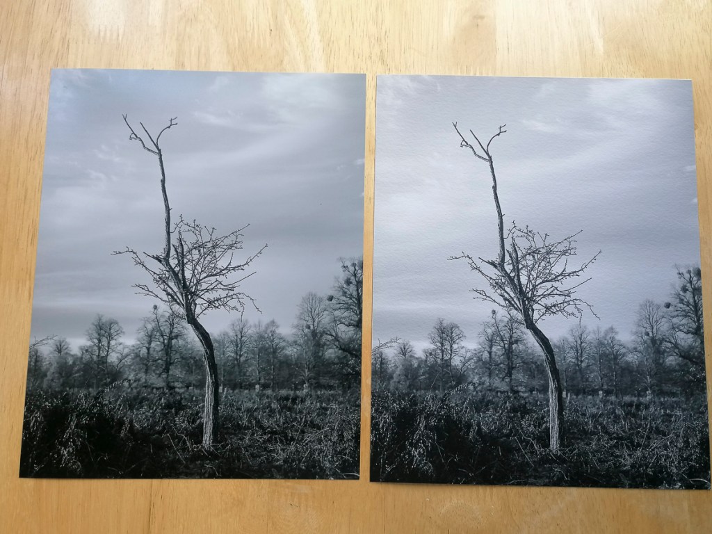
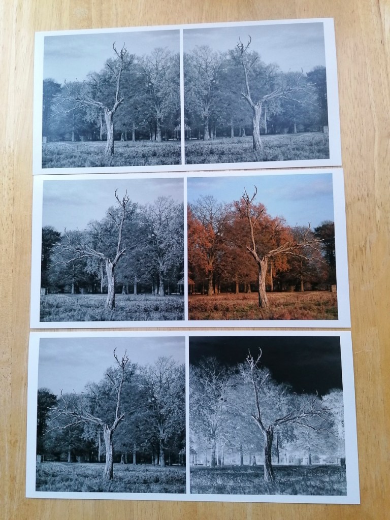
The initial file size is 16″ x 8″. I would also print these on Hahnemuhle German Etching 310gm fine art paper. At this point of the project, I had received my prints from DS Colour Labs. The difference this paper makes to an image compared with the Pearl C-prints is quite marked.
Unfortunately, the prints ordered via DS Colour Labs on 10 December 2020 arrived after my 1-1 tutorial with Åsa. This meant I was unable to show them and discuss these during this tutorial on the 16 December 2020. Despite this, it did give me a much better idea as to how the printing process affected the images.
In general, both the Black & White and colour Pearl C-Prints were ok, but I don’t think they did justice to the images themselves. The sheen on the prints ‘flattened’ the details compared to how they appeared on screen.
8″ x 8″ Prints
These are two of the original images next to the Pearl C-Prints.
The difference the substrate makes is marked when comparing the Pearl C-Print with Hahnemuhle Photo Rag 308.
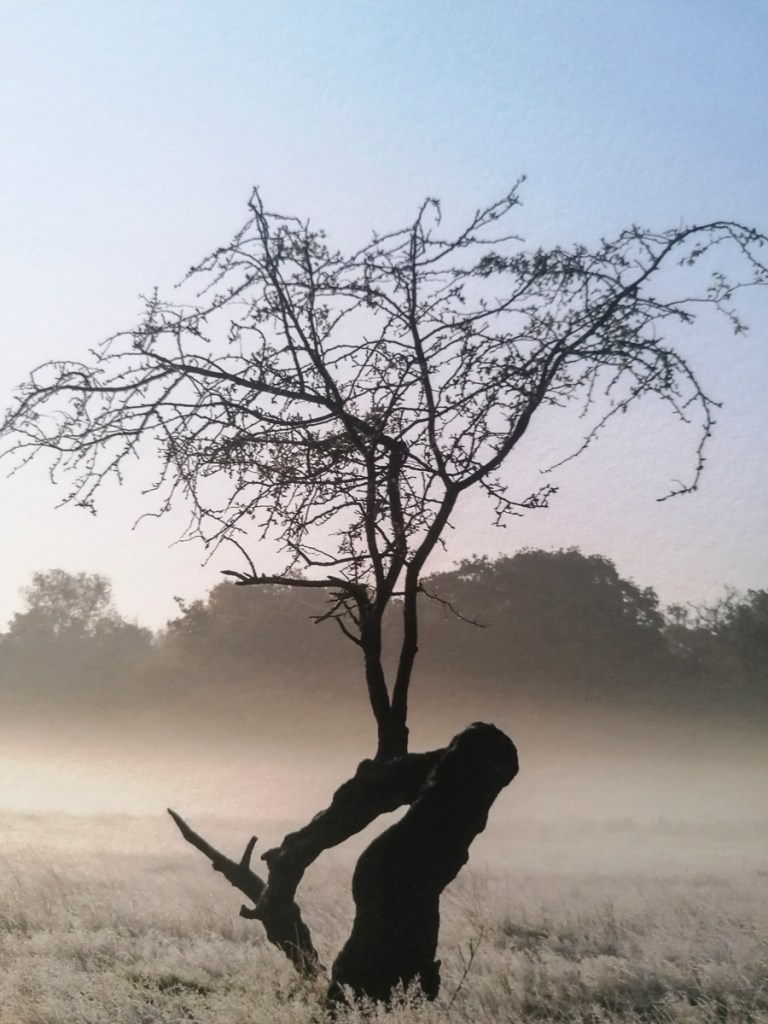
Original JPG
Pearl C-Print on Left, Hahnemuhle Photo Rag 308 on Right
The following images are close-up comparisons. For, me the fine art print paper gives the image a texture that creates an artistic effect rather than provide a ‘documentation’ of a tree and its environment.
Pearl C-Print
Hahnemuhle Photo Rag 308
Pearl C-Print
Hahnemuhle Photo Rag 308
10″ x 8″ Prints
JPG
JPG
Pearl C-Prints
JPG
JPG
JPG
JPG
Pearl C-Prints
JPG
JPG
JPG
JPG
Pearl C-Print
Pearl C-Print
JPG
JPG Revised
JPG Comparison
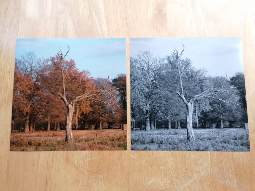
As with the Hahnemuhle Photo Rag 308, the following shows the differences between the Pearl C-Print and fine art paper – Hahnemuhle German Etching 310.
Pearl C-Print Colour and B&W
Pearl C-Print & Hahnemuhle German Etching 310
Pearl C-Print
Hahnemuhle German Etching 310
Pearl C-Print
Hahnemuhle German Etching 310
10″ x 5″ Prints
Again, the Pearl C-Print was disappointing. I do prefer the adjoined image rather than having the split in the middle. However, I do still like the pairing of the negative and positive images.
Going forwards, I would need to work out the best way of printing and presenting the final Body of Work. This would involve researching which fine art printing and/or framing bureau would be able to produce exactly what I would want.
In light of the Group Tutorial held on 25 November, I knew I had to restructure and refocus my current approach.
To paraphrase our tutor, Åsa:
The essence of this module is for me to absorb myself in the intent of practice-based research. To make progress in the module, and as a photographer in general, it is key for me to value and appreciate the practice of ‘making’.
Directions
Return & Return
EXPLORE*
*Appropriately, of course
At this stage of the project, I will:
Take a more explorative approach to my way of working
Continue making
Reflect on what works – and what doesn’t
Focus on formulating then using a particular technique and work flow
Strengthen the concept
Extend and develop my use of equipment, specifically:
Tripod
Speedlight Flash
Filters
Experimenting with Depth of Field (making the tree stand out from its environment)
Questions to Ask
During this project, I will also ask myself:
What is my photographic practice?
What will I show?
How will I show?
How will I talk about it?
What are the parameters of my inquiry?
How do I want to develop particular photographic techniques?
My Actions
The action I took first was to take a ‘step back’ in light of the directions and questions above. It was up to me to make the inquiry of what I am actually doing, process my answers then take action.
Thoughts
When I looked at the images I’d created so far, I was very happy with the progress I had made technically. I was now taking a different approach to tree photography compared to the one I used in the AGM60 Research & Experimentation module. What was missing at this stage in the images was the element that made them distinctly ‘Jennie Meadows’. I also felt that I wasn’t being ‘creative’. Editing and experimenting with images digitally is integral to my work. Why not now?
Inquiry Into Process
My first reaction to this advice was to think about my own inquiry. At the heart of this project lies the question:
How does my use of digital photography relate to my making images of hawthorn trees?
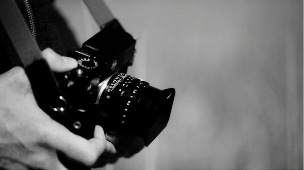
This was sparked by my thoughts about the reciprocal relationship between photographer, equipment and subject. Coming from a purely digital background, I am well-versed in using this technology to produce images. I know how to take, process and print ‘photographs’, having learnt and used these procedures over the last six years. With four out of the six in my class using analogue photography, I was beginning to see first hand the major differences in how the technology affects all aspects of the making process.
This inquiry was also sparked by looking at other photographer’s work based on trees. For example, within the book Into The Woods, the majority of the images have been produced using analogue and are gelatin silver prints. I had been making my images then converting them into Black & White. Why? I had got caught into a mind rut, where this seemed to be the thing to do. What I hadn’t realised is that this is just an option for this project and can be achieved using digital technology. However, when the camera I’m using has been made to capture colour and detail in spectacular fashion, I should be making the most of it.
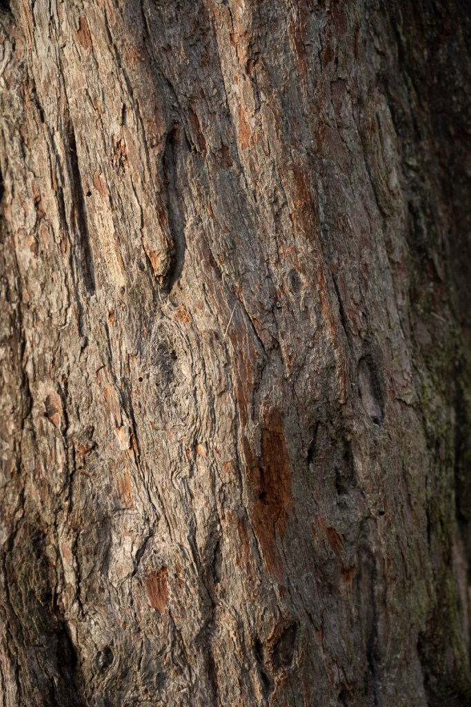
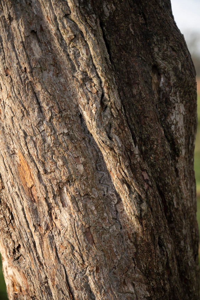
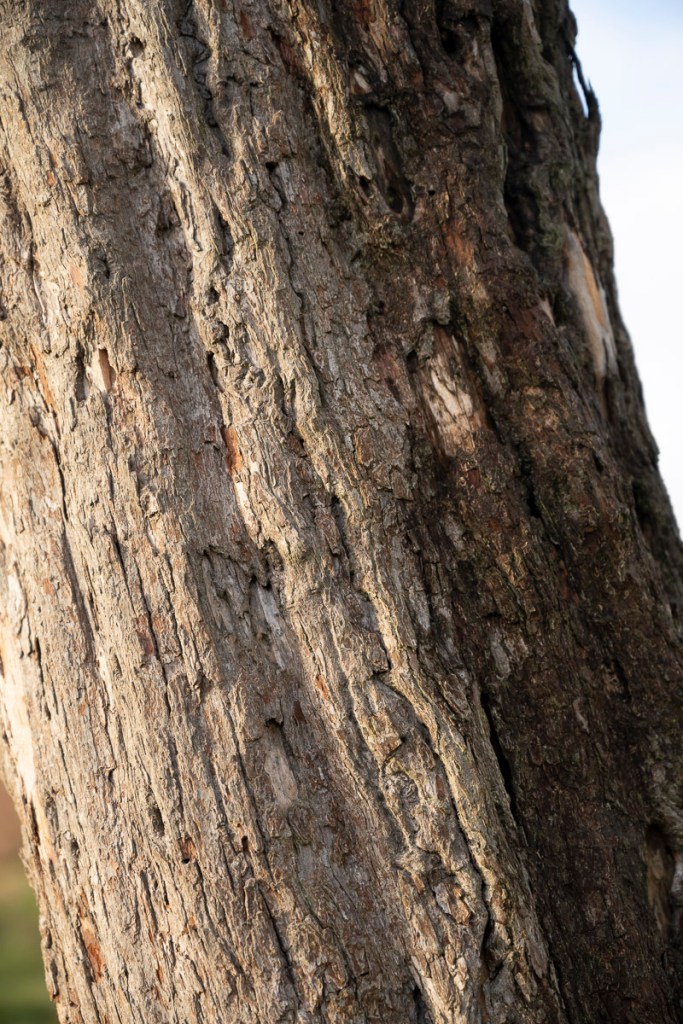
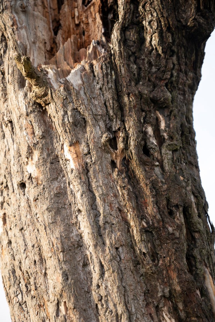
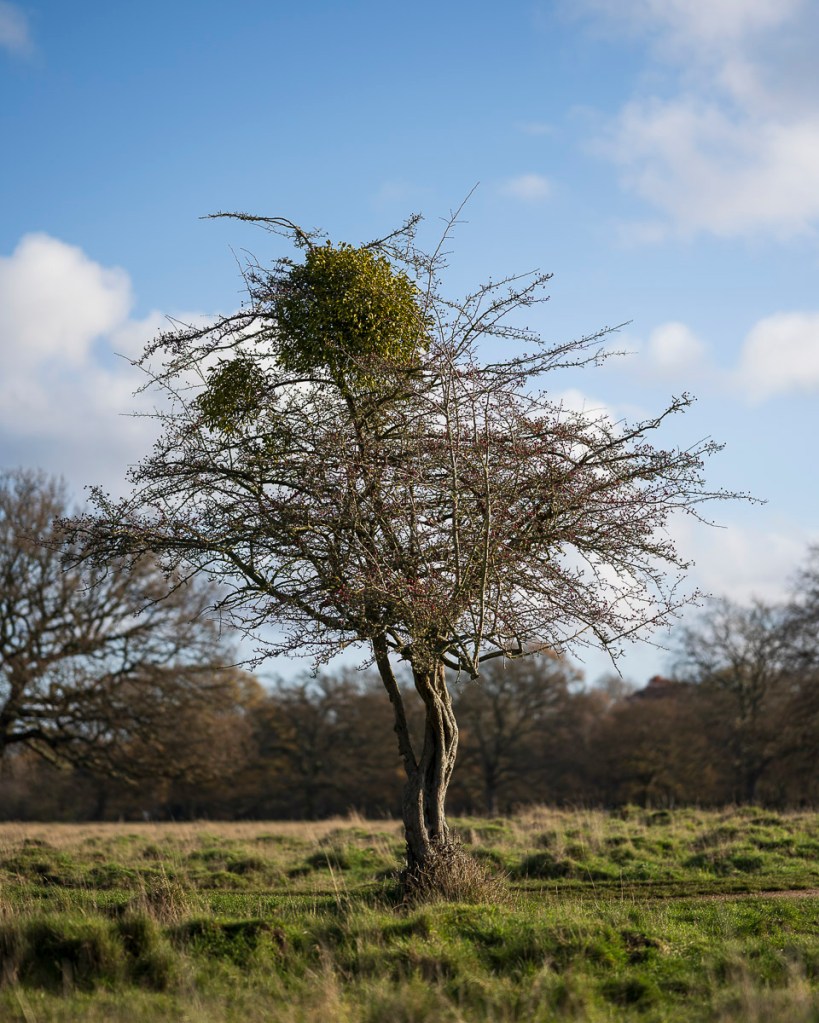
Subject Matter – Why Hawthorn Trees?
Ancient Trees are being recorded on an inventory and they have asked for photographs of these trees. I chose to focus on finding and photographing hawthorn trees that feature characteristics that would define them as ‘ancient’. These include:
Major trunk cavities or progressive hollowing
Decay holes
Physical damage to trunk
Bark loss
Large quantities of dead wood in the canopy
Crevices in the bark, under branches or on the root plate, sheltered from direct rainfall
A pollard form or show indications of past management
Cultural or historic value
Been part of a historic boundary, hedgerow (pre enclosures) or on a woodbank
A prominent position in the landscape
Size
Hawthorn can grow up to 2.5m plus in girth.
Record all hawthorn more than 1.5m.
Consider recording all hawthorn with any ancient characteristics more than 1.25m.
It’s important to rely on characteristics rather than size, which is an unreliable indication of age.
I am not recording these trees as purely documentary, but will be using an artistic approach using digital technology.
With regards to location, hawthorns are (and have been) connected with Bushy Park ecologically, historically and culturally. By focusing on a particular area in which the trees are present gives constructive limits to this project.
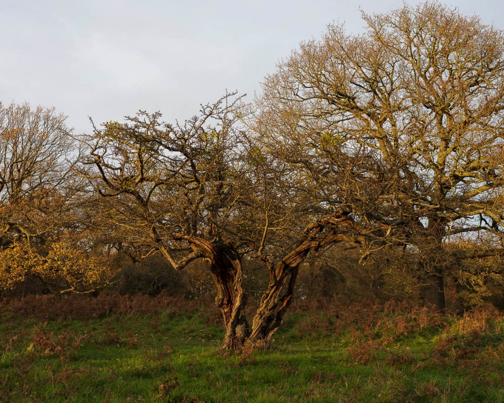
Up to 4 December, the project has been about finding suitable hawthorns to include and making ‘literal’ images. I have then been using various digital photographic equipment, exploring the potential ways in which these trees can be recorded in this way.
What Works?
5:4 aspect ratio (changes focal length from 85mm to 93mm in 35mm)
1:1 aspect ratio (changes focal length from 85mm to 110mm in 35mm)
Horizon along bottom quarter horizontal line
Aiming for this brings the tree line (bottom branches) to the lower third line (check)
Early-morning light
Late afternoon light (depending on angle of shot and tree)
Side lighting
Diffused light (slight cloud cover)
Tree in centre of composition
Tree taken from low angle
Tree in focus
Background out of focus
Enough sky for the tree to ‘breathe’
Soft sky details
Lighter at top of image
What Can Be Improved On?
General composition
Straight horizon in camera (saves on post-production editing)
Capturing trees in the optimum light conditions to show the details being recorded
Foreground focus and details
What Doesn’t Work?
Dark silhouette of tree
Prominent clouds (use of polarising filter)
Vignette effect of clouds (dark at top of image)
Sharp light
Still Unsure About…
Black & White vs Colour
Colour
Shows details
Shows colour of light
Shows difference between ‘dormant’ tree and green mistletoe
Black & White
Mimics traditional analogue images of trees (adds to nostalgic and ‘undated’ appearance
What Needs to Be Explored Further
Composition lines – trees in background
Best lens – 85mm? 35mm?
Best F number (F2.5 for F1.8 lens – 35mm and 85mm)
24mm-70mm is F4 – can it blur the background enough?
Use of tripod
Use of monitor
Use of Speedlight
New Directions?
Long exposure
Smooth out sky?
Shows passing of time?
Or will it just blur things?
Trees and time:
Interval timer shoot or time lapse?
Trees ‘move’ – a photograph doesn’t depict this
Trees are ‘evidence of time’
How do trees experience time?
Long exposure/vs snapshot (AGM61 essay Visions of the Temporal Metropolis: Exploring Photography, Time and the City)
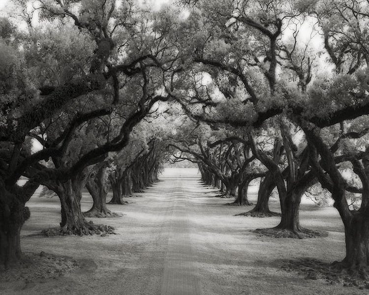
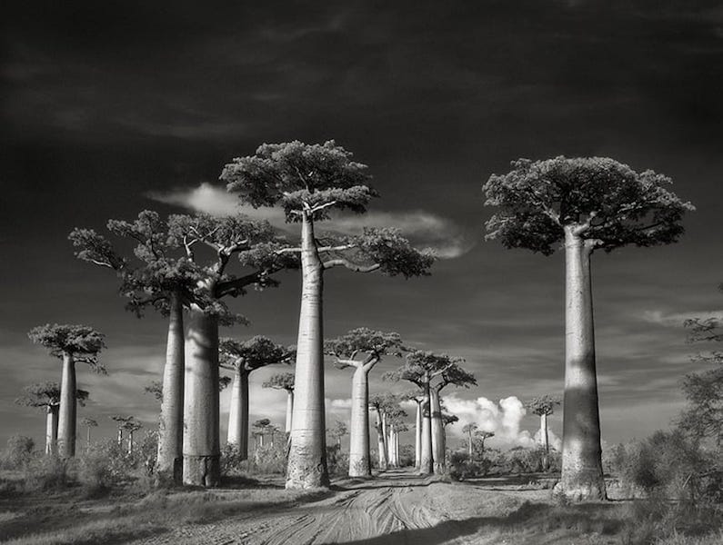
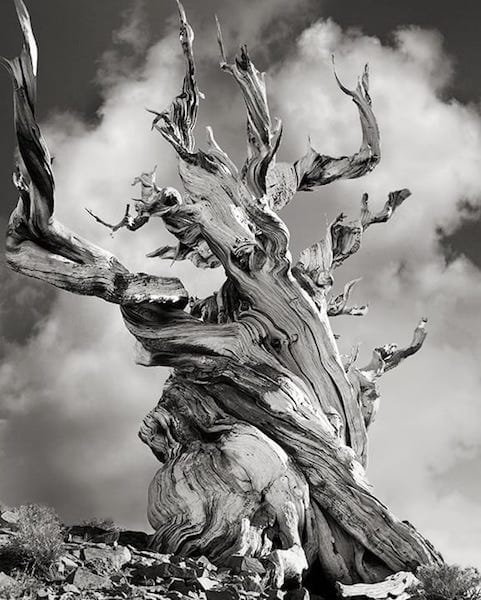
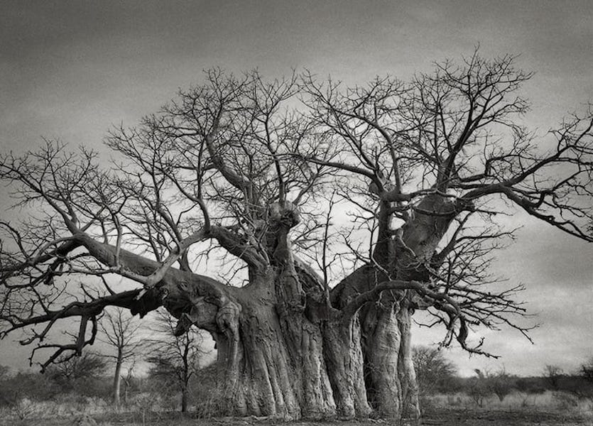
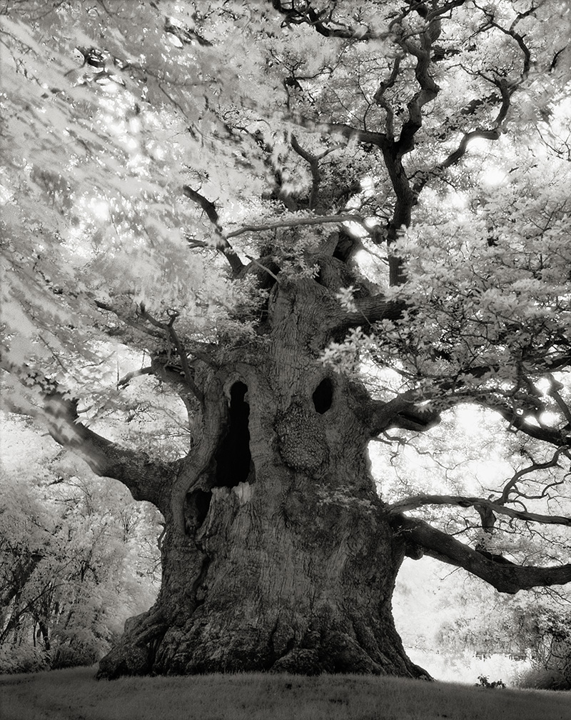
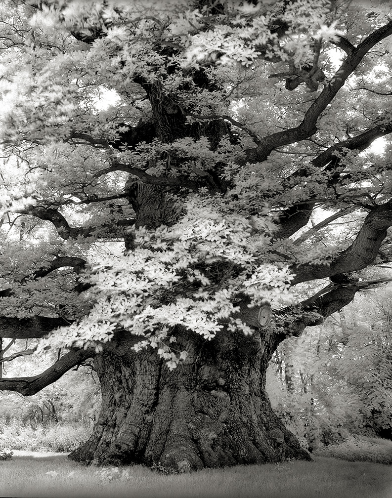
While researching images of ancient trees, I came across the work of Beth Moon who has spent many years photographing ancient trees in the UK, USA, Europe, Asia and Africa. So I could appreciate the photographs further, I acquired a copy of Moon’s book Ancient Trees: Portraits of Time. This book features all of the images in this collection, additional information about the individual trees and their locations, plus essays by Todd Forrest and Steven Brown (will be reading these later in the day).
Portraits of Time
Time is the shape of an old oak as the winds caress and sculpt the bark, defining hardship and beauty. Time is the trunk that splits apart in great age to accommodate the tempest. Evidence of time is revealed in the furrowed bark of an ancient tree, gnarled, crooked, and beautiful.
Portraits of Change.
Portraits of Survival.
Portraits of Time.
I’d like to keep a clear picture, so if a tree is destroyed by storm, disease, greed, or lack of concern, I will have a record of its power and beauty for those who were not able to make the journey. I photograph these trees because I know words alone are not enough, and I want their stories to live on. I photograph these trees because they may not be here tomorrow.
(Moon, B. 2020)
What I did observe is that Moon has paired ‘front’ and ‘back’ views of the same tree together.
I had seen this after I had paired these ‘front’ and ‘back’ images of the same tree on 14 December.
There is also a similarity in composition between Moon’s image on the left and my image from 24 November on the right.
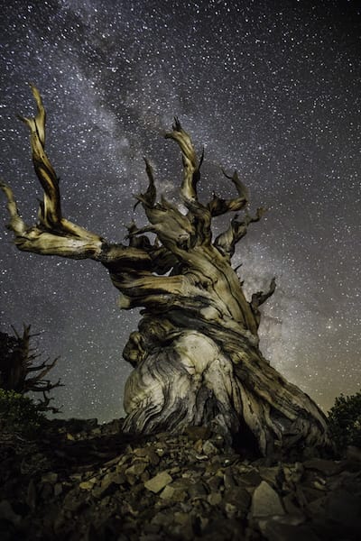
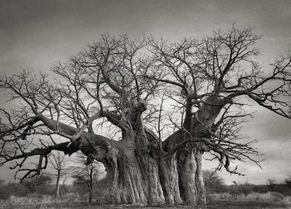
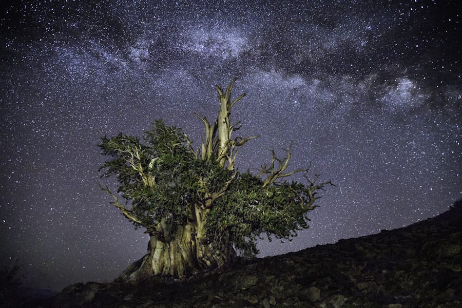
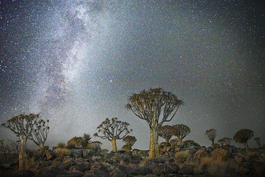
Diamond Nights
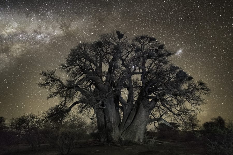
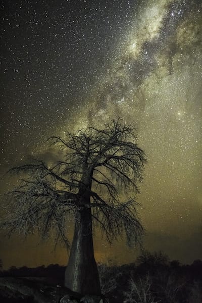
When looking at Moon’s website, I came across this collection of long-exposure images that capture the stars. This also marked Moon’s move from analogue to digital due to the nature of this photography.
“As night falls over the Makgadikgadi Pans, giant trees stand starkly against the horizon. Leafless branches reach for the light. On the opposite side of the sky, Earth’s shadow is rising. True wildness manifests itself in the form of curling black branches in November, silhouetted against an indigo sky.
Time exposures blend the boundaries between the visible and the invisible. There is a middle zone where splendor comes into being, where two different realities mingle and blur. If magic exists anywhere, it is here.
Our relationship to the wild has always played an important role in my work. This series was inspired by two fascinating, scientific studies that connect tree growth with celestial movement and astral cycles.
Researchers from the University of Edinburgh have shown that trees grow faster when high levels of cosmic radiation reach the earth’s surface, concluding that cosmic radiation impacts tree growth even more than annual temperature or rainfall. Secondly, renowned researcher, Lawrence Edwards, found that tree buds changed shape and size rhythmically, in regular cycles all through winter, directly correlating to the moon and planets.
David Milarch, founder of the Archangel Ancient Tree Archive, has said, “Trees are solar collectors. I believe energies inside the earth are transmuted and transmitted into the cosmos by the trees, so the trees are like antennas, senders, and receivers of earth energies and stellar energies.”
This work marked the transition not only from film to digital capture but also from black-and-white to color. Up until this point the majority of my work was done with a medium format film camera, but the long exposure time needed to photograph at night was not possible with film. Evolving digital technology has produced cameras with features that accommodate these conditions such as lower noise option levels and higher ISO settings.
I used a wide-angle lens and an ISO of 3200 to 6400. Exposures up to thirty seconds allowed enough light to enter the lens without noticeable star movement. Each location required considerable experimentation and different lighting techniques.“
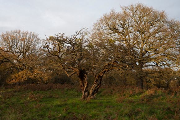
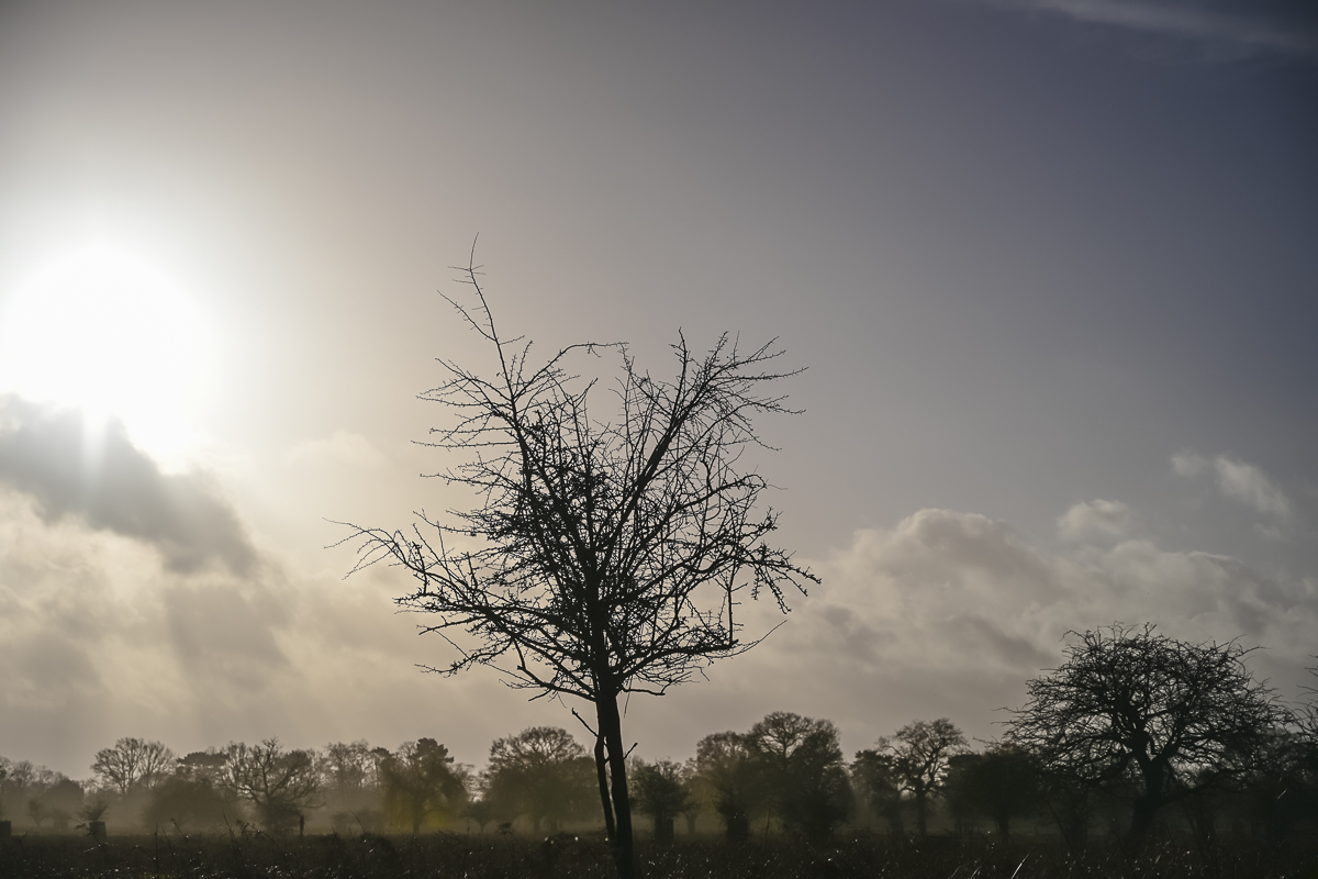
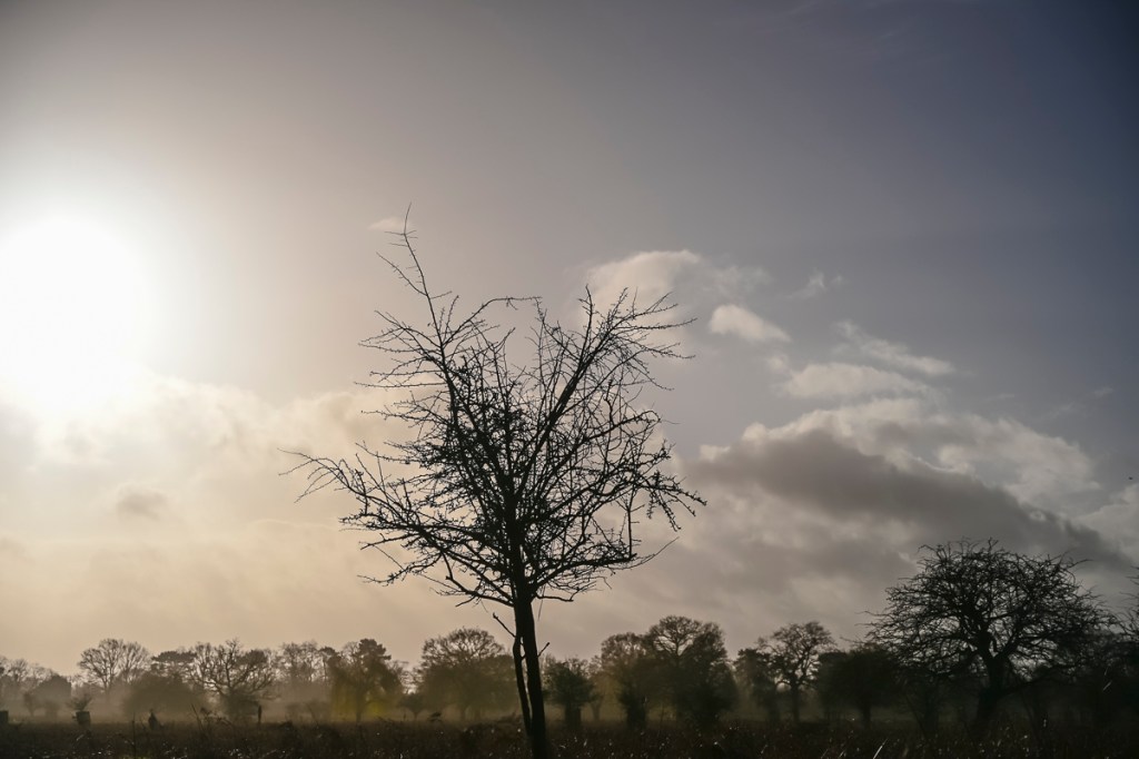
As I was still waiting for the prints to arrive and feeling a bit restless, I took a walk in Bushy Park. My main aim for the visit was to clear my head. The second was to try a few things out.
The previous day I had been looking at camera settings and using an Atomos Ninja V viewing monitor on the camera. Frustratingly, this monitor is better suited for shooting video rather than stills. However, it will be a useful tool for future projects. It is exceptionally good extracting high-res stills from the video footage recorded using the monitor. As it can record in ProRes RAW, this means the still has more range for colour correction. Something to explore in the future.
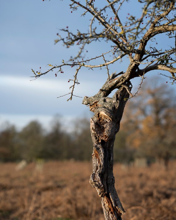
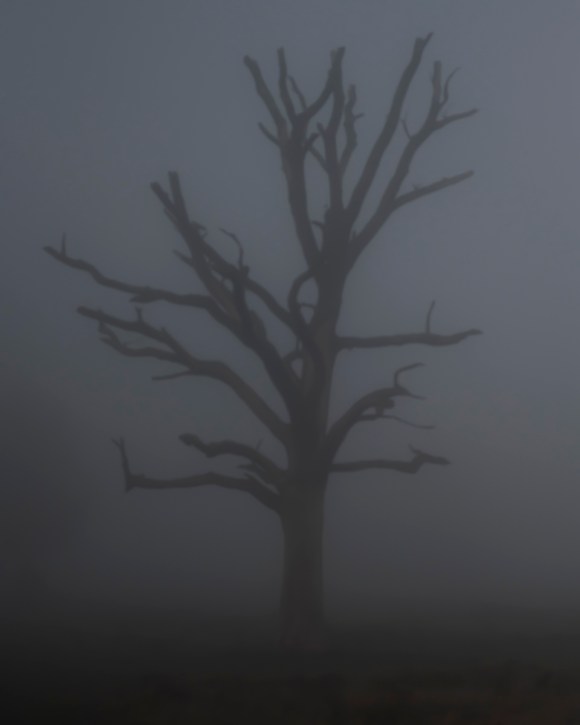
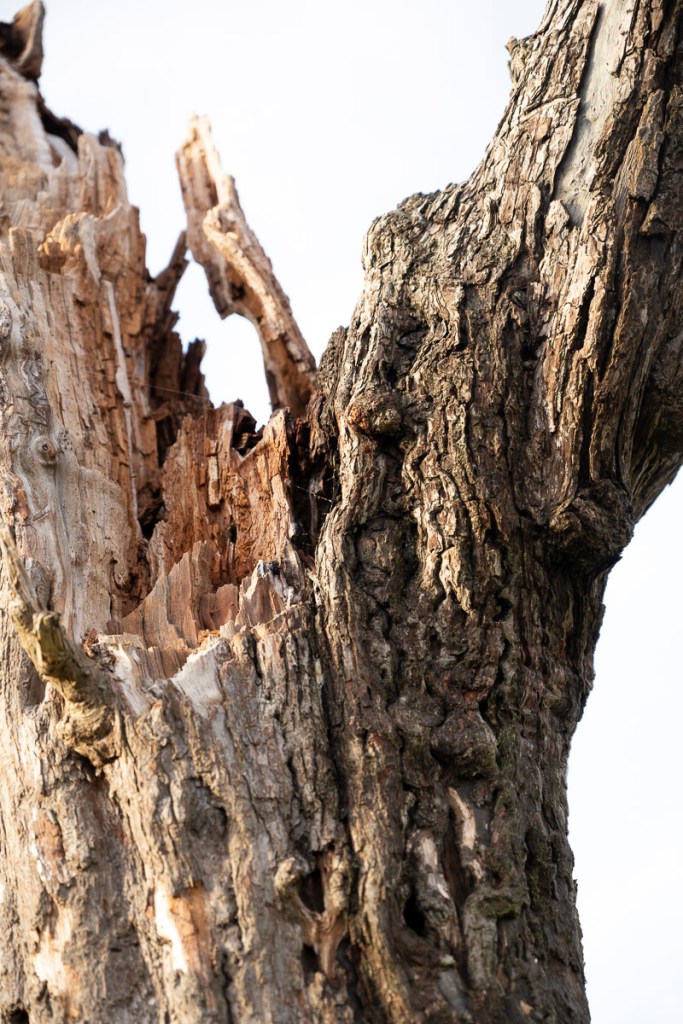
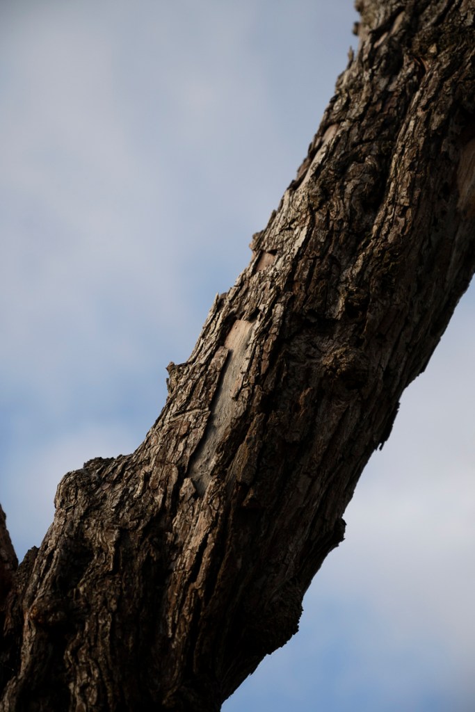
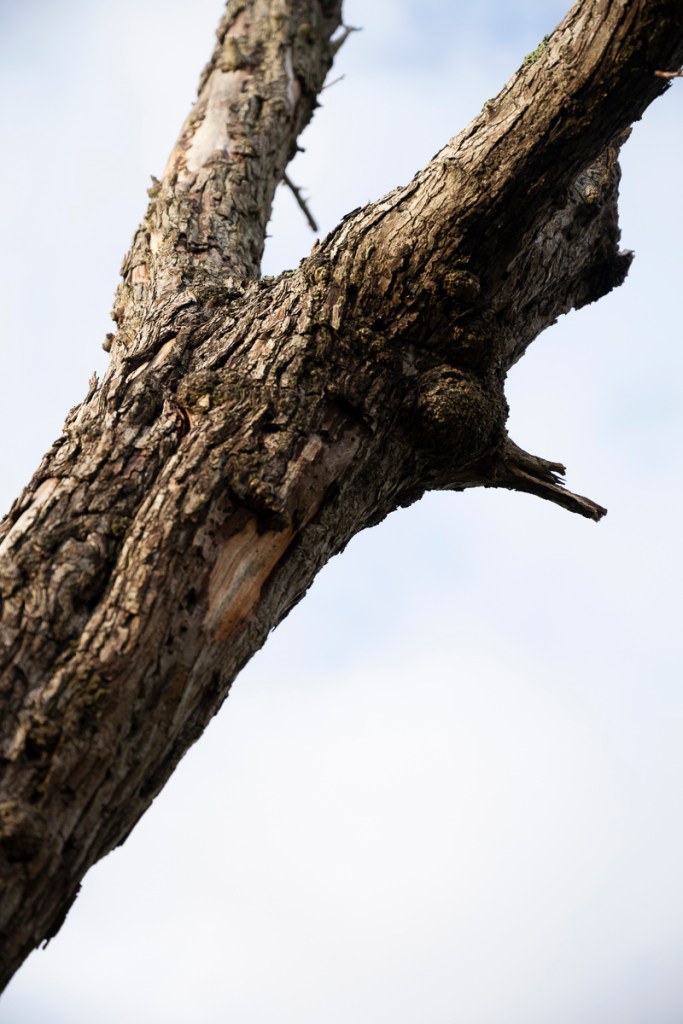
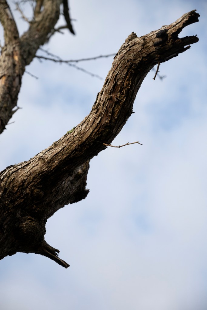
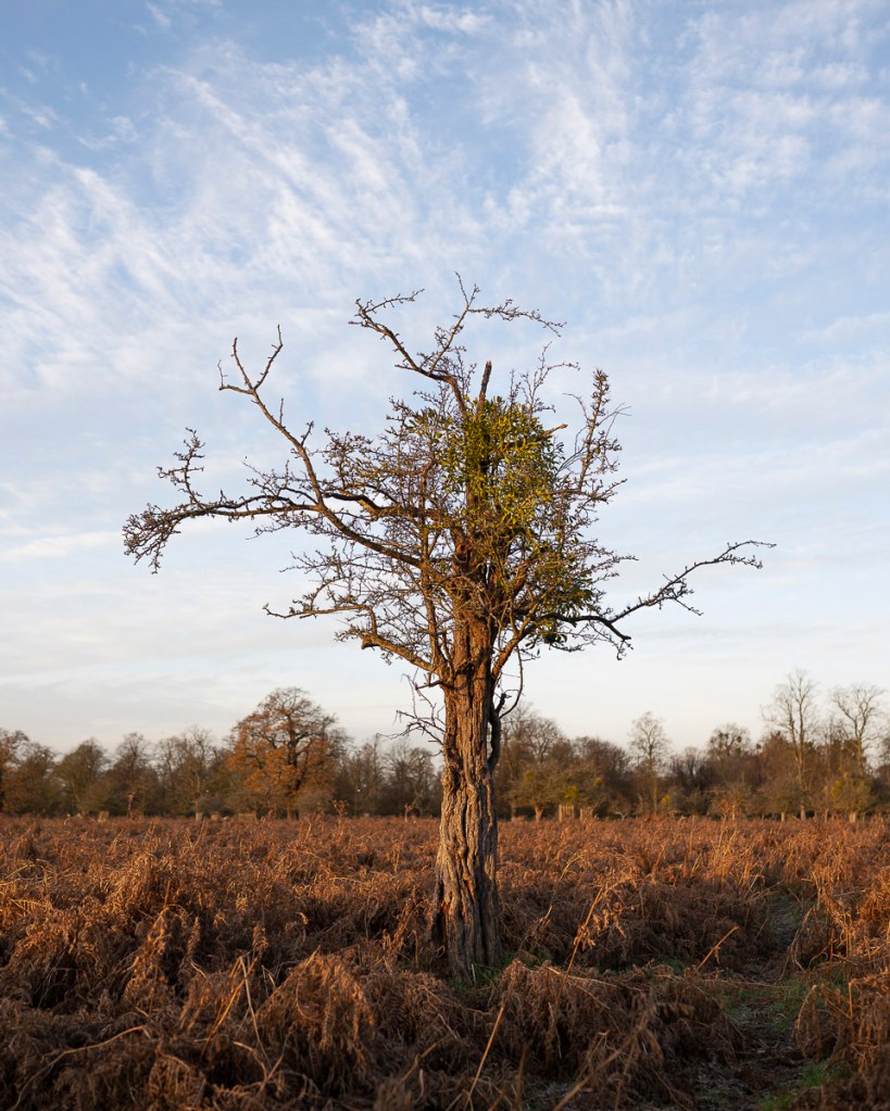
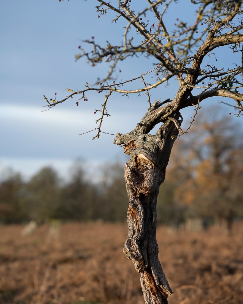
My first port of call was the tree I now call “Crazy Larry”. I still can’t get the light quite correctly on this one.
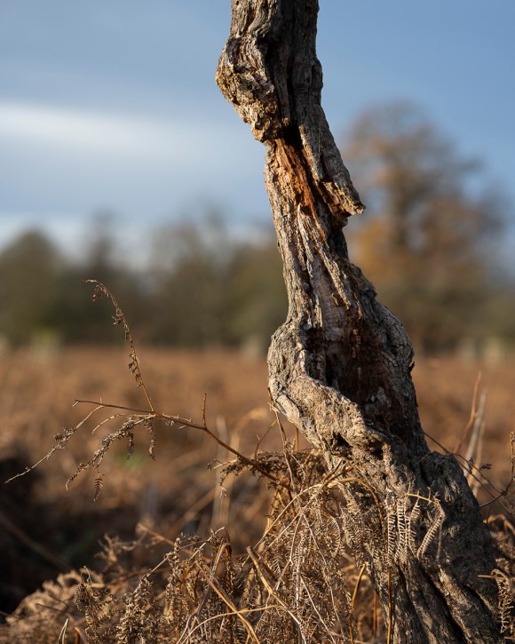
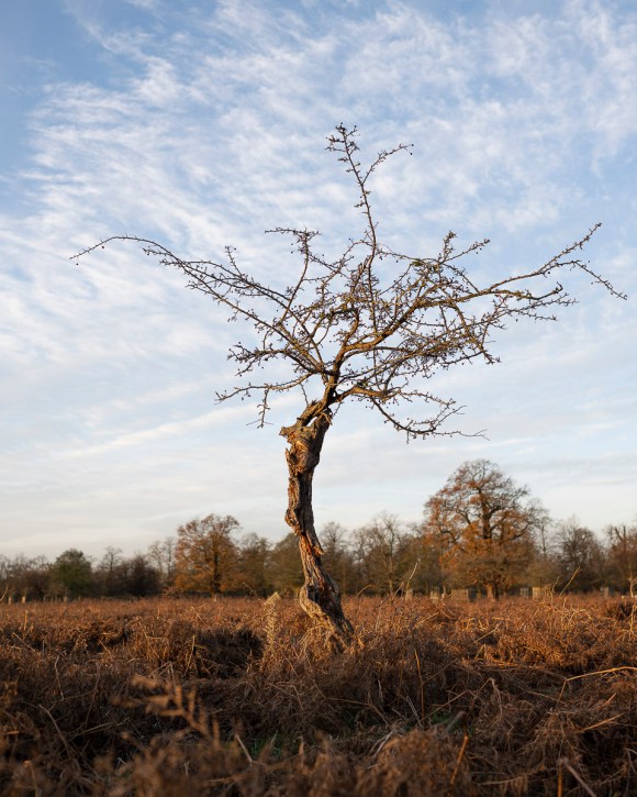
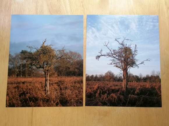
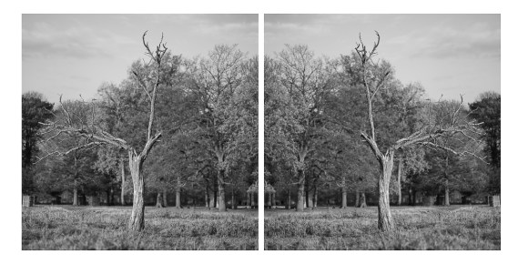
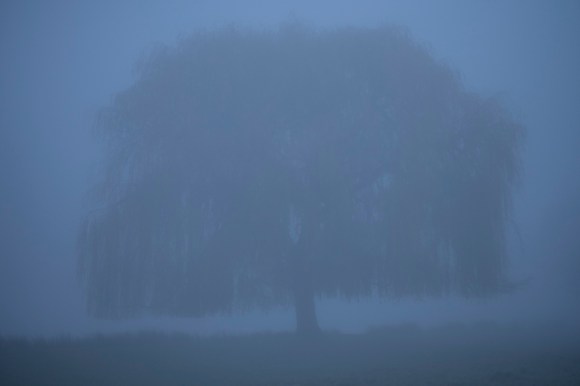
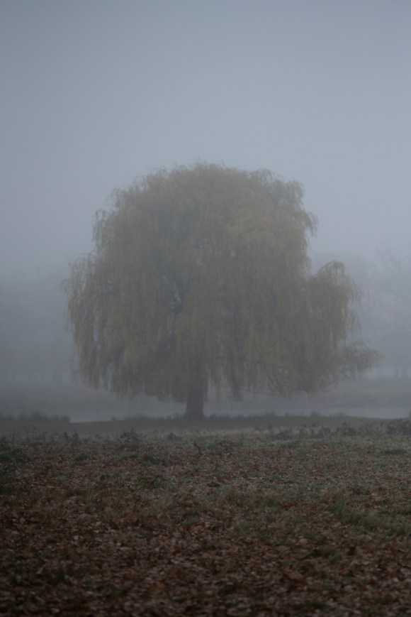
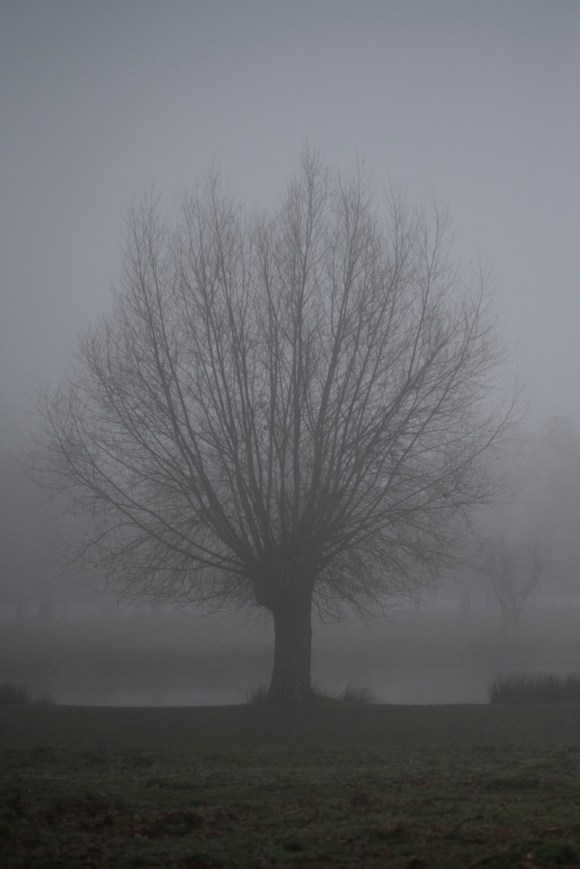
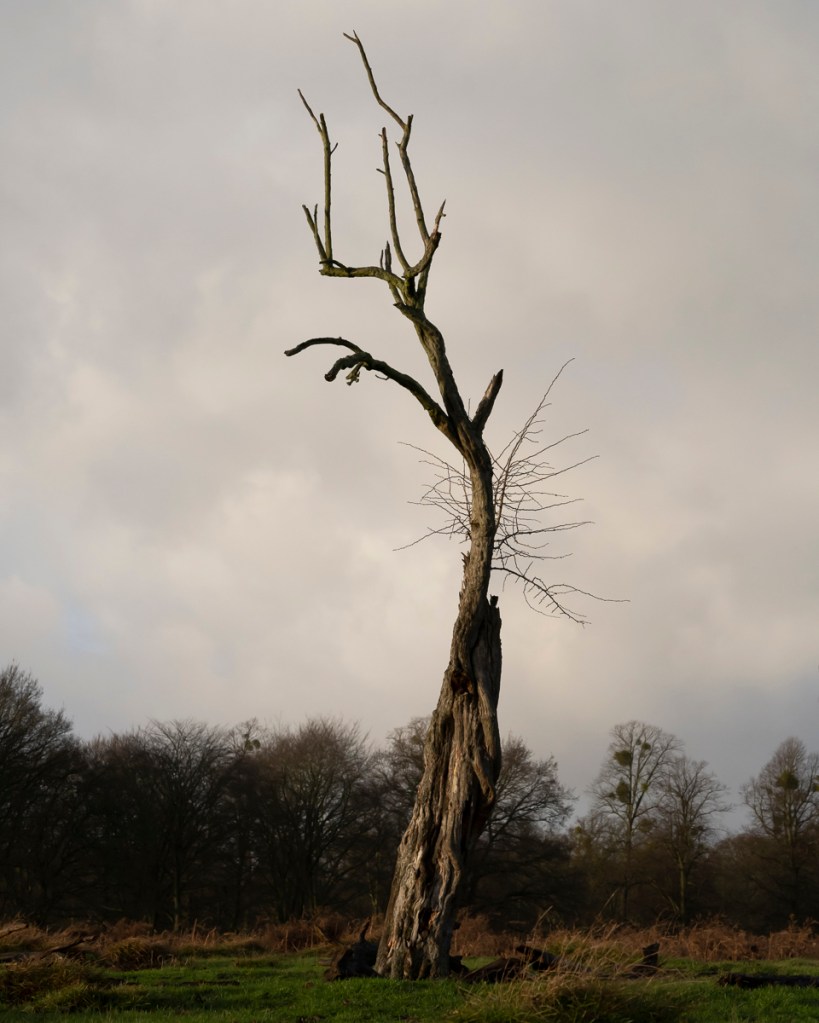
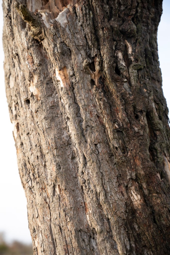
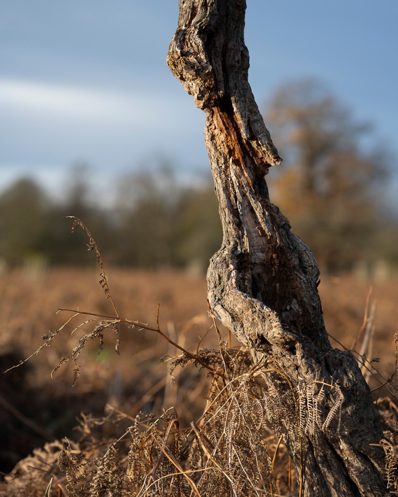
Next I returned to this, as yet, un-named, tree.
I then took a shot from the opposite side.
These are the two images together.
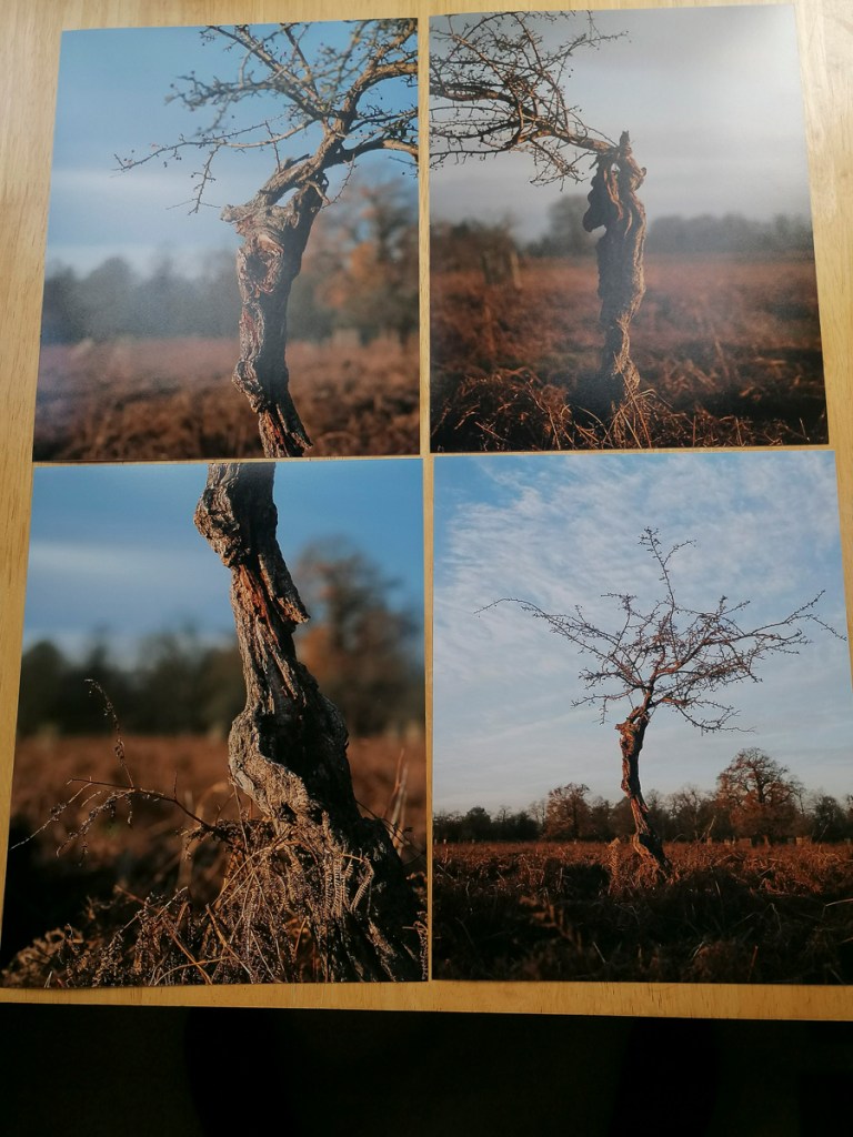
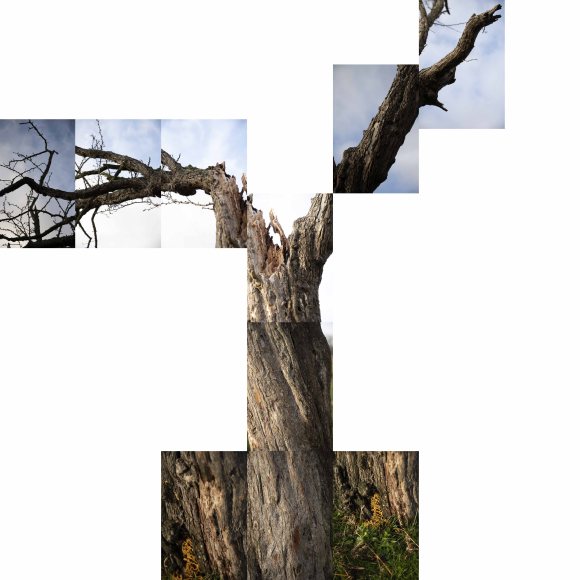
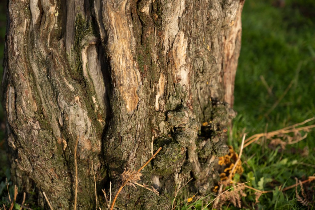
Next, I took close up shots from the same standing position. The thought behind this was to piece the images together in Adobe Photoshop to see if I could create a cohesive compound image.
This was my initial result. Definitely still needs work.
I also wanted to carry out a couple of interval timer shoots with the a hawthorn as the centre piece. The sky was cloudy and the wind was blowing them across at a steady pace, so this could work well.
These following shots were recorded as JPEG Fine files and taken at 3 second intervals. I used the tripod so there wouldn’t be any movement with the camera. The tripod was at quite a low level. In order to work out the composition, I used the Nikon Snap Bridge app on my phone. This was ok, but it seemed I still had to use the camera to set up and activate the interval timer sequence. This is something I should have practiced at home first.
I also tried to set an Adobe Premier file to create a time-lapse. Then I realised it’s been a year since I last did this. Time to return to my notes to jog my memory on the method.
As for the subject of time, this concept in relation to trees was starting to bubble.
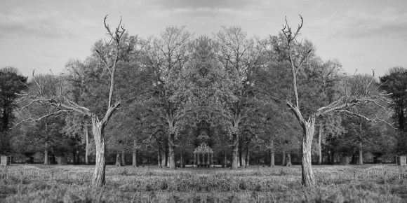
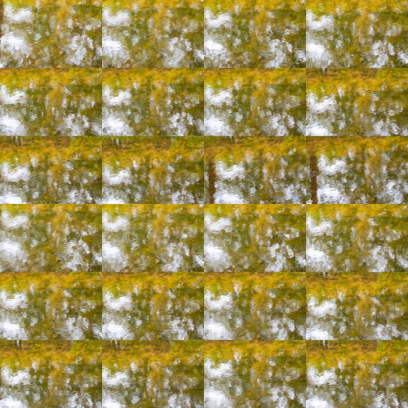
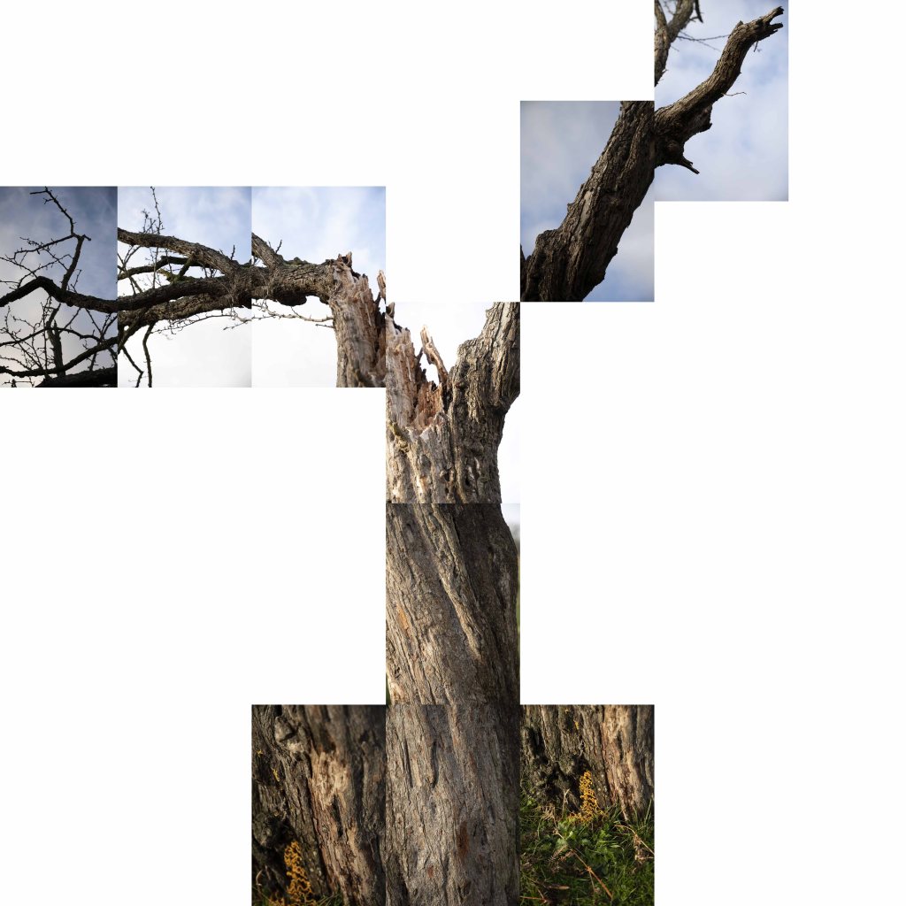
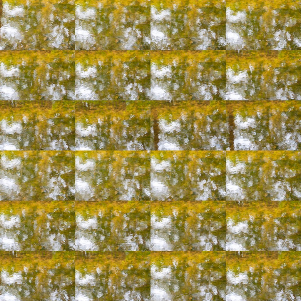
While waiting for the test prints to arrive from DS Labs, I thought I would try something different. Inspired by the photographic collage technique and methods of Noel Myles, I created the following compound image.
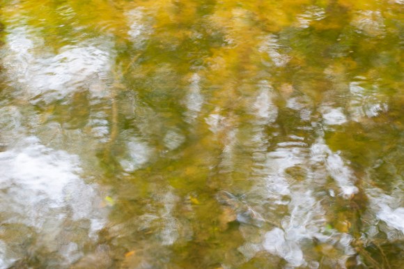
These are images taken in May 2017 when I first started experimenting with interval timer shooting and timelapse photography. The piece is comprised of 24 individual images that I’ve combined using Adobe Photoshop. The subject is the Longford River, which flows through Bushy Park. They were taken on a particular stretch of the river where the sun hits the water at a certain of day, creating the most hypnotising reflections.
This piece was inspired by Myles’ similar obsession to mine of going repeatedly to the same place and taking extreme amounts of images. This is a thread that runs through my own practice and the basis of the majority of my work. I was always criticised by my classmates at Richmond School of Art of ‘taking too many shots’. At the time, I took this a negative aspect, but now I realise it’s how I work.
I also realised that I had tried something similar during the AGM60 Research & Experimentation module.
As the light wasn’t great for experimenting with the camera outside, I selected then uploaded a selection of images for another test print. Also, I had recently colour calibrated my monitor and was keen to see how this would make a difference to the prints.
In addition, I knew I had to have physical images to help with the creative process. There’s only so much you can do on screen.
The following were printed as matte C-Types.
8″ x 8″ Prints
10″ x 8″ Prints
10″ x 5″ Prints
I was also curious to see the images printed on fine art paper. The following was printed on Hahnemuhle Photo Rag 308, also at 8″ x 8″.
To see the difference, I also ordered an 10″ x 8″ print on Hahnemuhle German Etching 310 paper.