Two further workshops as part of the MA Photography course were Adobe Photoshop and Adobe Lightroom Classic.
Adobe Photoshop Workshop
I was already quite familiar with Adobe Photoshop, having first used it back in 1998 and during my previous studies and photographic work. The programme is an essential element of digital photography. However, despite its extensive capacity for editing and manipulating images, it can be over-complicated and downright frustrating. The other main aspect of Adobe Photoshop is that there is always more than one way to get a result.
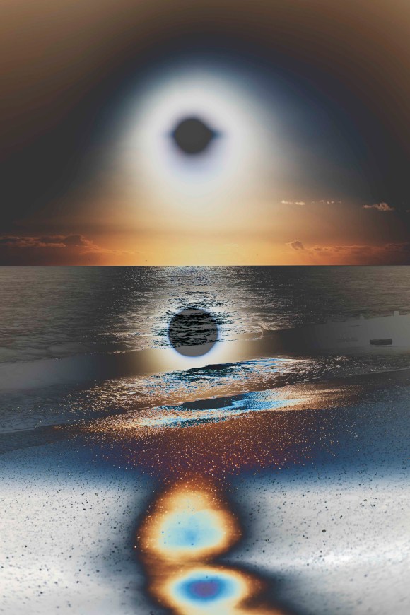
During the workshop, Simon introduced the class to a range of the programme’s functions, starting with the basics and taking us through the main functions. One of the functions that Simon outlined was ‘Curves’. This is a function I currently use in Adobe Camera Raw to create my colour digital negatives, but not in Photoshop. As I explained in the post outlining the Preparation for Digital Printing Workshop, my current workflow is to prepare and edit the images as much in Adobe Camera Raw then use Adobe Photoshop for the final touches and manipulation. It was interesting to see the effect I could achieve using the Curves in Photoshop.
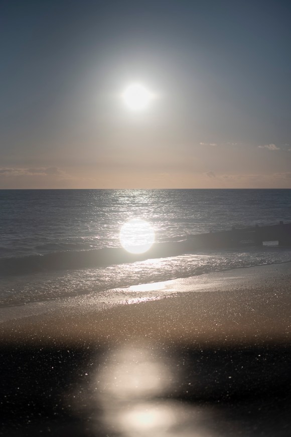
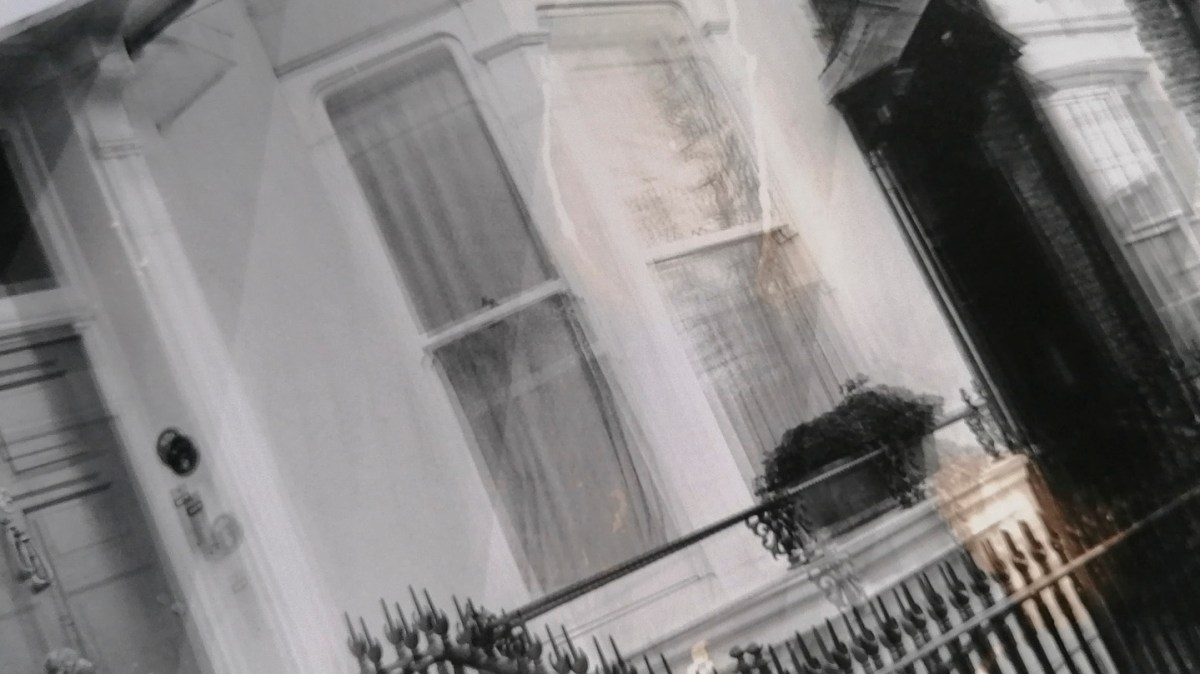
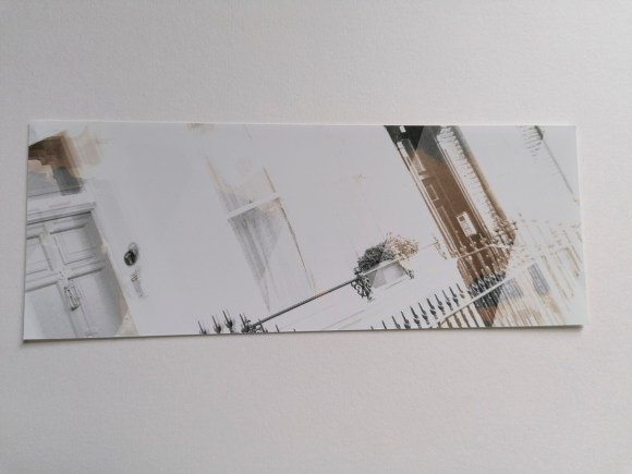
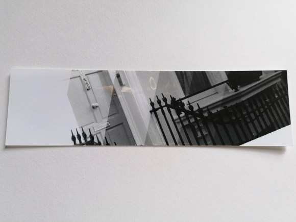
For this quick experiment, I selected one of the double exposure sunset shots. The original is on the left, the adjusted one is on the right.
This was the setting that I used to create the solarising effect.
Interesting – something to keep in mind and experiment with further. As with all digital manipulation, it can be quite tempting just to add an effect because you can. As my HNC tutor, Ria, drummed into me during my course, there has to be a darn good reason for changing an image – don’t just focus on surface or aesthetics.
Adobe Lightroom Classic
This is a programme that I am aware of and have access to, but have never used as part of my workflow. According to Adobe, it is ‘the essential tool for organizing, editing, and sharing your photography.’ Simon explained it was a mix of Adobe Camera Raw and Adobe Photoshop. He also outlined that, unlike the latter (which is a combination of functions that have just been added to and adapted over the years) Lightroom Classic was created in a logical way.
I have to admit that the workshop was a bit of a blur for me, as this type of lesson doesn’t suit my kinesthetically learning style. I’ve also developed a workflow in processing my digital images over the last four years that I have got used to. Maybe it is time to try something new and, potentially, more effective and efficient. This will have to be addressed and assessed over the coming months.
As with all Adobe applications, there are online tutorials for both of these applications. I have found these to be very useful in the past. Now is the time to revisit them.
One of the facilities within the Photography department is the Print Bureau. This on-site amenity means that students have access to digital printers and are able to process images without outsourcing. An introduction to these facilities and other aspects of digital printing was covered by Simon, one of the Photography department’s technicians.
The first thing that Simon explained to the class was scanning negatives. The department has two types of scanners that all of the photography students can use. I have to admit that it wouldn’t be something that I would use considering my work is entirely digital and I don’t use or have any film negatives. However, it is a facility that a lot of the students working in analogue who need to digitise negatives or slides would find useful.
Simon then went through the process of preparing a digital file for printing. This was familiar territory to me as this is something I’ve worked on over the last four years, so it was a great opportunity to refine my printing knowledge further.
The first aspect was checking the colour settings in the applications used. Simon recommended changing these to ‘Europe Prepress 3’, which would ensure that the printing colour profile would match the industry setting. In turn, this makes sure the prints result in being the same colour as intended. The applications to which this applies when printing digital photos are Adobe Bridge and Photoshop.
The other aspect was not to change the colour settings of the monitors in the Photography department. This large bank of screens had all been checked with a colorimeter. This is a monitor calibration tool that fits on the screen then fires a selection of colours at it. This results in any discrepancies being detected and the computer programmed to compensate for any of the monitor’s colour inaccuracy.
One issue I have encountered when printing is the difference between what is seen on screen and on the final printed sheet. This tool removes that difference, which in turn saves a lot of time, stress and money. At the time of writing, it was something I knew I had to add to my equipment list. I spend a lot of time editing and working on images at home. If I want to improve my skills, perform in a more professional way and raise the quality of my images, this is essential.
Simon continued explaining colour printing principles to the class, including colour theory, dpi considerations and setting up files for printing in Adobe Photoshop. This is different from my particular workflow as I generally prepare my digital files initially in Adobe Camera Raw. It was useful to see it from a different perspective. Simon also explained that it is best to save a file as a TIF to send to the printers. This is something that I do for my final prints, regardless of whether it is a Camera Raw-processed file or a Photoshop one.
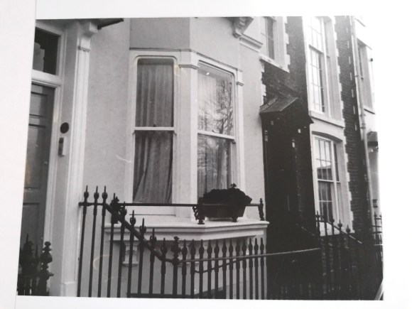
After preparing a file for printing, I had the opportunity to print one of my images using the bureau. The image I chose was this one. The reason being, it that I have previously printed the same one using both c-type gloss and pearl papers. I wanted to see how it looked digitally printed using Paper Rag, a fine-art printing paper.
This is the original digital image.
As the image was being printed on A4 and the original is 10″ x 10″, I had to change the size of the image. A4 is 8.27″ x 11.69″ so it had to be smaller than this and allow for a border. I will need to double-check which other sizes are available when preparing prints. I’m used to printing with set sizes on a 2:3 ratio in inches. This is because I tend to shoot with my camera’s sensor setting size, which is 4016 x 6016 pixels.
I was very pleased with the result.
The paper really suited the image and I would be more than happy framing this. Also, the cost of the print £3.50, which is reasonable compared to the pricing of other print bureaus I regularly use. As for turnaround, the general time for these prints is 72 hours. This is the maximum time and will be less during quieter periods.
The additional option available is to print on acetate sheets. This means I could create my own negatives digitally, which could then be processed in the darkroom. I could also use them in a process such as cyanotype, a method I have carried out previously:
With a refresher on printing plus the introduction to the university’s printing facilities, it reminded me how much I do know about the whole process in relation to digital photography. After my slight frustration with my gaps of knowledge in regards to analogue, my confidence in my abilities returned.
A further workshop as part of the course was an introduction to the studios and lighting systems. This was carried out by Mark, the ever-helpful and knowledgable Photography Head Technician. As I was already familiar with studio photography, it was great to get a detailed overview of what was available.
The University of Brighton’s School of Media has three studios within the Photography and Moving Image department. These are situated in the Edward Street Building. There are two large studios ideal for shoots involving people or large sets. Both of these studios have black and white background rolls and a frame that can be used for your own backdrops. Also available are a selection of plinths and a red sofa.
With regards to lighting, one has lights set on tripods and the other has pentagraphs that can be used in a classic four-light formation. Also available is a selection of studio lighting accessories such as softboxes, reflectors, umbrellas, bouncers and coloured gels.
There is a further small studio with a plinth featuring an infinity curve, which makes it ideal for smaller, still-life shoots. Each studio features a Hasselblad digital camera on a fixed studio mono stand. Also in each studio, there is a large screen Mac, which can be tethered to the camera for instant results. Quite handy for test shots when shooting on film. Also, this could be used if I didn’t have access to my DSLR or if I had a double-aspect shoot planned.
I wasn’t sure at this stage whether I would be using these facilities, but it was reassuring they are there if needed. Also, there are technicians on hand if any additional help is required with regards to setting up and using the studios and associated equipment.
The workshop also prompted me to revisit my notes on studio lighting made during my HNC module focusing on portrait photography.
On Tuesday 18th February, the class had a seminar with Xavier and Fergus. The focus of the seminar was:
Writing and Managing Proposals
Artist Statements
Contexts
References
Resources
Planning
Time Management
During the seminar, the class discussed various strategies for writing and managing formal written proposals, and how to present clear, in-depth and focused proposals that support, promote, and clarify photographic work for both myself and others.
The class considered questions such as:
What is the function of a proposal and an artist statement?
What is my specific idea, and how can I express it clearly?
What is fundamental/central to my project and how can I emphasise this?
What is the context of my work – specifically within the field of photography (both historical and contemporary), as well as within other fields?
What are my references (visual, conceptual and/or otherwise)?
How can I plan and manage my time effectively to serve both the intellectual and the creative process?
What makes a good artist statement?
The following is an outline of the presented considerations for my reference:
Proposals
Outline intentions
Describe wider concerns
Focus thinking
Assist initiating work
Artist Statements
Introduce practice
Articulate concerns, motivations, processes
Support interpretation by others
Can be adapted and used for various applications/opportunities
Enhance ongoing reflection
Acknowledge development
Volume
Purpose
Adaptation and expansion
Draw upon tutorial notes and discussions with peers
The seminar task was to find an artist statement, exhibition press release or photographer’s proposal and prepare a short, informal, 5 to 10-minute presentation (for discussion purposes) that considered the clarity, effectiveness and supportive role of this text, specifically in relation to the work at hand.
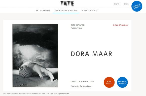
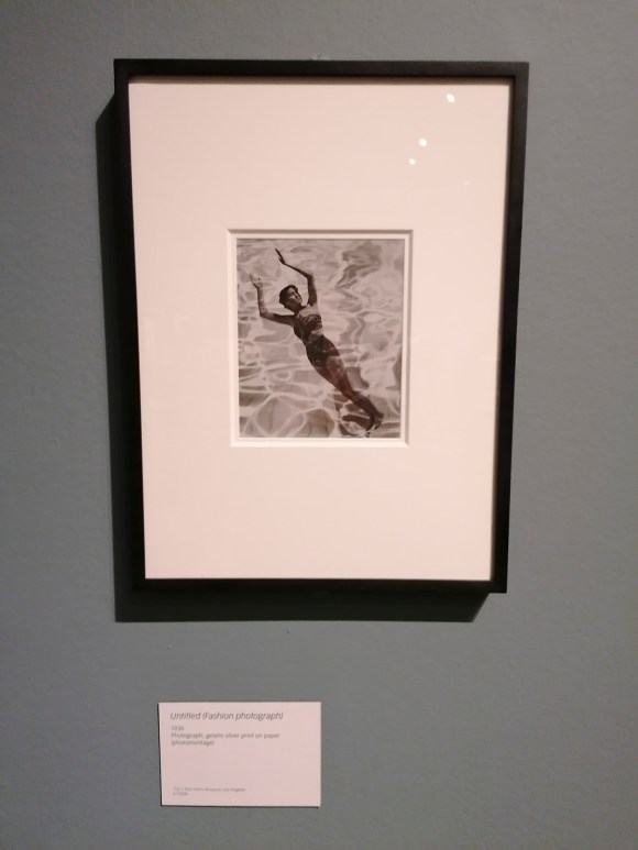
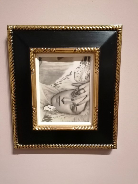
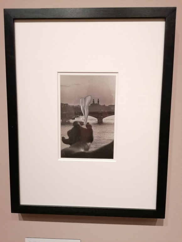
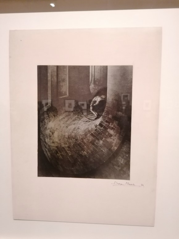
This was my presentation. I had recently visited the Dora Maar exhibition at Tate Modern. This was, in my opinion, a very strong example of a clear and effective exhibition description.
As part of the MA Photography course, the class had two darkroom workshops, one Black and White, the other Colour.
I was quite excited to try out the extensive darkroom facilities at the University of Brighton. The facilities at RHACC consisted of what appeared to be a broom cupboard painted with white walls. The only time I used during my four years at the college was to wash a cyanotype print. Also, the last time I had developed a photographic print was about 25 years ago. Apart from a brief foray into blueprinting, my photographic work since then has solely been digital.
In preparation for the workshops, I bought The Darkroom Handbook by Michael Langford. Published in 1981, it covers all the basics of processing, printing and manipulative techniques.
At the time of my initial reading of this book, I already knew how to recreate a lot of the effects within this book digitally. It was great having a reference to how these could be achieved using the original analogue techniques and technology.
Black & White Darkroom Workshop
The first workshop on Tuesday 11th February focused on Black & White printing. This was so the class could get to grips with the basics. Mark, the Photography department’s Head Technician, took us through the process of Black & White printing. This introduction involved an orientation of the whole darkroom area and the printing process from start to end, plus all of the Health & Safety aspects. After this initial introduction, the class took a negative (either their own or borrowed) to process themselves. This is when I realised my lack of analogue photographic knowledge which made me more determined to get to grips with darkroom printing. It also was a great opportunity to recognise the differences between digital printing as well as the pros and cons of both.
I won’t outline the whole process here, but this my initial test strip result. Not the most fantastic of prints, but it taught me a lot.
The first thing learned was the importance of using the test stip to calculate the correct exposure time. Also, how essential it is to leave the paper to ‘fix’ long enough so the print does not result in an unintentional sepia tone (as seen above).
When it came to printing a larger version, I also learned that it’s essential to ensure that either the negative or the paper are not moved in any way. Otherwise, it results in a double image (as shown below).
I have to admit that it did take me the whole three-hour session to get to this stage. It does take me a while to get to grips with a new way of working and process the information. I learn best kinesthetically, which means I have to physically repeat a process several times in order to both understand it and carry it out myself. As such, I returned to the darkroom on Monday 17th February for another printing session.
This was the resulting test strip.
These were the resulting prints.
Not the best, but it was a good reminder of ‘practice makes perfect’.
Colour Darkroom Workshop
On Tuesday 18th February, the class attended the Colour Darkroom Workshop. This both had similarities and differences to the Black & White one the previous week. The similar aspects were the use of the negative and setting up the enlarger. The main differences were not being able to use any light when taking the photographic paper out of the black bag before exposure plus the use of a machine for printing rather than the developing, fixing and washing trays.
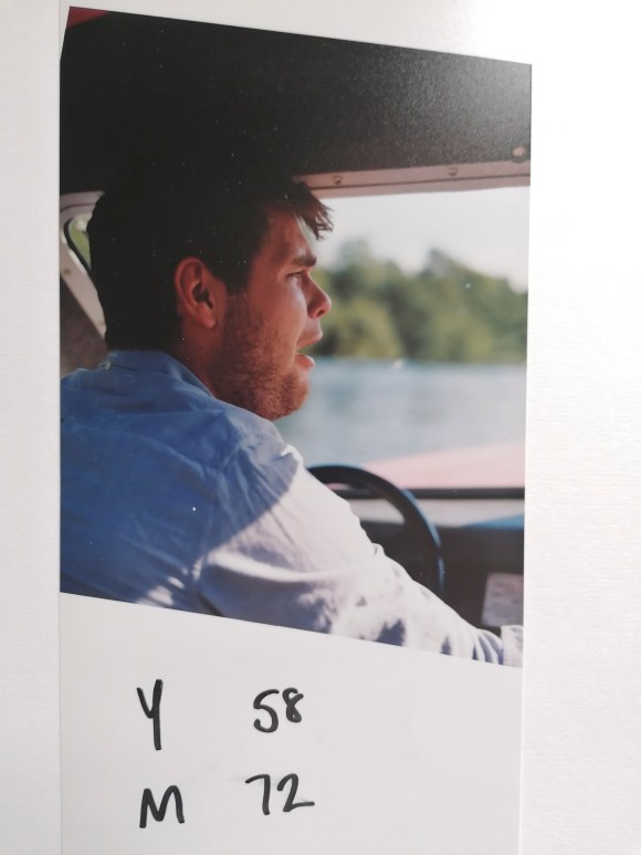
For this introduction to this type of colour printing, I borrowed one of my classmate’s negatives.
Again, I’m not going to note the whole process, but this I what I learned.
Firstly, it’s very easy to put the photographic paper with the emulsion side facing down on the masking frame. Which explains why the following two prints were the other way round.
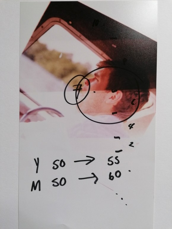
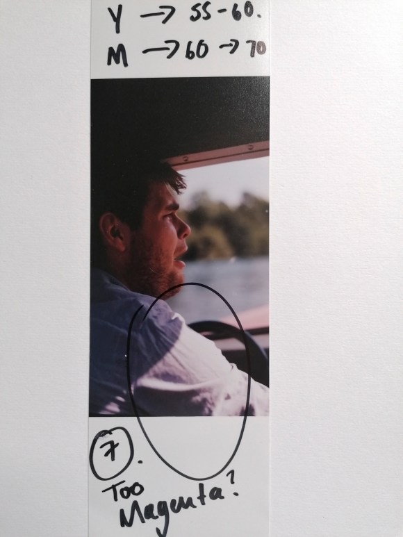
Secondly, the colour tone of the print image can be changed by either increasing or decreasing the three primary print colours: Yellow, Magenta and Cyan.
It takes a combination of numbers, colours and looking under a neutral light to get the right tone.
Again, it would have helped if I had the paper the right way round for this final print.
The main thing I did learn is that by using the colour enlargers, a richer contrast can be created using Black & White prints. A bit like split toning in Adobe Camera Raw or Photoshop.
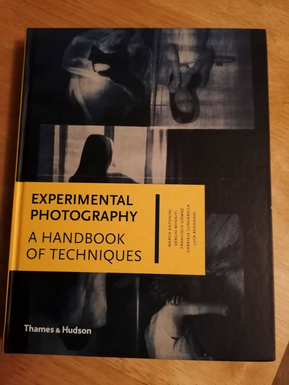
At this stage, I wasn’t sure if I would involve analogue processing in my work. However, there was a nagging feeling that I could use this at a later stage. I do have a strong interest in cameraless techniques and effects. I also know how to create my own negatives digitally. My first introduction to the darkroom involved making photograms when I was at primary school and that experience has always stuck with me. A book that I started reading at the same time as the one above is Experimental Photography: A Handbook of Techniques by Marco Antonini, Sergio Miniti, Fransicso Gómez, Gabriele Lungarella and Luca Bendandi.
This inspiring book features a wide range of alternative techniques including cameraless, making one’s own cameras, operative hacks plus print and post-print experimentation. Again, lots more to be considered at this stage.
What I did take away from these two sessions is that it highlighted where my gaps in photographic knowledge laid. Also, I shouldn’t be too hard on myself that I didn’t understand the analogue processes as much as digital. Looking at how I used to take and process my digital images when I started compared to what I do now, it reminded me of the time, effort, mistakes and sheer hard work it took to me to get to my current stage. I also realised that this knowledge and experience could, and should, be applied to my work going forward.
In my previous photographic studies, the starting point was predominately based on looking at and researching other photographers and artists in conjunction with their work. I hadn’t been to an exhibition for a while, so thought it a good idea to get back into the habit. I find that with each exhibition I visit, I always find inspiration and potential ideas as well as learning something new.
Tate Modern on the South Bank is one of my favourite art venues in London, so I checked on the institution’s website to see who and what they were exhibiting. One of the current exhibitions featured the work of surrealist photographer, Dora Maar.
When researching Maar, I discovered that she was an artist and poet as well as a photographer with a long and extensive career spanning many decades of the 20th century. I have to admit (somewhat ashamedly) that I hadn’t extensively encountered Maar’s work previous to this. Some of the images seemed familiar and I was intrigued enough to make a visit, which I did on 30th January 2020.
During the 1930s, Dora Maar’s provocative photomontages became celebrated icons of surrealism. Initially trained as a painter, Maar turned to photography and became a commercial success in the spheres of fashion and advertising. Maar was also involved with the surrealist movement, offering her photographic services to Man Ray as an assistant. This eminent photographer turned Maar down, famously stating that ‘he couldn’t teach her anything’.
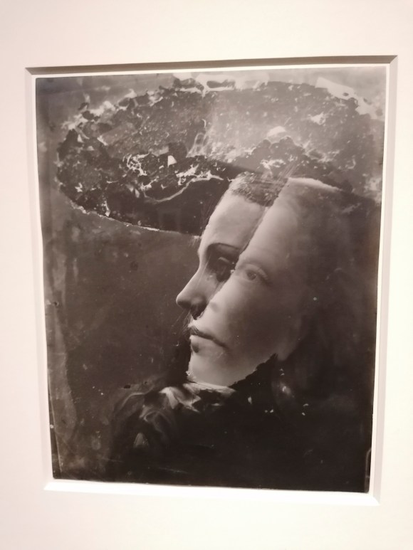
On visiting the exhibition, I was not disappointed. The exhibition itself was split into nine rooms, each focused on a particular aspect and era of Maar’s work. These were:
Room 1: The Invention of Dora Maar
Room 2: On Assignment
Room 3: On the Street
Room 4: The Everyday Strange
Room 5: Surrealism
Room 6: In the Darkroom and the Studio
Room 7: The War Years
Room 8: New Landscapes, New Surfaces
Room 9: Return
The following works were the ones that had the most impact on me.
I also bought the accompanying book to the exhibition, which I will be reading in much more detail with regards to research.
Visions of the Temporal Metropolis: Exploring Photography, Time and the City
‘Creating an image means to actualise the inhuman vision of the camera, presenting us with an image of time that confronts us with a perception we have and could never have.’
(Emerling, J. 2012 pp. 167)
This essay aims to explore how time has been used to depict cities photographically. With this subject being a potentially extensive area of academic research, this exploration will be through looking at a select number of images, including one of the first photographic images and contemporary photographic practice, then applying various key theoretical debates concerning these depictions.
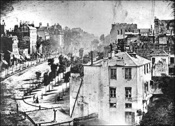
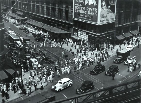
One of the earliest photographic images recording a city is Louis Daguerre’s (1787-1851) Boulevard du Temple (Figure 1). Taken in Paris in 1839, this ground-breaking daguerreotype is celebrated as the first known instance of human beings captured in a photograph.
Figure 1: Louis Daguerre, Boulevard du Temple, 1839, Daguerreotype
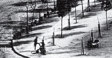
Not only is it the first photographic image of people, but it is also concurrently one of the first depictions of a city. This photograph shows an apparently deserted Paris. The perception with which the viewer is confronted is a place inhabited only by the shoeshine person and their customer (Figure 2).
Figure 2: Louis Daguerre, Boulevard du Temple, 1839, Daguerreotype
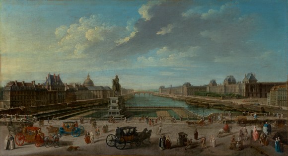
If one was looking at this Parisian street in 1839, it most certainly would have been a bustling vista with horse-drawn carriages and people moving at a metropolitan pace. When comparing Daguerre’s depiction of Paris with that of Jean-Baptiste Raguenet’s (1715-1793) oil painting of 1763 (Figure 3), this is the more-likely scene and the perception that most people would have of Paris of the late 18th/early 19th Century.
Figure 3: Jean-Baptiste Raguene (1715 – 1793), A View of Paris from the Pont Neuf, 1763, Oil on canvas
The lack of subjects in Daguerre’s image is due to them moving too fast to be recorded by this method of photography. The initial daguerreotype process involved a long exposure of a silver-plated sheet of copper for several minutes before being developed and fixing the image using chemicals. Only those subjects who stayed still enough were captured by the camera’s ‘inhuman vision’. This image illustrates how time can change one’s perception of the subject, in this case, a city, within a photograph. It can also be said that, once the technique is described, it then becomes clear that it is, in fact, an image of a fast-paced environment. If other people and the horse-drawn carriages were to be present in the image, they would have been moving slowly or not at all.
Time is integral to photography. One of the key reciprocal elements involved in taking a photograph is the duration at which the shutter is open. This duration will either freeze time in an instant (snapshot) or show movement within an image (time exposure). In general, the shorter the exposure time, the sharper the image. Paradoxically, a longer exposure does not automatically result in a greater blur. If the exposure is longer than the composition’s moving elements, these elements will not be visible, as shown in Daguerre’s image. This is not the only self-contradiction within photography, as Belgian theorist, Thierry de Duve analyses in his 1978 critical discourse ‘Time exposure and the Snapshot: the photograph as paradox’.
Within this work, de Duve labels ‘snapshot’ and ‘time exposure’ as ‘two opposite attitudes in our perceptual and libidinal apprehension of the photograph’. (de Duve, T. 1978, pp. 113). The paradox, as du Duve concludes, occurs as these opposing attitudes co-exist to a greater or lesser extent in every photograph and can be identified. This is reflective of the author, J. Scott-Fitzgerald’s tenet that ‘first-rate intelligence is the ability to hold two opposed ideas in mind at the same time and still retain the ability to function.’ (Scott-Fitzgerald, J. 1936). One could re-phrase this by stating that a photograph can hold two opposed depictions of time and still function as a readable image.
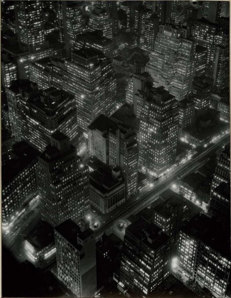
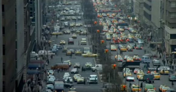
A later photographic image of a city that shares this paradox is Berenice Abbott’s (1898-1991) ‘Night View’ (1932) portraying New York (Figure 4). At first the first look, this image appears to be a snapshot. There are no obvious moving elements. However, when looking closer, it does have specific visual qualities associated with the ‘picture-like’ photograph, which du Duve terms as ‘time-exposure’ The photograph was taken between 4:30 p.m. and 5 p.m. on 20th December 1932 with a calculated exposure of 15 minutes. The image captures that time during dusk when the sky goes dark and office lights become visible.
In an article discussing this image by Shannon Perich (Associate Curator of the Photographic History Collection at the Smithsonian’s National Museum of American History), Perich describes the visible trends in Abbott’s work as having the modernist tendency which puts the image into perspective in the time it was taken and represented the emerging of the modern New York and new lifestyles that came with it. By using a long exposure, the ‘inhuman’ camera represents what Perich terms ‘the technical achievements and modern urban architecture of the 1930s’ North America, plus a change in the way of working.’ (Perich, S. 2010).
For me, this is one of the most poetic images of New York, capturing the city in a very pictorial fashion. The image softens the city, smooth its hard edges and frenetic energy. It is an example of du Deve’s observation that the ‘aesthetic ideal of time exposure is thus a slight out-of-focus’ and that ‘the blurred surroundings that belonged to the 19th-century style of photo-portrait act as a metaphor for the fading in time’.
By using this time-exposure technique, Abbott has given a temporality to the image by re-creating a chiaroscuro effect. As du Duve states, it does this by ‘loosening the fabric of time and allowing the viewer to travel through the image’. (du Duve, T. 1978, pp. 121). This sensation can be experienced when looking closely at Abbott’s image.
Figure 4: Night View [New York at night, Empire State Building, 350 Fifth Ave., West Side, 34th and 33rd streets], 1932 Berenice Abbott/Courtesy of the Smithsonian Institution)
To paraphrase du Duve, this is a photograph that endeavours to regain some of the features through which painting traditionally enacts time, creating a painterly illusion of depth by blurring its margins and overall grain.
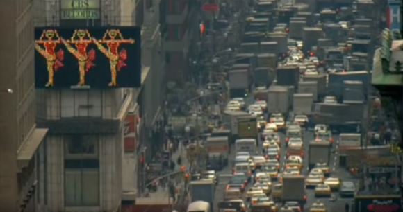
In contrast to the above long-exposure image, many of Abbott’s photographs of New York are what de Duve considers to be instantaneous snapshots, ‘petrified analogues that steal life.’ (de Duve, T. 1978, pp. 114). One of these images, taken in Manhattan in 1936, shows the frozen postures of individuals and vehicles (Figure 5). Captured from a similar viewpoint as Daguerre’s image of Paris, this ‘snapshot’ image gives the perception of New York one would expect during the 1930s. The sidewalks are full of people walking with purpose and direction while roads are filled with a selection of vehicles. This presents a further paradox within photography. By freezing an impossible posture and an unperformed movement, it presents an unresolved alternative. By not showing what happens before and after the camera has taken this image, de Duve would argue that the image is disconnected from its temporal context. There is no real knowing what happened before or after that captured moment. Would there be further traffic or people within the scene, or would it be just as deserted as Daguerre’s long-exposure image of Paris?
Figure 5: Berenice Abbott, Herald Square, 34th and Broadway, Manhattan, July 16, 1936, Gelatin silver print
As discussed, the perception of a city can be different depending on the length of exposure. For de Duve, this is either through a singular event or by making the event form itself in the image. However, there is an alternative way of perceiving the time and the city through photographs: time-lapse photography. This technique involves taking a series of photographic images at set intervals during a total time then processing them in sequence to create a film.
Traditionally, the camera is static, capturing the images in a tableau style from the same point and perspective. This photographic technique is a way of recording then changing the passing of time. For example, it can speed up a process such as a plant growing or celestial objects moving across the sky. Historically, the technique was primarily used to record and document nature.
One of the original pioneers of time-lapse photography was Arthur Clarence Pillsbury (1870-1946), an American photographer who held a government photographic concession in Yosemite National Park from 1906 to 1927. In 1912 he started taking motion pictures of the wildflowers of the Sierra. Pillsbury writes that he had:
‘conceived the idea of making the individual pictures in the film at one or two-second intervals and at once my pictures of the cliffs sprang into life, the clouds went drifting by and their shadows on the cliffs added to the lifelike appearance.’
(Acpillsburyfoundation.org, 2018)
Time-lapse has a further key element: automation, which enhances the camera’s inhuman vision. Carrying out an interval timer shoot enables the capture of the subjects’ movement with an unconscious observation. The camera can do what the human eye is not capable of as Walter Benjamin (1892-1940) states:
‘Evidently, a different nature opens itself to the camera than opens to the naked eye—if only because an unconsciously penetrated space is substituted for a space consciously explored by man.’
(Benjamin, W. 2008, pp. 16)
It is the opposite of Henri Cartier-Bresson’s (1908-2004) contemplation of the ‘decisive moment’ when taking a photograph:
‘Sometimes it happens that you stall, delay, wait for something to happen. Sometimes you have the feeling that here are all the makings of a picture – except for one thing that seems to be missing. But what one thing?’
(Cartier-Bresson, H. 1952, pp. 45)
During an interval-timed shoot, the camera does not wait for something to happen – the device slavishly takes a shot at the programmed interval for the set time. The camera doesn’t, as Cartier-Bresson suggests one should, pause for someone to walk into its range of view before operating the shutter. As such, the images from this technique become a succession of unposed snapshots. These snapshots are then put in a filmic format with each image usually showing for 1/25 of a second. This resulting film is a contraction of time and a change in perception. For example, if a camera takes one shot every second for 25 shots, this will cover a period of 4 minutes and 10 seconds. When processed, the time-lapse sequence will then be one-second long. When watched, there is the perception of both what is happening and what has happened, but only for that one second.
In approximately 1880, the introduction of gelatin-silver bromide plates made possible snapshots with an exposure time of 1/25 of a second. This resulted in ‘reorienting photography toward the instantaneous, those moments of time or of movement that were not necessarily available to the naked eye.’ (Doane, M.A., 2006, pp. 25). Time-lapse presents a series of snapshot moments, ones that cannot be seen without the camera’s observation, in filmic form. This is contrary to Carlo Rim’s (1902-3 – 1989) rumination on photography concerning film. Rim proposes that film consists of a succession of posed snapshots. The French film screenwriter, producer, and director continues:
‘and it only rarely gives us the illusion of the unexpected and the rare. Ninety films out of a hundred are merely interminable poses. One doesn’t premeditate a photograph like a murder or work of art.’
(Rim, C. 1930, pp. 41)
When using time-lapse to record temporality within the city, the resulting imagery is usually unexpected and rare. Attempting to premeditate what is captured in each shot during a timed, interval shooting session is nigh on impossible. By capturing the city and re-presenting in this way, the viewer is again confronted with a new perception, both real and imagined.
The first major commercial usage of time-lapse showing time in a city was within the feature film, ‘Koyaanisqatsi’ (1982). According to the director, Godfrey Reggio, the film is:
‘an apocalyptic vision of the collision of two different worlds – urban life and technology versus the environment.’
(Reggio, G. 2018)
By using this technique within the film, combining the solid stillness of the buildings and architecture with the flows of traffic and people, Reggio reveals the frenetic pace of city life (Figures 6 & 7). In this film there are several time-lapse sequences shown as one shot per frame running at 1/25. As such, these sequences contract the occurrence of the original event, speeding up time and giving the perception of the city being a hive of relentless activity. This reflects Emerling’s statement that:
‘A photograph… does not give a simple image of time as a tense. It gives us an aspect of time as duration, as a contraction or a dilation in time.’
(Emerling, J.2012, pp. 170)
Figure 6: Still from Koyaanisqatsi (Dir: Reggio, G. 1982)
Figure 7: Still from Koyaanisqatsi (Dir: Reggio, G. 1982)
A more recent example of a city being depicted through time-lapse photography is the experimental documentary ‘Communion Los Angeles’ (2018). This dystopian vision of the present is a collaborative piece by Peter Bo Rappmund (b. 1979) and Adam R. Levine (b. 1978). Rappmund is an artist who has produced various feature-length documentaries using time-lapse: Psychohydrography, (2010), Tectonics (2012) and Topophilia (2015). These documentaries highlighted various environmental issues including the effects of human interference on the ecology. Levine is a film and video artist whose work has utilised time-lapse and according to his website, ‘focuses on hidden histories, vernacular practices and the cityscape’ (Levine, A.R. 2020). The documentary explores the 35-mile length of California’s Route 110, part of which goes through the metropolitan area of Los Angeles. By focusing on this road, it gives the not-so-pleasant perception of this city being overtaken by cars.
Figure 8: Still from Communion Los Angeles (Dirs: Rappmund, P. & Levine, A.R. 2018)
Figure 9: Still from Communion Los Angeles (Dirs: Rappmund, P. & Levine, A.R. 2018)
Through their use of time-lapse photography, Rappmund, Levine and Reggio record and show details of the city in a different time span from reality giving alternative views of the Metropolis. The overall perception of both films, which confront the viewer, is that the city is a negative and detrimental space and place.
Despite this similarity in perception, ‘Communion Los Angeles’ uses photography to portray the passing of time differently to ‘Koyaanisqatsi’. Instead of speeding up time, the documentary slows it down. ‘Communion Los Angeles’ comprises a series of still photographs taken by a DSLR camera then put together digitally to make an animation. Each image is on screen for more than the usual 1/25 frame rate. As such, it enables the viewer to see the image for longer, giving the perception of time dilating. By using this method, Rappmund and Levine had more control over the moving imagery, allowing these photographers to manipulate the presentation of time. This is in opposition to Cartier-Bresson’s suggestion that a photographer, unlike a writer, doesn’t have time to reflect. Instead, a writer can ‘accept and reject, accept again; and before committing his thoughts to paper’. This method of photography enables the photographer to ‘tie the several relevant elements together’. (Cartier-Bresson, H. 1952, pp. 44-45).
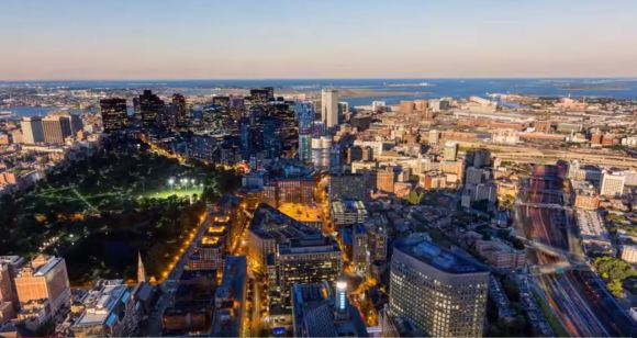
So far, the meta-theme of the time-lapse examples discussed is one of single temporal linearity. There is a complicit acceptance that the truth is unfolding before the viewer’s eyes in one particular time frame during each sequence. But what happens if different images taken at different times are combined? One photographer who has taken time-lapse to a new level is Julian Tryba. In 2014, Tryba produced a film called ‘Boston Layer-Lapse’, an innovative piece using time-lapse combining multiple sequences shot at various times of the day and night. The sequences were then edited together to create what Tryba terms as a visual time dilation effect he has named ‘Layer-Lapse’. On the accompanying notes to this film, Tryba states:
‘Traditional time-lapses are constrained by the idea that there is a single universal clock. In the spirit of Einstein’s relativity theory, Layer-Lapses assign distinct clocks to any number of objects or regions in a scene. Each of these clocks may start at any point in time, and tick at any rate’.
(Tryba, J. 2014)
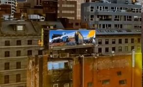
The resulting piece shows a range of mesmerising location scenes within the city of Boston. Each sequence has elements of the differing times at which the original images were shot. These were then digitally edited using layer masks to hide or show selected segments of each image.
Figure 10: Still from Boston Layer-Lapse (Dir. Tryba, J. 2014)
When looking at the still in Figure 10, evidence of the different times of day are visible. For example, the lights in the park at the middle left of the image plus the buildings at the bottom middle are on. These elements appear to be in darkness. In contrast, sunlight and shadows can be seen on the right-hand side of the image.
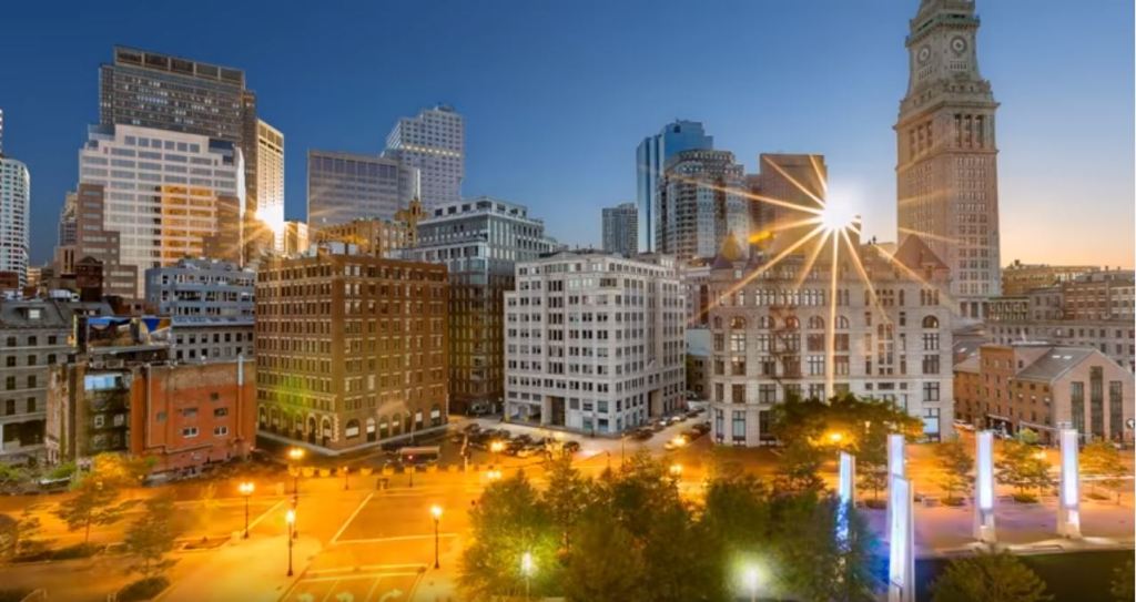
Figure 11: Still from Boston Layer-Lapse (Dir. Tryba, J. 2014)
Within the still shown in Figure 11, the sun and its reflection are visible, but the lower half of the image was shot during the night. The result of this effect gives a warped temporal perception of this city.
The temporal perception is warped further as one of the scenes (Figure 12) before the one in Figure 11 also contains this element showing on the billboard at the middle, left-hand side of the screen (Figure 13).
Figure 12: Detail of Still from Boston Layer-Lapse (Dir. Tryba, J. 2014)
Figure 13: Still from Boston Layer-Lapse (Dir. Tryba, J. 2014)
There is a further temporal contraction of time within this film running alongside the one affecting the visual time dilation effect. The images were shot over a period of 100 hours and then edited over a period of 350 hours resulting in a film with a run time of two minutes and 48 seconds. It is the equivalent of seeing a six-hour block of time simultaneously. The camera has again been used to create images of a city that would be impossible if one were witnessing every moment as it happened when it happened. It cannot be seen in the ‘now’, as Emerling states:
‘An image is a line of time… A photograph, a writing with light, is always too late to record anything as it is. It always gives us something as it was, never as it is.’
(Emerling, J. 2012 pp. 167)
The visual time dilation is not the only perception within ‘Boston Layer-Lapse’. In contrast to the dystopian vision of the city within ‘Koyaanisqatsi’ and ‘Communion Los Angeles’, ‘Boston Layer-Lapse’ shows a utopia-like Metropolis. The streets are busy with cars and people, but this film gives an overall impression that this is a functioning city without tension.
As explored above, this piece has looked at how photographs of the city can be considered an image of time created by the camera. Through using technology combined with the inhuman and unconscious vision, time itself can either be shown as contracted or dilated. This, in turn, affects how cities can be depicted photographically, including pictorial, portrait-like images of time-exposure and sharp snapshots. These depictions can also be shown as either a frenetic, polluting dystopia or a graceful and beauteous utopia.
To summarise, time combined with the inhuman vision of the camera results in different perceptions of a city. By looking at examples from one of the ground-breaking images of photography to one of the latest digital manipulations of visual time, it becomes apparent that the way in which the city is experienced as a visual phenomenon is not fixed. It is also a combination of the unconscious observation of the camera and the curation of the photographer. The questions raised by this combination is how existing images can be re-examined and how future photographic work can be curated and created.
In conclusion, what emerges from exploring the topic of photography, time and the city is the revelation of the potential scope for further investigation. There has been extensive research and musings on the relationship of time and photography to many subjects, which could not be addressed in the scope of this work. By focusing on a particular subject in connection to this relationship, it gives a specific range to extend this discourse within contemporary photographic debates. With the emergence of new technologies, combined with the convergence of existing ones, further investigation regarding the discourse of photography and time concerning the city plus additional categories is required.
Benjamin, W. (2008). The Work of Art in the Age of Mechanical Reproduction. London: Penguin Books.
Campany, D. (2019). Safety in Numbness: Some remarks on the problems of ‘Late Photography’ – David Campany. [online] David Campany. Available at: https://davidcampany.com/safety-in-numbness/ [Accessed 27th January 2020].
Campany, D., Stillness, (2008), Bell, A. and Traub, C. (2015). Vision anew. Oakland, Calif: Univers of California Press.
Cartier-Bresson, H., Images a la Sauvette, (1952). Campany, D. (2007). The Cinematic. London: Whitechapel.
De Duve, T., ‘Time Exposure and the Snapshot: The Photograph as Paradox’, (1978). October No. 5 Summer.
Douane, M. A., Real Time: Instantaneity and the Photographic Imagery, Green, D. and Lowry, J. (2006). Stillness and time. Brighton: Photoworks / Photoforum.
Emerling, J., Photography History and Theory, (2012). Routledge.
Laguna Art Museum. (2012). Peter Bo Rappmund Psychohydrography, 2010. Available from: https://www.youtube.com/ watch?v=e5mAdg8WwWk [Accessed 5th December 2019].
Levine, A.R. (2020). About — Adam R. Levine. [online] Available at: http://www.adamrlevine.com/bio [Accessed 13th January 2020].
Rim, C., De I’instantané, (1st September 1930), L’Art vivant, no 137 (Paris), trans, Robert Erich Wolf, ‘On the Snapshot’, in Christopher Phillips, ed., (1989) Photography in the Modern Era: European Documents and Critical Writings, 1913-1940 (New York: The Metropolitan Museum of Art), 37-40 in Campany, D. (2007). The Cinematic. London: Whitechapel.