For the seminar on 17th March, I had to identify how something ‘outside of the box’ may bear an interesting relationship to my research project. This could be something I engage with in my life outside of my studies or encounter in my day-to-day experience. It also could be something not necessarily related to contemporary art or photography. For the seminar, I had to be prepared to discuss how and why I think this is specifically relevant to my work.
My potential ‘outside of the box’ influence is Woman on the Edge of Time by Marge Piercy, a book written in 1979.
The narrative focuses on Connie, a woman who is contacted by a Luciente, a person who exits in 2137. The book’s complex plot follows their interaction, comparing and contrasting Connie’s dystopian, racist and misogynistic modern existence of the late 1970s with that of a feminist utopian future. Connie is able to ‘shift’ to the future with Luciente’s assistance. By doing this, Connie is able to experience life in a society where the borders are blurred between the sexes and society has become more equal. The narrative becomes an allegory of the way women are trapped within the confines of their societal expectations and how possible changes in society can release them from these traps. It also highlights that even though this possible future utopia is more ‘equal’, it isn’t 100% perfect.
I originally read this book in the late 1980s and recently rediscovered it again by chance. When reading this book, the following came to mind:
Being on the ‘Edge of Time’
Double exposures
Gender/temporal fluidity
The curtain between shadow and light
Using different textures
Longer exposures
Creating the ‘future’ with ‘now’
The different language used by ‘now’ and ‘future’ characters
While waiting for the focus of this project to sharpen, there were two things I needed to do. First, start taking photos. Second, get refamiliarised with my DSLR camera.
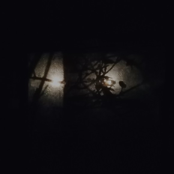
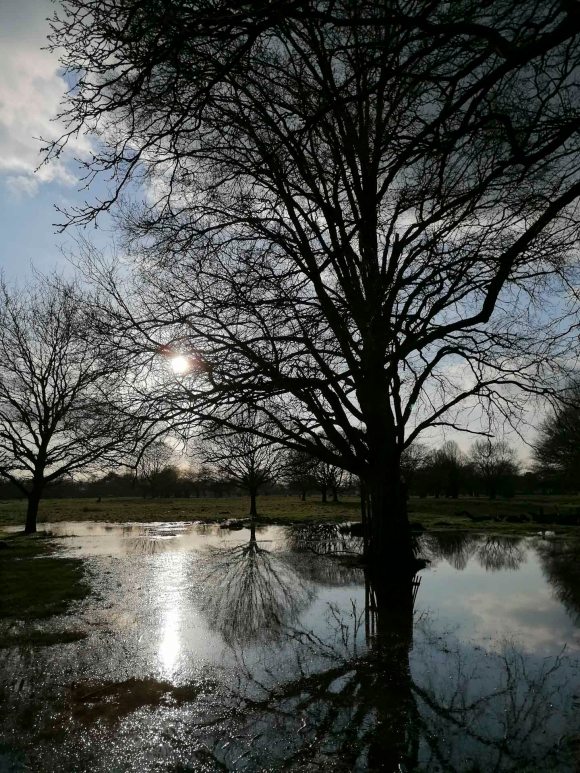
21 February 2020 – Richmond Park
These images were captured during a walk from Kingston Gate to Richmond Gate, following the lower path. The last time I made this walk was at least five years ago. I used to spend a lot of time running and along this path, so it was interesting experiencing the environment at a slower pace. This enabled me to spot the following tree formation.
It seemed to resemble a pterodactyl. This reminded me of a dragon I spotted in the same park back in 2014.
This was at the very early stages of my photographic work and I was experimenting with an open-source photo editing software, Irfan View. The original image was taken with my mobile phone while out on a bike ride. The latter was inspired by the solarisation technique famously attributed to the surrealist photographer Lee Miller and a technique used extensively by Man Ray.
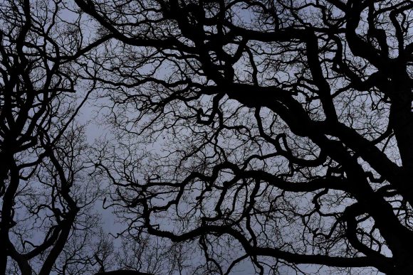
The sky in the park that day was dull pewter which gave a very haunting effect when looking up through the trees.
1 March 2020
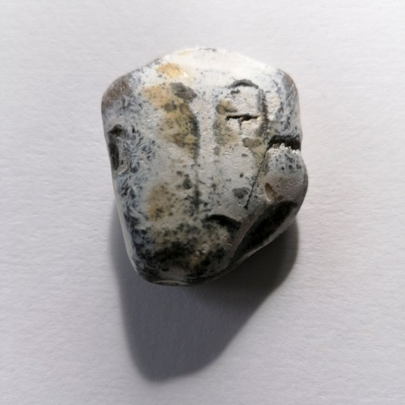
While sitting on Brighton beach, a particular rock caught my eye.
I could see various faces on the rock’s surface depending on the part on which part I focused. Interestingly, when I posted the image on Instagram, a comment was made by Paul Kenny (a photographer whose work I greatly admire): Modigliani.
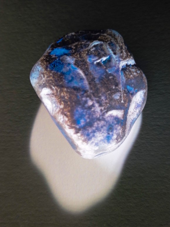
I also carried out a quick experiment using my colour negative technique.
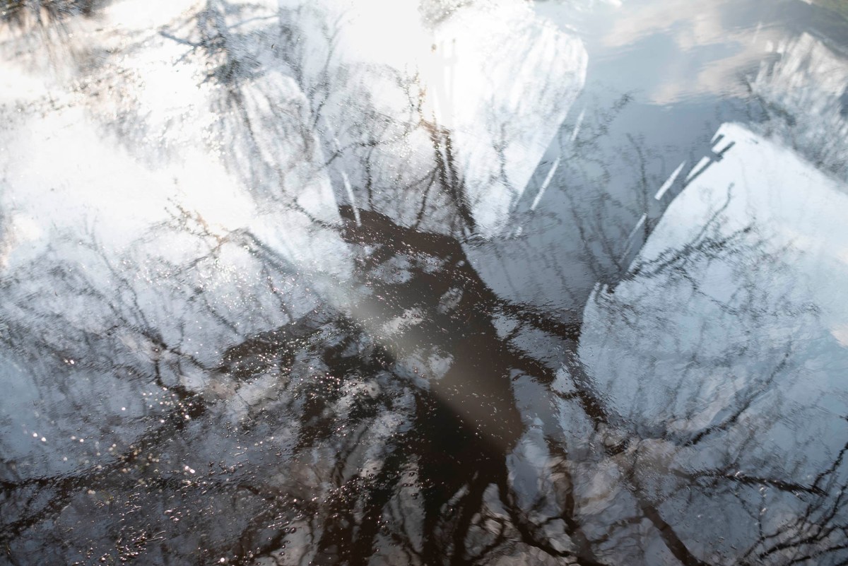
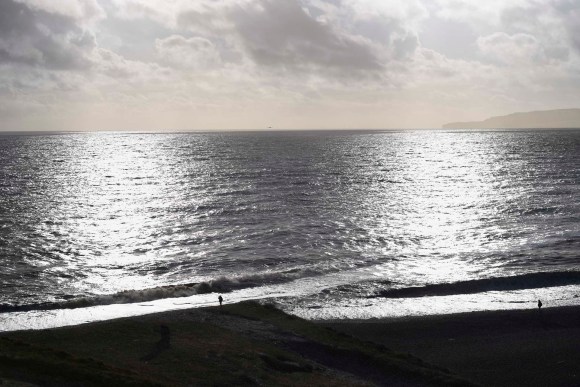
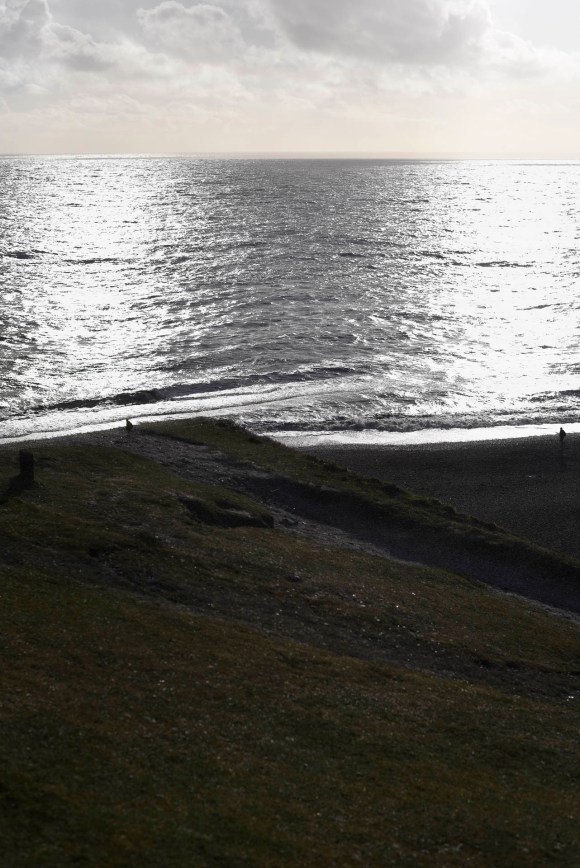
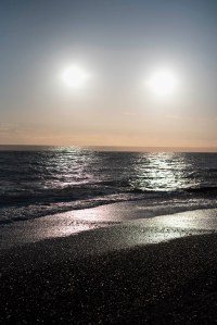
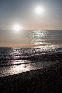
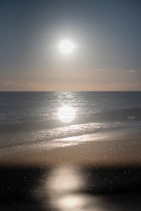
1 March 2020 – Cuckmere Haven & East Dean Village
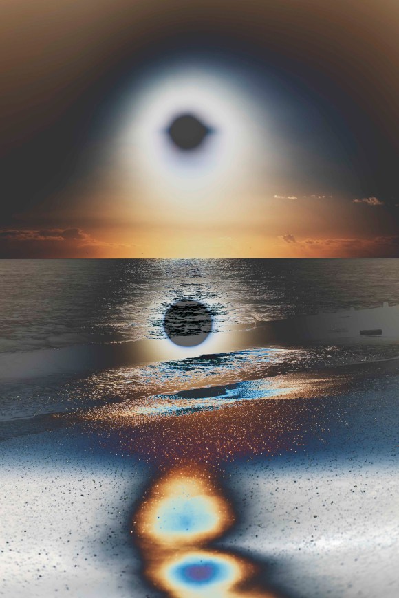
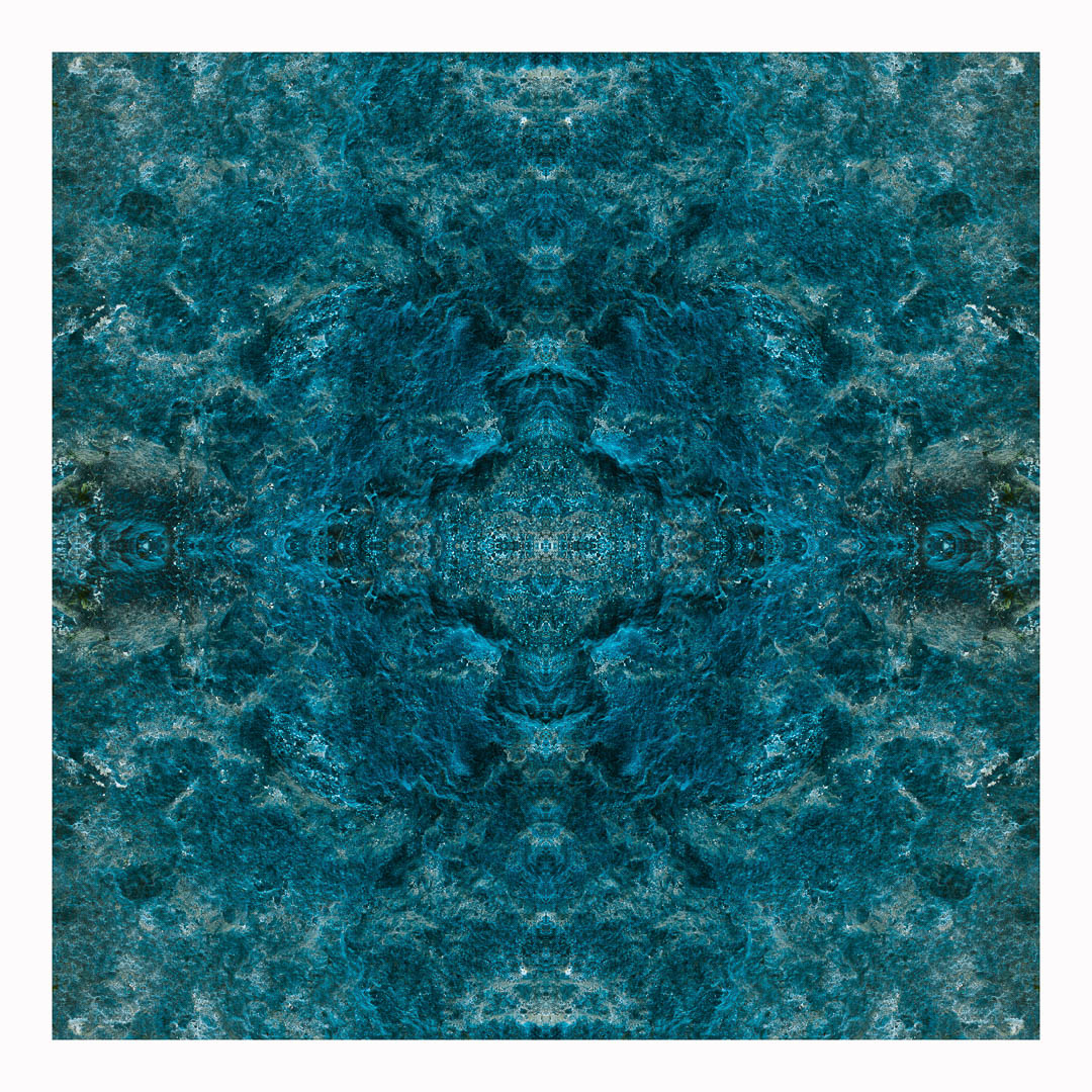
On a beautiful sunny, and very windy, afternoon, I visited Cuckmere Haven with my partner. This is one of my favourite spots near to Brighton and I have been there many times. The sunlight was quite harsh and there were lots of specular highlights on the waves. I knew that if I did take any photos, even with a polarising filter, the images wouldn’t be anything special. This is when I remembered the multiple exposure function on my Nikon D750. I had recently read a feature on the subject, so it seemed a good time to experiment. My previous work involving this technique was carried out using Adobe Photoshop, not with the camera on location.
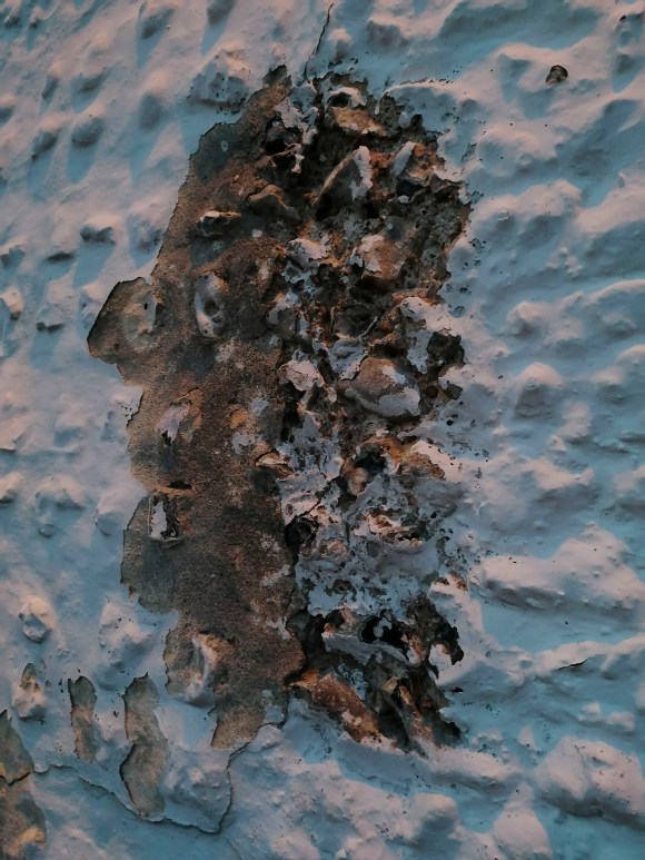
After a walk along the cliffs, we made our way to the village of East Dean. While sitting outside the Tiger Inn enjoying a well-earned drink, I spotted this on the wall outside.
This reminded me of a profile of an 18th-Century man resplendent in a wig from that time. While waiting for the bus, I noticed the light coming through the window in the shelter nearby.
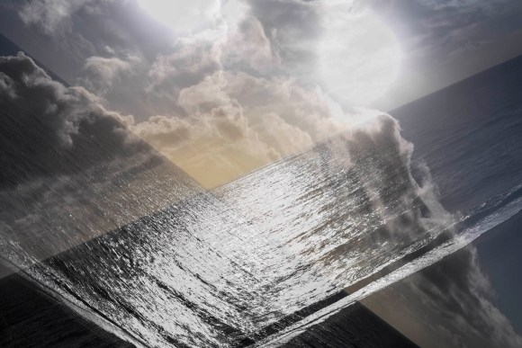
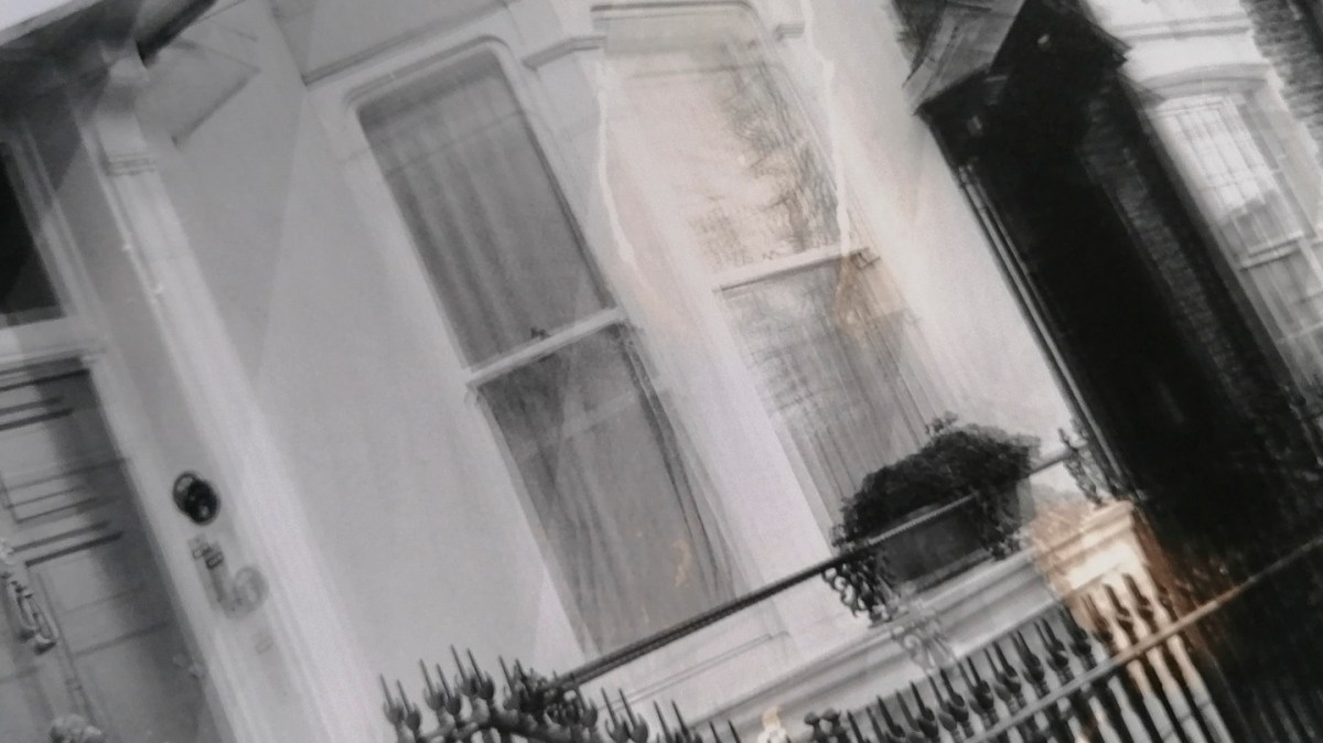
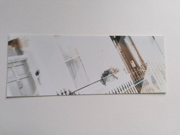
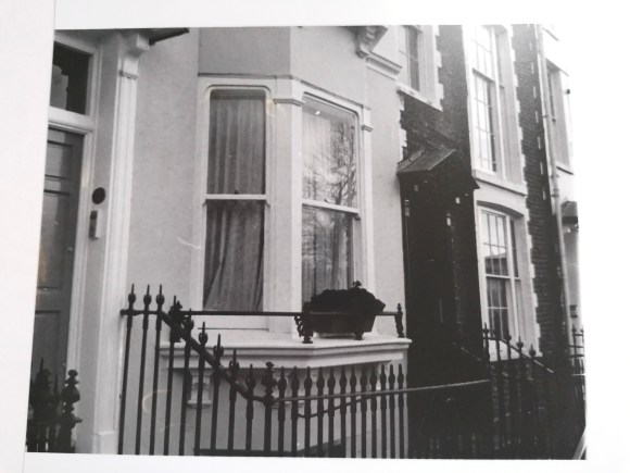
2 March 2020 – Brighton Beach Double Exposure
Inspired by my trip to Cuckmere, I continued experimenting with the double-exposure function.
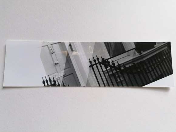
3 March 2020 – Brighton Beach Double Exposure
The light wasn’t as good as the previous evening but it was still worth capturing these shots.
Bushy Park Friday 6th March
After a morning visiting the British Surrealism exhibition at Dulwich Picture Gallery, I was again inspired to go to Bushy Park to see what I could find.
The recent rain had made a particular area extremely water-logged, so I was able to capture this image with my mobile phone.
It gave this image a very dreamy and surreal feeling. I also took the following double exposures using my DSLR camera.
For the seminar on Tuesday 17th March, the class was tasked to identify a current exhibition, upcoming artist-talk or event or potential interviewee that each student felt was pertinent to their own project. We would then need to bring to the session a short summary of the chosen influence. I had to be prepared to discuss how I think that I could engage with this in a way that makes it specifically useful, productive and relevant to my own research and practice.
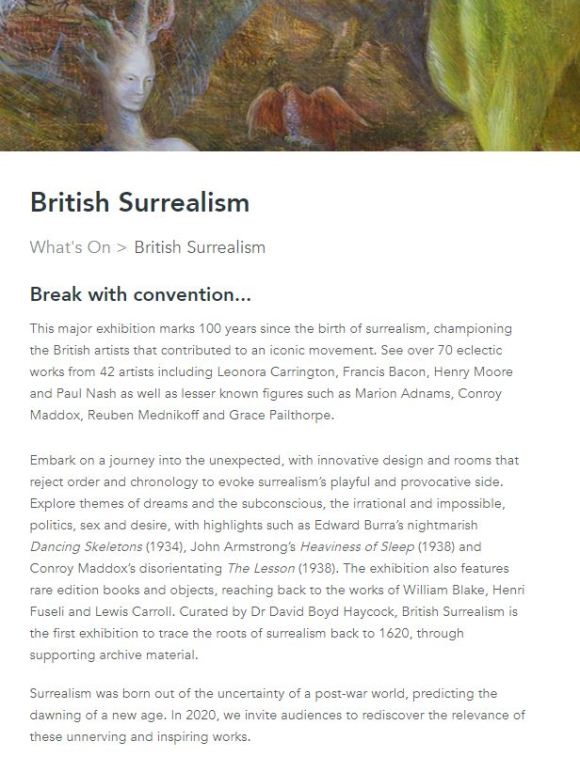
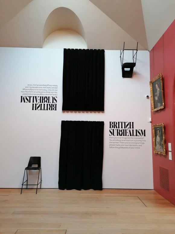
As I had started on a particular line of research focusing on surrealism, I was pleased to discover that the Dulwich Picture Library was currently holding a relevant exhibition. According to the gallery’s website (shown below), this major exhibition marked 100 years since the birth of surrealism, championing the British artists that contributed to an iconic movement.
As stated, the exhibition ‘features over 70 eclectic works from 42 artists including Leonora Carrington, Francis Bacon, Henry Moore, and Paul Nash.’ This is alongside pieces from lesser-known figures such as Marion Adnams, Conroy Maddox, Reuben Mednikoff and Grace Pailthorpe.
On the website, the exhibition invites and entices the visitor to ’embark on a journey into the unexpected, with innovative design and rooms that reject order and chronology to evoke surrealism’s playful and provocative side.’ Themes that will be explored are ‘dreams and the subconscious, the irrational and impossible, politics, sex and desire’.
With my interest piqued, I set off for my visit on Friday 6th March. I have to admit (somewhat shamefully) that I hadn’t visited this gallery previously and was quite looking forward to the experience.
The following isn’t a critical examination of the exhibition, but a record of my observations and how these could contribute to enhancing my Body of Work for this module and future projects.
The gallery itself is a beautiful building that was opened in 1817 and the world’s first gallery designed to display art for the public. The permanent displays feature a range of masterpieces by revered artists such as Gainsborough, Murillo, Canaletto, and Rembrandt. When wandering around the various rooms, it’s like being in a box of organic dark chocolates. The paintings on show bathed in natural light combined with the heady smell of the oil paint give the space a real sensory experience.
Before entering the surrealism exhibition, there was one painting that caught my eye.
The fact that each flower was painted at a different time, creating a non-existent bouquet, triggered a potential line of inquiry. Something to be considered?
However, as the purpose and focus of my visit was the British Surrealism exhibition, I made a pact with myself to return to the gallery another day in order to appreciate this space as it should be.
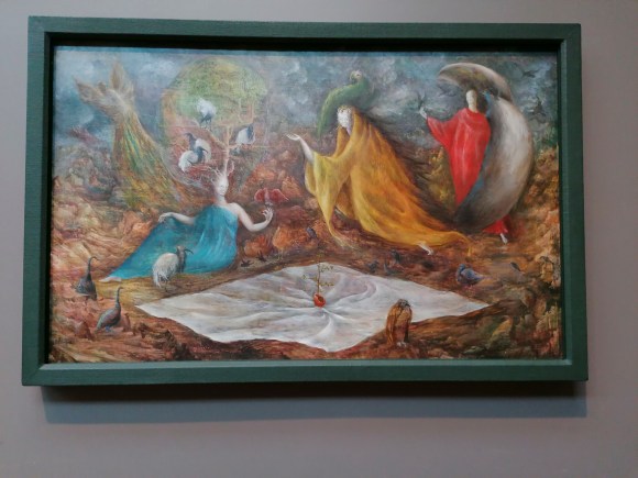
Before entering the exhibition itself, the visitor is teased by one of the more well-known surrealist paintings, The Pomps of the Subsoil by Lenora Carrington.
The Pomps of the Subsoil by Leonora Carrington, 1947. Oil on canvas, 58.5 x 93 cm
This painting depicts three figures surrounded by various bird-like creatures. There is a very dream-like feel to the painting – it does not appear ‘solid’ in comparison to the masterpieces in oil surrounding it. I suppose this could be thought of as a juxtaposition in itself, one of the main tenets of surrealism. When looking closer, the ‘birds’ have an ethereal, ghostly and translucent appearance.
The Pomps of the Subsoil by Leonora Carrington, 1947. Oil on canvas, 58.5 x 93 cm Detail 1
The Pomps of the Subsoil by Leonora Carrington, 1947. Oil on canvas, 58.5 x 93 cm Detail 2
The accompanying plate gave just enough of a teasing taste of what was to come.
The entrance to the exhibition itself was indeed surreal.
Ironically, I had already tried to access the exhibition via the exit. Maybe I should have started there?
I then entered into the first room via the black velvet curtain. To verify, it was the one closest to the floor. I think a staircase leading up to the one above may have been taking one surrealist twist too far.
As with the majority of exhibitions I’ve attended during my studies, there were the obligatory (and essential) wall explanations. These gave succinct introductions to aspects of surrealism explained in plain English. Very helpful for future reference.
British Surrealism Room Info 1
British Surrealism Room Info 2
British Surrealism Room Info 3
British Surrealism Room Info 4
British Surrealism Room Info 5
British Surrealism Room Info 6
British Surrealism Room Info 7
The work on display was quite varied.
rbt
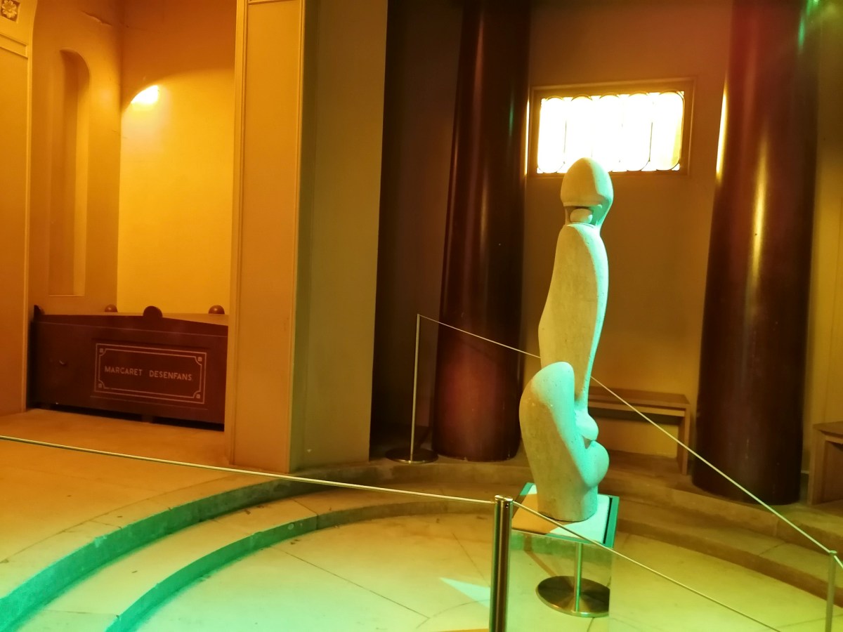
The piece of work that I took my time appreciating was F.E. McWilliam’s sculpture ‘Spanish Head (1938-39 Hopton Wood Stone).
This beguiling statue was placed in the Mausoleum within the gallery and bathed in an eery green light.
There were also prints and paintings that were considered to have influenced the surrealist art movement.
This slideshow requires JavaScript.
I had hoped that there would be more photography included in this exhibition. Whether it was due to a lack of British surrealist photography available or the fact that this gallery focuses on non-photographic art, I wasn’t sure at this stage. The only one on display was taken by Roland Penrose (husband of American photographer, Lee Miller).
Four Women Asleep, Lambe Creek, Cornwall, England 1937 Modern C-type exhibition print
This photograph features four of the key women connected to surrealism. Going from left to right, this depicts Lee Miller; the Guadelopian model Adrienne Fidelin; the English artist Leonara Carrington; and the French artist and performer Nusch Éluard.
With the above in mind, my next step was to extrapolate what makes this exhibition specifically useful, productive and relevant to my own research and practice.
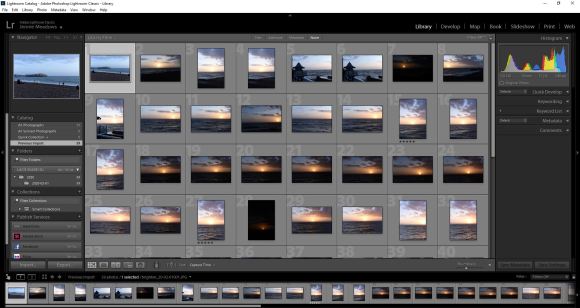
Two further workshops as part of the MA Photography course were Adobe Photoshop and Adobe Lightroom Classic.
Adobe Photoshop Workshop
I was already quite familiar with Adobe Photoshop, having first used it back in 1998 and during my previous studies and photographic work. The programme is an essential element of digital photography. However, despite its extensive capacity for editing and manipulating images, it can be over-complicated and downright frustrating. The other main aspect of Adobe Photoshop is that there is always more than one way to get a result.
During the workshop, Simon introduced the class to a range of the programme’s functions, starting with the basics and taking us through the main functions. One of the functions that Simon outlined was ‘Curves’. This is a function I currently use in Adobe Camera Raw to create my colour digital negatives, but not in Photoshop. As I explained in the post outlining the Preparation for Digital Printing Workshop, my current workflow is to prepare and edit the images as much in Adobe Camera Raw then use Adobe Photoshop for the final touches and manipulation. It was interesting to see the effect I could achieve using the Curves in Photoshop.
For this quick experiment, I selected one of the double exposure sunset shots. The original is on the left, the adjusted one is on the right.
This was the setting that I used to create the solarising effect.
Interesting – something to keep in mind and experiment with further. As with all digital manipulation, it can be quite tempting just to add an effect because you can. As my HNC tutor, Ria, drummed into me during my course, there has to be a darn good reason for changing an image – don’t just focus on surface or aesthetics.
Adobe Lightroom Classic
This is a programme that I am aware of and have access to, but have never used as part of my workflow. According to Adobe, it is ‘the essential tool for organizing, editing, and sharing your photography.’ Simon explained it was a mix of Adobe Camera Raw and Adobe Photoshop. He also outlined that, unlike the latter (which is a combination of functions that have just been added to and adapted over the years) Lightroom Classic was created in a logical way.
I have to admit that the workshop was a bit of a blur for me, as this type of lesson doesn’t suit my kinesthetically learning style. I’ve also developed a workflow in processing my digital images over the last four years that I have got used to. Maybe it is time to try something new and, potentially, more effective and efficient. This will have to be addressed and assessed over the coming months.
As with all Adobe applications, there are online tutorials for both of these applications. I have found these to be very useful in the past. Now is the time to revisit them.
One of the facilities within the Photography department is the Print Bureau. This on-site amenity means that students have access to digital printers and are able to process images without outsourcing. An introduction to these facilities and other aspects of digital printing was covered by Simon, one of the Photography department’s technicians.
The first thing that Simon explained to the class was scanning negatives. The department has two types of scanners that all of the photography students can use. I have to admit that it wouldn’t be something that I would use considering my work is entirely digital and I don’t use or have any film negatives. However, it is a facility that a lot of the students working in analogue who need to digitise negatives or slides would find useful.
Simon then went through the process of preparing a digital file for printing. This was familiar territory to me as this is something I’ve worked on over the last four years, so it was a great opportunity to refine my printing knowledge further.
The first aspect was checking the colour settings in the applications used. Simon recommended changing these to ‘Europe Prepress 3’, which would ensure that the printing colour profile would match the industry setting. In turn, this makes sure the prints result in being the same colour as intended. The applications to which this applies when printing digital photos are Adobe Bridge and Photoshop.
The other aspect was not to change the colour settings of the monitors in the Photography department. This large bank of screens had all been checked with a colorimeter. This is a monitor calibration tool that fits on the screen then fires a selection of colours at it. This results in any discrepancies being detected and the computer programmed to compensate for any of the monitor’s colour inaccuracy.
One issue I have encountered when printing is the difference between what is seen on screen and on the final printed sheet. This tool removes that difference, which in turn saves a lot of time, stress and money. At the time of writing, it was something I knew I had to add to my equipment list. I spend a lot of time editing and working on images at home. If I want to improve my skills, perform in a more professional way and raise the quality of my images, this is essential.
Simon continued explaining colour printing principles to the class, including colour theory, dpi considerations and setting up files for printing in Adobe Photoshop. This is different from my particular workflow as I generally prepare my digital files initially in Adobe Camera Raw. It was useful to see it from a different perspective. Simon also explained that it is best to save a file as a TIF to send to the printers. This is something that I do for my final prints, regardless of whether it is a Camera Raw-processed file or a Photoshop one.
After preparing a file for printing, I had the opportunity to print one of my images using the bureau. The image I chose was this one. The reason being, it that I have previously printed the same one using both c-type gloss and pearl papers. I wanted to see how it looked digitally printed using Paper Rag, a fine-art printing paper.
This is the original digital image.
As the image was being printed on A4 and the original is 10″ x 10″, I had to change the size of the image. A4 is 8.27″ x 11.69″ so it had to be smaller than this and allow for a border. I will need to double-check which other sizes are available when preparing prints. I’m used to printing with set sizes on a 2:3 ratio in inches. This is because I tend to shoot with my camera’s sensor setting size, which is 4016 x 6016 pixels.
I was very pleased with the result.
The paper really suited the image and I would be more than happy framing this. Also, the cost of the print £3.50, which is reasonable compared to the pricing of other print bureaus I regularly use. As for turnaround, the general time for these prints is 72 hours. This is the maximum time and will be less during quieter periods.
The additional option available is to print on acetate sheets. This means I could create my own negatives digitally, which could then be processed in the darkroom. I could also use them in a process such as cyanotype, a method I have carried out previously:
With a refresher on printing plus the introduction to the university’s printing facilities, it reminded me how much I do know about the whole process in relation to digital photography. After my slight frustration with my gaps of knowledge in regards to analogue, my confidence in my abilities returned.
A further workshop as part of the course was an introduction to the studios and lighting systems. This was carried out by Mark, the ever-helpful and knowledgable Photography Head Technician. As I was already familiar with studio photography, it was great to get a detailed overview of what was available.
The University of Brighton’s School of Media has three studios within the Photography and Moving Image department. These are situated in the Edward Street Building. There are two large studios ideal for shoots involving people or large sets. Both of these studios have black and white background rolls and a frame that can be used for your own backdrops. Also available are a selection of plinths and a red sofa.
With regards to lighting, one has lights set on tripods and the other has pentagraphs that can be used in a classic four-light formation. Also available is a selection of studio lighting accessories such as softboxes, reflectors, umbrellas, bouncers and coloured gels.
There is a further small studio with a plinth featuring an infinity curve, which makes it ideal for smaller, still-life shoots. Each studio features a Hasselblad digital camera on a fixed studio mono stand. Also in each studio, there is a large screen Mac, which can be tethered to the camera for instant results. Quite handy for test shots when shooting on film. Also, this could be used if I didn’t have access to my DSLR or if I had a double-aspect shoot planned.
I wasn’t sure at this stage whether I would be using these facilities, but it was reassuring they are there if needed. Also, there are technicians on hand if any additional help is required with regards to setting up and using the studios and associated equipment.
The workshop also prompted me to revisit my notes on studio lighting made during my HNC module focusing on portrait photography.
On Tuesday 18th February, the class had a seminar with Xavier and Fergus. The focus of the seminar was:
Writing and Managing Proposals
Artist Statements
Contexts
References
Resources
Planning
Time Management
During the seminar, the class discussed various strategies for writing and managing formal written proposals, and how to present clear, in-depth and focused proposals that support, promote, and clarify photographic work for both myself and others.
The class considered questions such as:
What is the function of a proposal and an artist statement?
What is my specific idea, and how can I express it clearly?
What is fundamental/central to my project and how can I emphasise this?
What is the context of my work – specifically within the field of photography (both historical and contemporary), as well as within other fields?
What are my references (visual, conceptual and/or otherwise)?
How can I plan and manage my time effectively to serve both the intellectual and the creative process?
What makes a good artist statement?
The following is an outline of the presented considerations for my reference:
Proposals
Outline intentions
Describe wider concerns
Focus thinking
Assist initiating work
Artist Statements
Introduce practice
Articulate concerns, motivations, processes
Support interpretation by others
Can be adapted and used for various applications/opportunities
Enhance ongoing reflection
Acknowledge development
Volume
Purpose
Adaptation and expansion
Draw upon tutorial notes and discussions with peers
The seminar task was to find an artist statement, exhibition press release or photographer’s proposal and prepare a short, informal, 5 to 10-minute presentation (for discussion purposes) that considered the clarity, effectiveness and supportive role of this text, specifically in relation to the work at hand.
This was my presentation. I had recently visited the Dora Maar exhibition at Tate Modern. This was, in my opinion, a very strong example of a clear and effective exhibition description.
As part of the MA Photography course, the class had two darkroom workshops, one Black and White, the other Colour.
I was quite excited to try out the extensive darkroom facilities at the University of Brighton. The facilities at RHACC consisted of what appeared to be a broom cupboard painted with white walls. The only time I used during my four years at the college was to wash a cyanotype print. Also, the last time I had developed a photographic print was about 25 years ago. Apart from a brief foray into blueprinting, my photographic work since then has solely been digital.
In preparation for the workshops, I bought The Darkroom Handbook by Michael Langford. Published in 1981, it covers all the basics of processing, printing and manipulative techniques.
At the time of my initial reading of this book, I already knew how to recreate a lot of the effects within this book digitally. It was great having a reference to how these could be achieved using the original analogue techniques and technology.
Black & White Darkroom Workshop
The first workshop on Tuesday 11th February focused on Black & White printing. This was so the class could get to grips with the basics. Mark, the Photography department’s Head Technician, took us through the process of Black & White printing. This introduction involved an orientation of the whole darkroom area and the printing process from start to end, plus all of the Health & Safety aspects. After this initial introduction, the class took a negative (either their own or borrowed) to process themselves. This is when I realised my lack of analogue photographic knowledge which made me more determined to get to grips with darkroom printing. It also was a great opportunity to recognise the differences between digital printing as well as the pros and cons of both.
I won’t outline the whole process here, but this my initial test strip result. Not the most fantastic of prints, but it taught me a lot.
The first thing learned was the importance of using the test stip to calculate the correct exposure time. Also, how essential it is to leave the paper to ‘fix’ long enough so the print does not result in an unintentional sepia tone (as seen above).
When it came to printing a larger version, I also learned that it’s essential to ensure that either the negative or the paper are not moved in any way. Otherwise, it results in a double image (as shown below).
I have to admit that it did take me the whole three-hour session to get to this stage. It does take me a while to get to grips with a new way of working and process the information. I learn best kinesthetically, which means I have to physically repeat a process several times in order to both understand it and carry it out myself. As such, I returned to the darkroom on Monday 17th February for another printing session.
This was the resulting test strip.
These were the resulting prints.
Not the best, but it was a good reminder of ‘practice makes perfect’.
Colour Darkroom Workshop
On Tuesday 18th February, the class attended the Colour Darkroom Workshop. This both had similarities and differences to the Black & White one the previous week. The similar aspects were the use of the negative and setting up the enlarger. The main differences were not being able to use any light when taking the photographic paper out of the black bag before exposure plus the use of a machine for printing rather than the developing, fixing and washing trays.
For this introduction to this type of colour printing, I borrowed one of my classmate’s negatives.
Again, I’m not going to note the whole process, but this I what I learned.
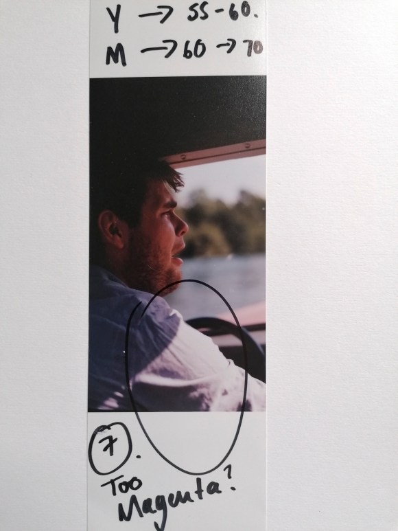
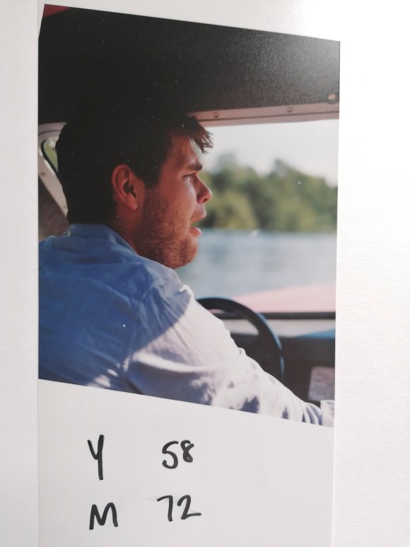
Firstly, it’s very easy to put the photographic paper with the emulsion side facing down on the masking frame. Which explains why the following two prints were the other way round.
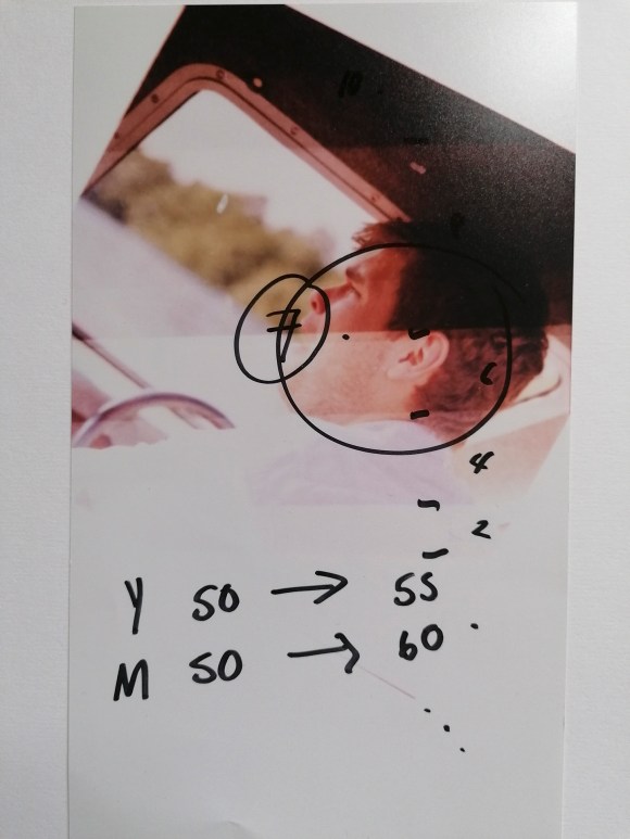
Secondly, the colour tone of the print image can be changed by either increasing or decreasing the three primary print colours: Yellow, Magenta and Cyan.
It takes a combination of numbers, colours and looking under a neutral light to get the right tone.
Again, it would have helped if I had the paper the right way round for this final print.
The main thing I did learn is that by using the colour enlargers, a richer contrast can be created using Black & White prints. A bit like split toning in Adobe Camera Raw or Photoshop.
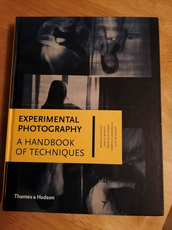
At this stage, I wasn’t sure if I would involve analogue processing in my work. However, there was a nagging feeling that I could use this at a later stage. I do have a strong interest in cameraless techniques and effects. I also know how to create my own negatives digitally. My first introduction to the darkroom involved making photograms when I was at primary school and that experience has always stuck with me. A book that I started reading at the same time as the one above is Experimental Photography: A Handbook of Techniques by Marco Antonini, Sergio Miniti, Fransicso Gómez, Gabriele Lungarella and Luca Bendandi.
This inspiring book features a wide range of alternative techniques including cameraless, making one’s own cameras, operative hacks plus print and post-print experimentation. Again, lots more to be considered at this stage.
What I did take away from these two sessions is that it highlighted where my gaps in photographic knowledge laid. Also, I shouldn’t be too hard on myself that I didn’t understand the analogue processes as much as digital. Looking at how I used to take and process my digital images when I started compared to what I do now, it reminded me of the time, effort, mistakes and sheer hard work it took to me to get to my current stage. I also realised that this knowledge and experience could, and should, be applied to my work going forward.
A further useful tool I was introduced to during my HNC is SWOT analysis. This tool helps in defining and understanding one’s specialist areas and the opportunities available. This analysis also assists in identifying and mapping one’s own qualities and skills.
A SWOT analysis is commonly used in the professional world to evaluate the past, present and future position of a company. A personal SWOT analysis can do the same for an individual in pursuit of their career goals. By using this tool, I could get a new perspective on what I can do well, where my challenges lie and which avenues I should pursue.
The four categories within a SWOT analysis are:
Strengths
Weaknesses
Opportunities
Threats
This was my SWOT analysis for this module as of 5th March 2020, developed from the original one I formulated on 9th February. Due to the current global situation, this is not a complete list and will be amended when necessary for my reference.
One of the aims of this unit is for me to identify the key elements of my own creative practice. While trying to work out the direction in which I would take in producing the Body of Work required, I realised I had to identify these elements that have influenced me so far.
Having spent the last four years developing my work and creativity, I knew I had to note and recognise what made me the photographer and artist I am at this stage. I also recognised that this module was the opportunity to develop the particular techniques I’ve honed so far in order to create a new body of work. As I’ve discovered, it gives a new project a much stronger foundation rather than starting from scratch.
A useful tool that I had encountered during my HNC was the SCAMPER technique, an idea generation process that utilises action verbs as stimuli. It is a well-known type of checklist developed by Bob Eberie that assists the person in coming up with ideas either for modifications that can be made on an existing product or for making a new product. SCAMPER is an acronym with each letter standing in for an action verb which in turn stands for a prompt for creative ideas. For a full explanation, go to