Unfortunately, the prints ordered via DS Colour Labs on 10 December 2020 arrived after my 1-1 tutorial with Åsa. This meant I was unable to show them and discuss these during this tutorial on the 16 December 2020. Despite this, it did give me a much better idea as to how the printing process affected the images.
In general, both the Black & White and colour Pearl C-Prints were ok, but I don’t think they did justice to the images themselves. The sheen on the prints ‘flattened’ the details compared to how they appeared on screen.
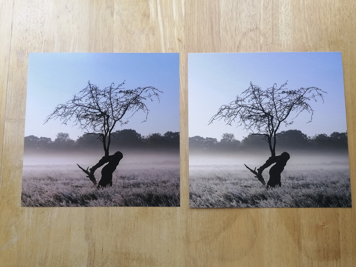
8″ x 8″ Prints
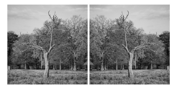
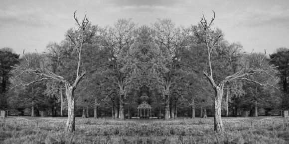
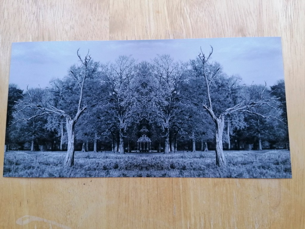
These are two of the original images next to the Pearl C-Prints.


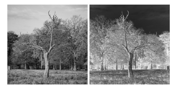
The difference the substrate makes is marked when comparing the Pearl C-Print with Hahnemuhle Photo Rag 308.

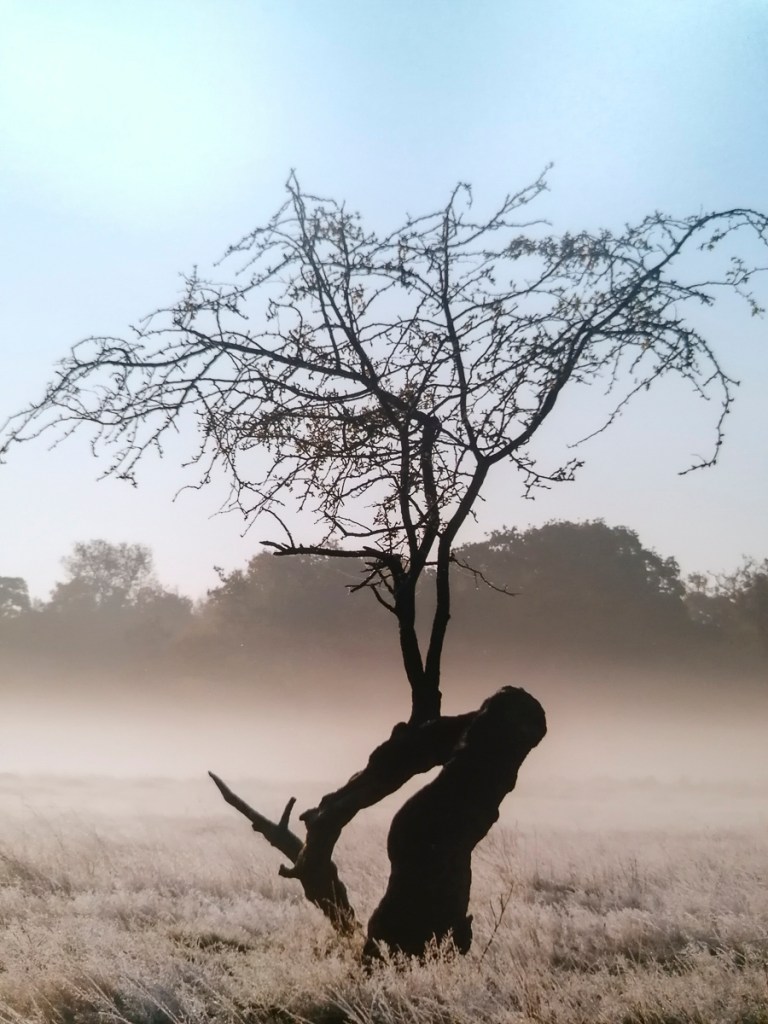
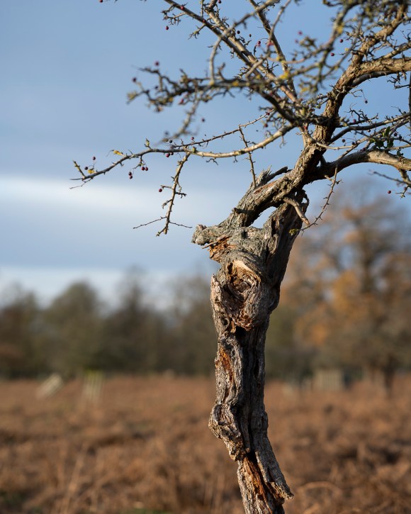
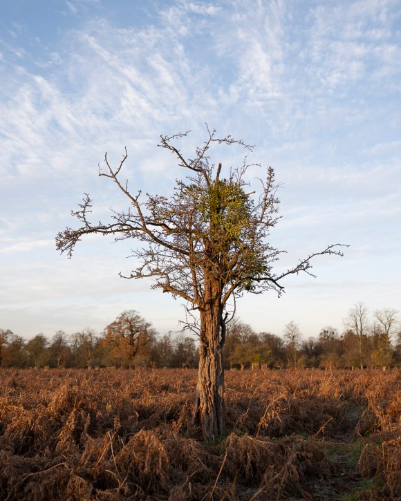
Original JPG 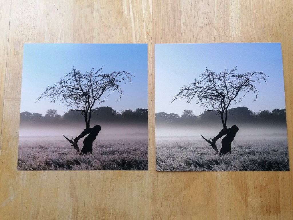
Pearl C-Print on Left, Hahnemuhle Photo Rag 308 on Right
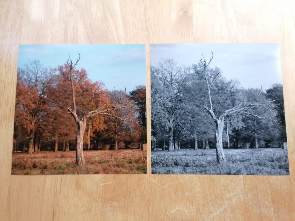
The following images are close-up comparisons. For, me the fine art print paper gives the image a texture that creates an artistic effect rather than provide a ‘documentation’ of a tree and its environment.
Pearl C-Print 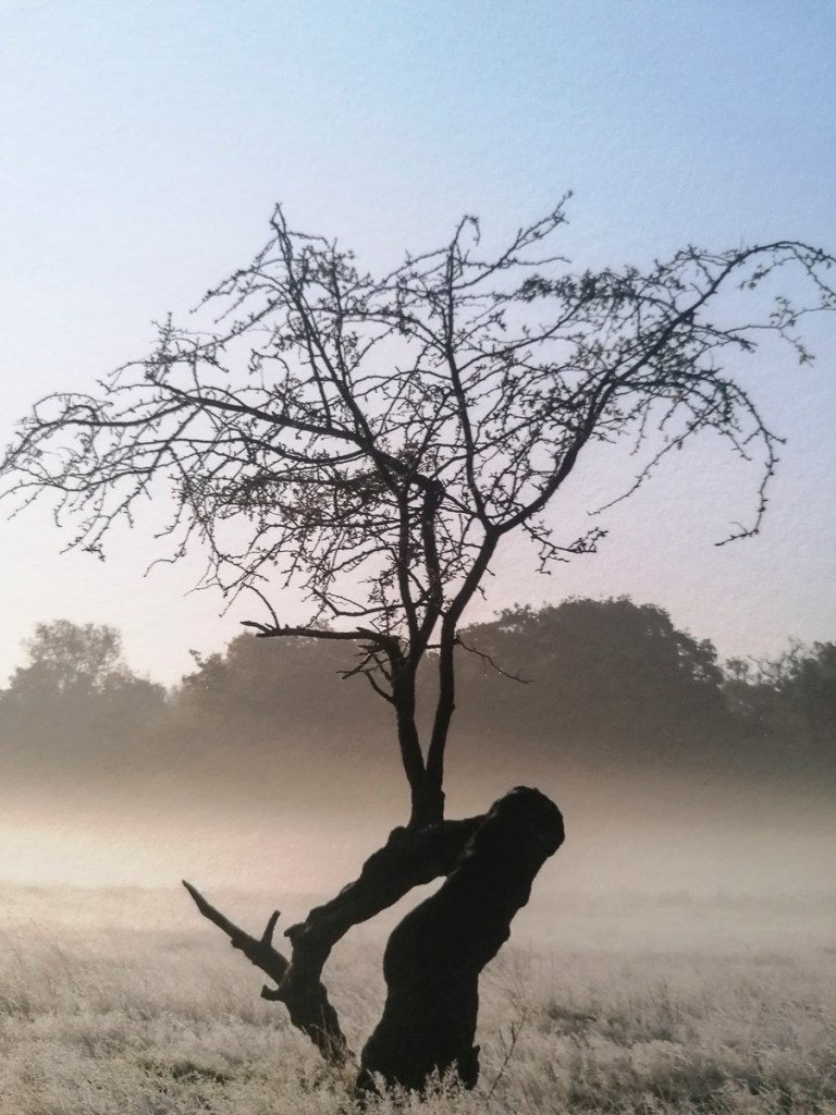
Hahnemuhle Photo Rag 308 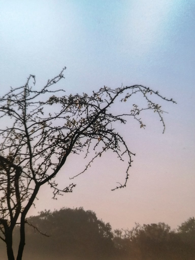
Pearl C-Print 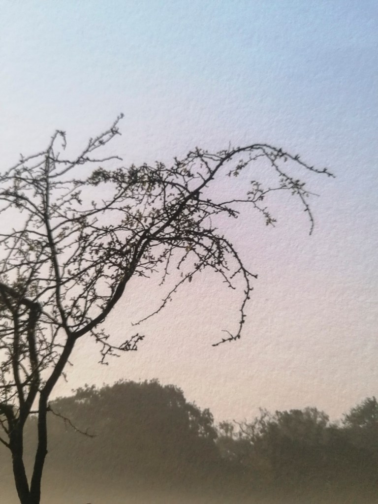
Hahnemuhle Photo Rag 308
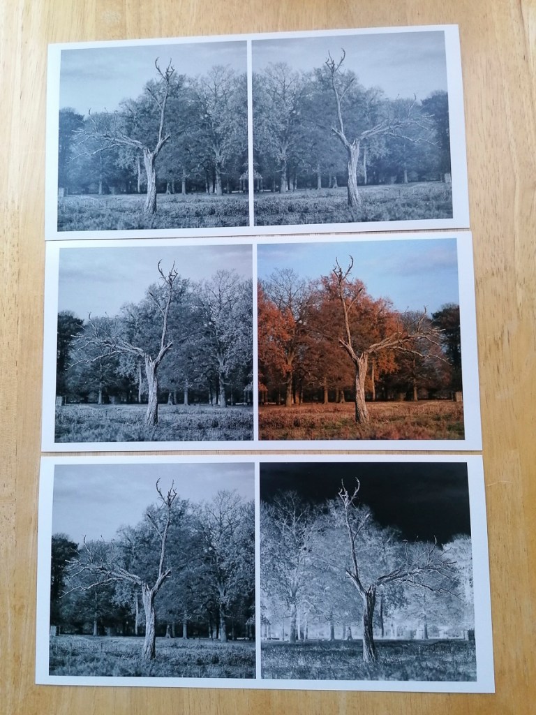
10″ x 8″ Prints
JPG 
JPG 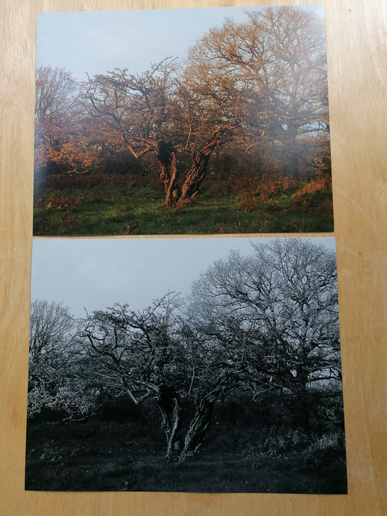
Pearl C-Prints
JPG 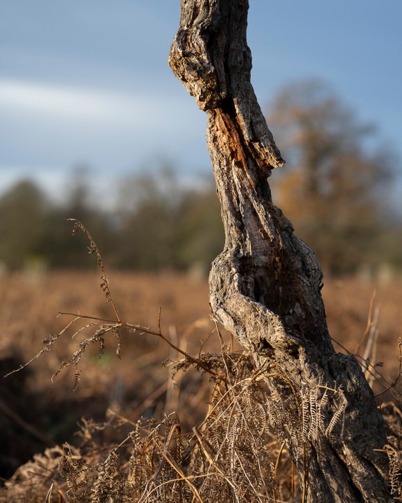
JPG 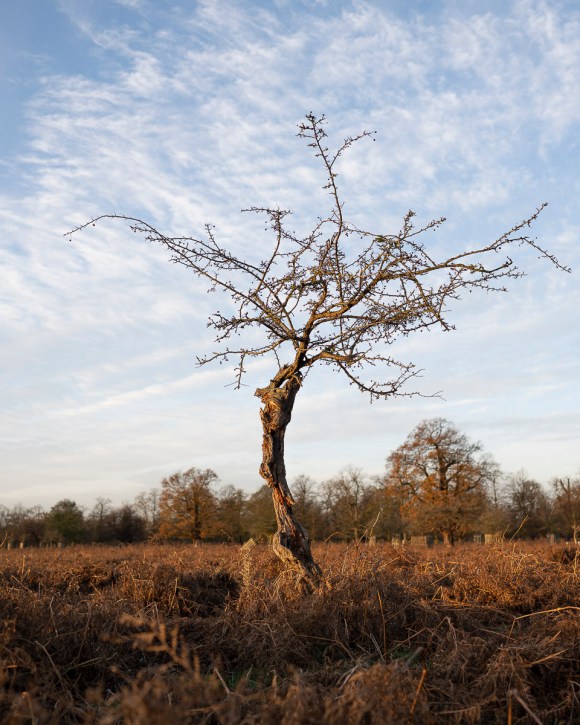
JPG 
JPG 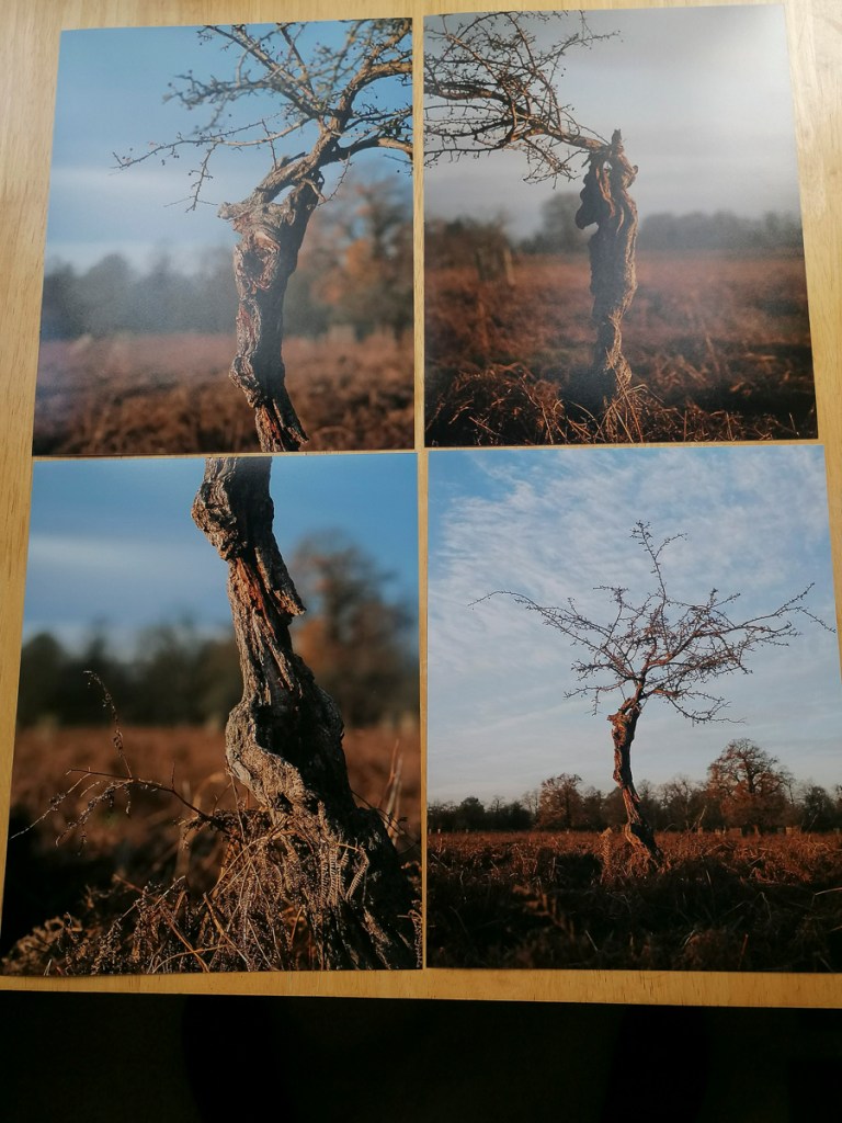
Pearl C-Prints
JPG 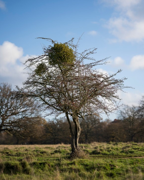
JPG 
JPG 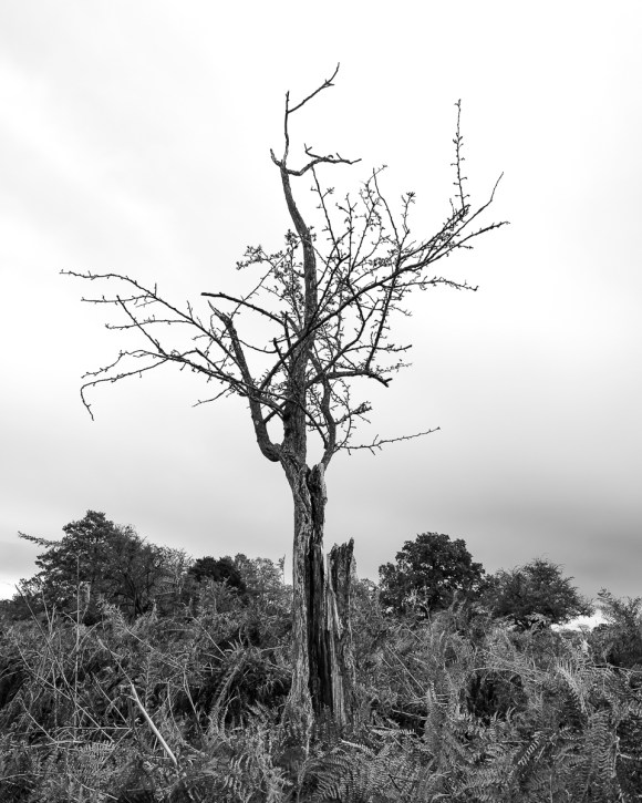
JPG 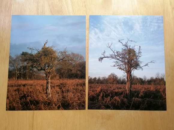
Pearl C-Print 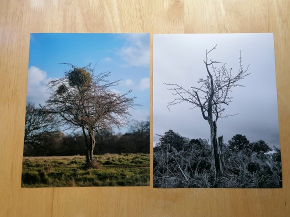
Pearl C-Print

JPG JPG Revised 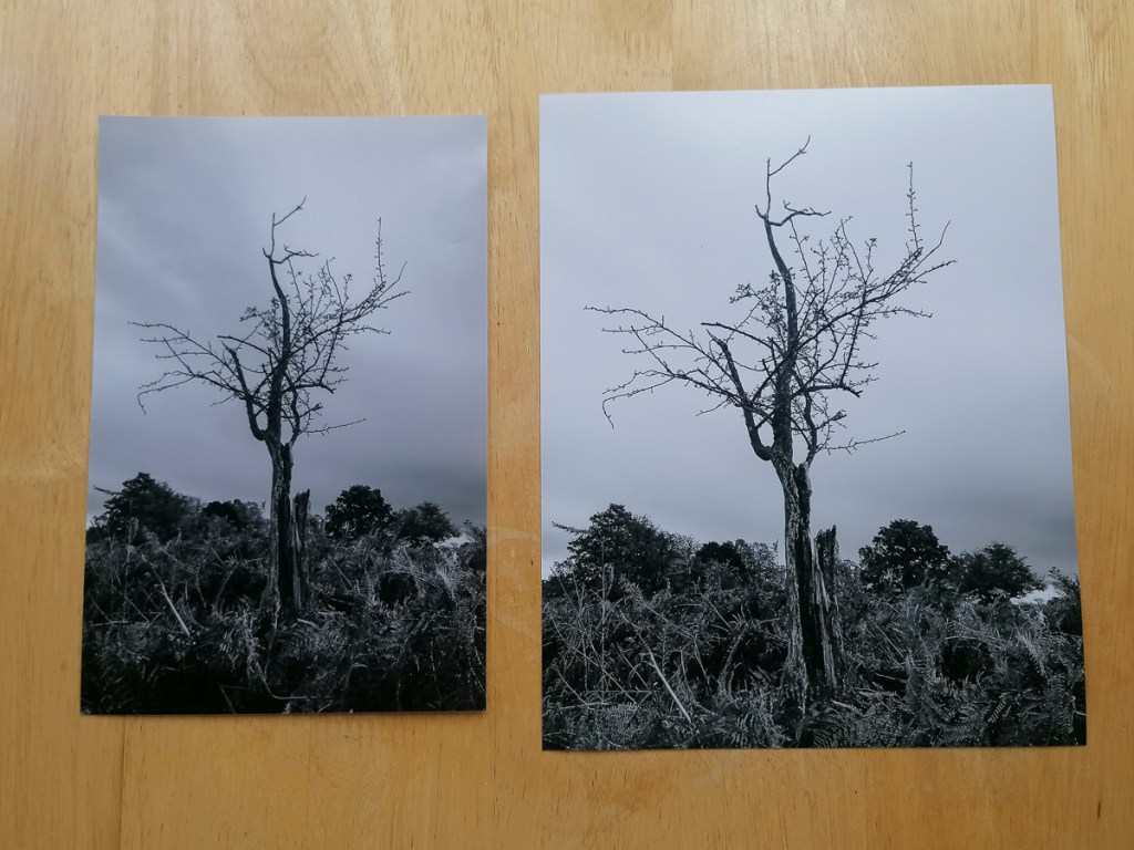
JPG Comparison
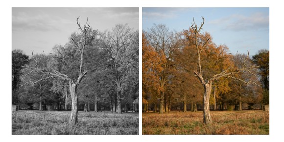
As with the Hahnemuhle Photo Rag 308, the following shows the differences between the Pearl C-Print and fine art paper – Hahnemuhle German Etching 310.
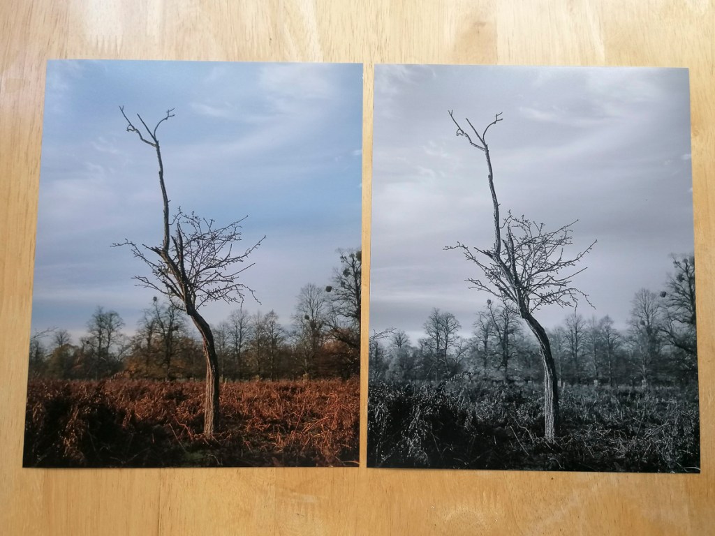
Pearl C-Print Colour and B&W 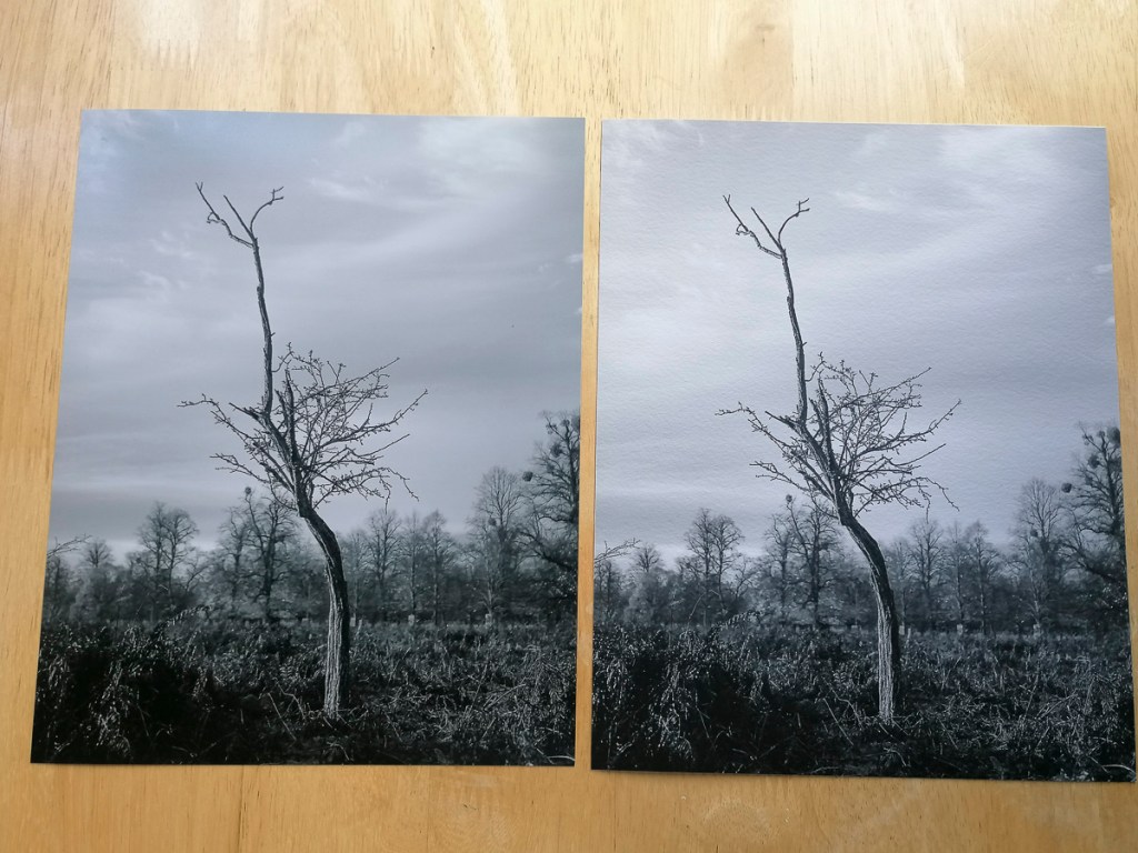
Pearl C-Print & Hahnemuhle German Etching 310 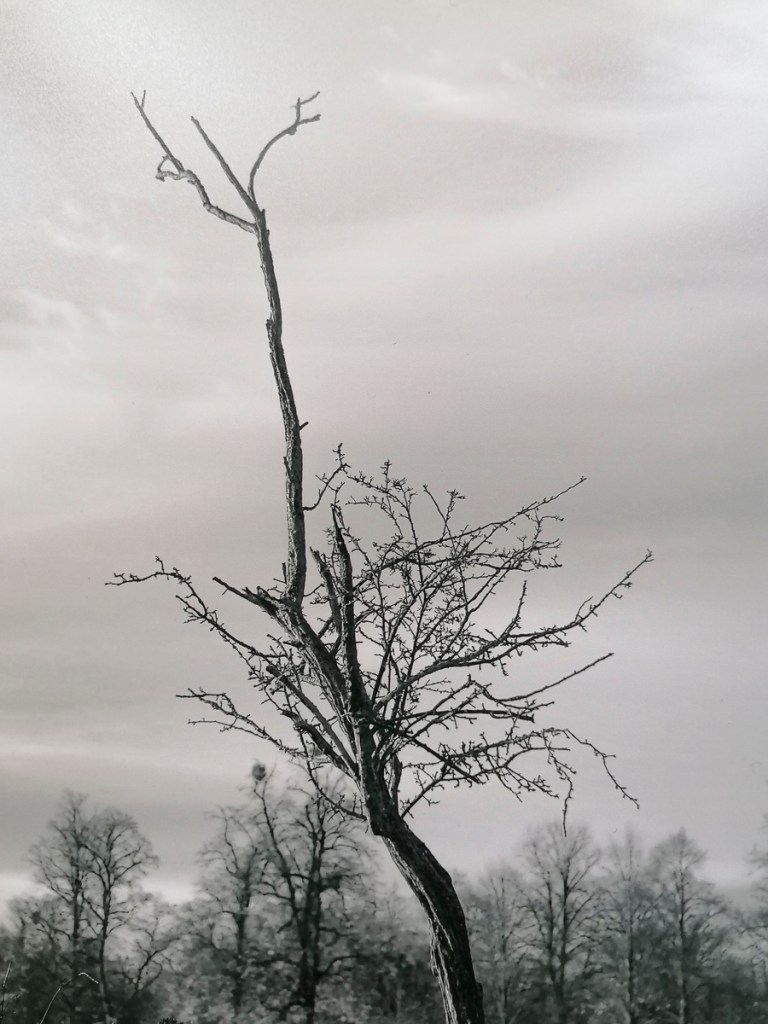
Pearl C-Print 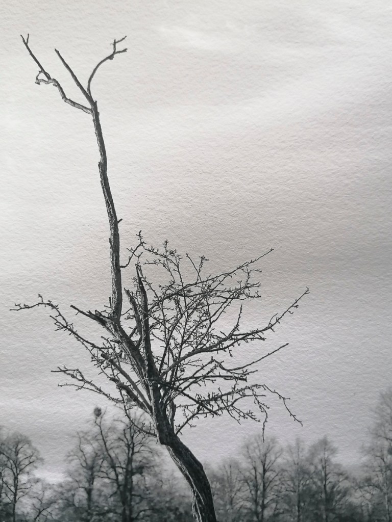
Hahnemuhle German Etching 310 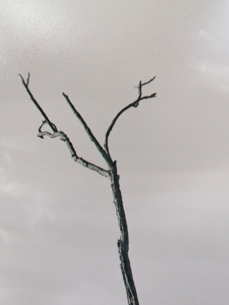
Pearl C-Print 
Hahnemuhle German Etching 310
10″ x 5″ Prints
Again, the Pearl C-Print was disappointing. I do prefer the adjoined image rather than having the split in the middle. However, I do still like the pairing of the negative and positive images.
Going forwards, I would need to work out the best way of printing and presenting the final Body of Work. This would involve researching which fine art printing and/or framing bureau would be able to produce exactly what I would want.
