As part of the MA Photography course, the class had two darkroom workshops, one Black and White, the other Colour.
I was quite excited to try out the extensive darkroom facilities at the University of Brighton. The facilities at RHACC consisted of what appeared to be a broom cupboard painted with white walls. The only time I used during my four years at the college was to wash a cyanotype print. Also, the last time I had developed a photographic print was about 25 years ago. Apart from a brief foray into blueprinting, my photographic work since then has solely been digital.
In preparation for the workshops, I bought The Darkroom Handbook by Michael Langford. Published in 1981, it covers all the basics of processing, printing and manipulative techniques.

At the time of my initial reading of this book, I already knew how to recreate a lot of the effects within this book digitally. It was great having a reference to how these could be achieved using the original analogue techniques and technology.
Black & White Darkroom Workshop
The first workshop on Tuesday 11th February focused on Black & White printing. This was so the class could get to grips with the basics. Mark, the Photography department’s Head Technician, took us through the process of Black & White printing. This introduction involved an orientation of the whole darkroom area and the printing process from start to end, plus all of the Health & Safety aspects. After this initial introduction, the class took a negative (either their own or borrowed) to process themselves. This is when I realised my lack of analogue photographic knowledge which made me more determined to get to grips with darkroom printing. It also was a great opportunity to recognise the differences between digital printing as well as the pros and cons of both.
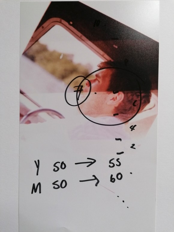
I won’t outline the whole process here, but this my initial test strip result. Not the most fantastic of prints, but it taught me a lot.
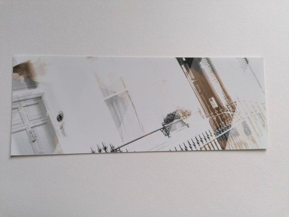
The first thing learned was the importance of using the test stip to calculate the correct exposure time. Also, how essential it is to leave the paper to ‘fix’ long enough so the print does not result in an unintentional sepia tone (as seen above).
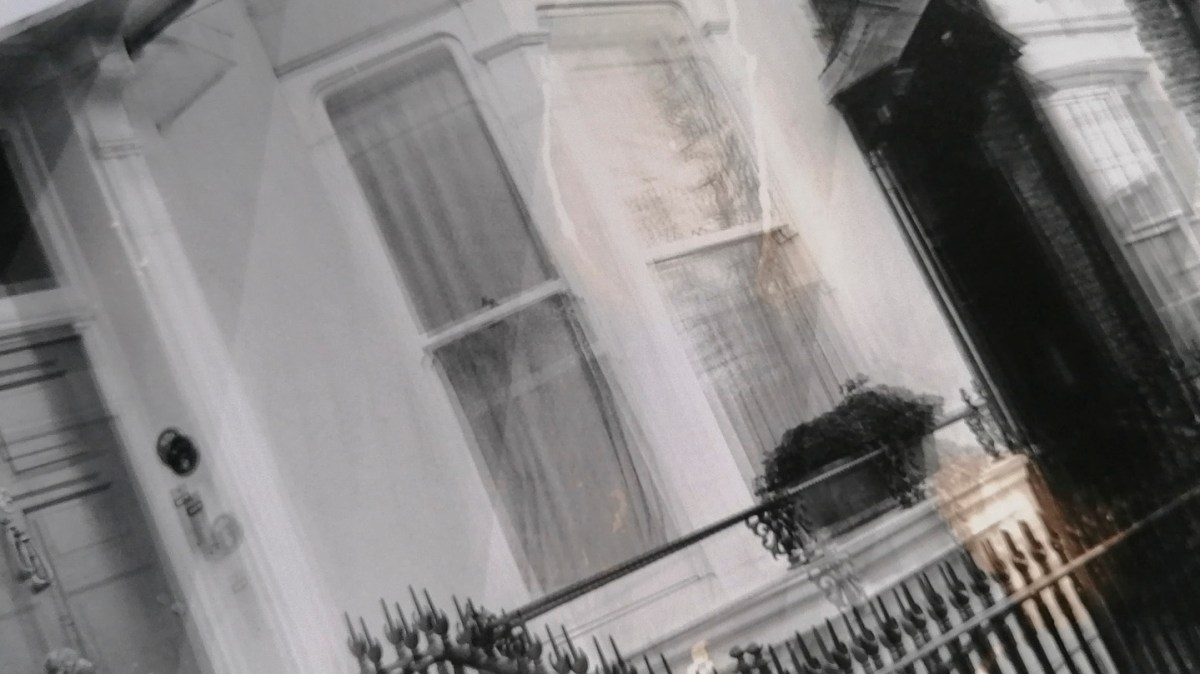
When it came to printing a larger version, I also learned that it’s essential to ensure that either the negative or the paper are not moved in any way. Otherwise, it results in a double image (as shown below).


I have to admit that it did take me the whole three-hour session to get to this stage. It does take me a while to get to grips with a new way of working and process the information. I learn best kinesthetically, which means I have to physically repeat a process several times in order to both understand it and carry it out myself. As such, I returned to the darkroom on Monday 17th February for another printing session.
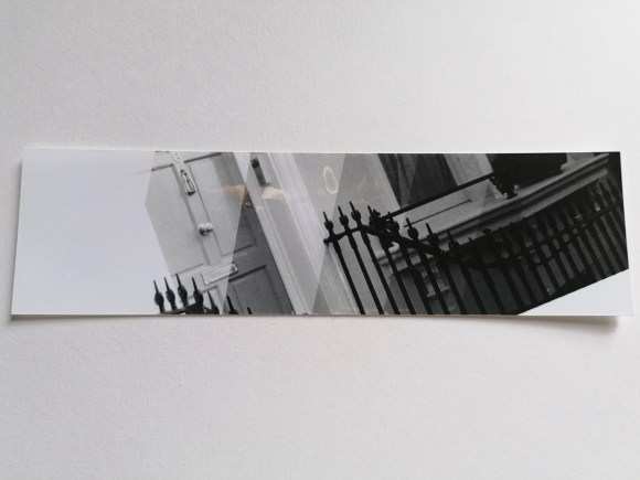
This was the resulting test strip.
These were the resulting prints.
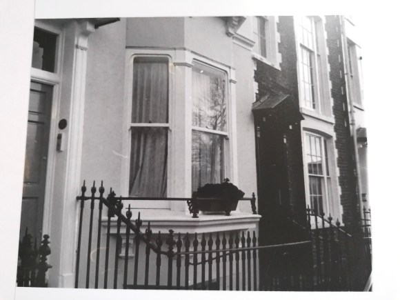
Not the best, but it was a good reminder of ‘practice makes perfect’.
Colour Darkroom Workshop
On Tuesday 18th February, the class attended the Colour Darkroom Workshop. This both had similarities and differences to the Black & White one the previous week. The similar aspects were the use of the negative and setting up the enlarger. The main differences were not being able to use any light when taking the photographic paper out of the black bag before exposure plus the use of a machine for printing rather than the developing, fixing and washing trays.
For this introduction to this type of colour printing, I borrowed one of my classmate’s negatives.
Again, I’m not going to note the whole process, but this I what I learned.
Firstly, it’s very easy to put the photographic paper with the emulsion side facing down on the masking frame. Which explains why the following two prints were the other way round.
Secondly, the colour tone of the print image can be changed by either increasing or decreasing the three primary print colours: Yellow, Magenta and Cyan.
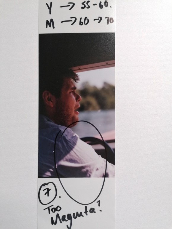
It takes a combination of numbers, colours and looking under a neutral light to get the right tone.

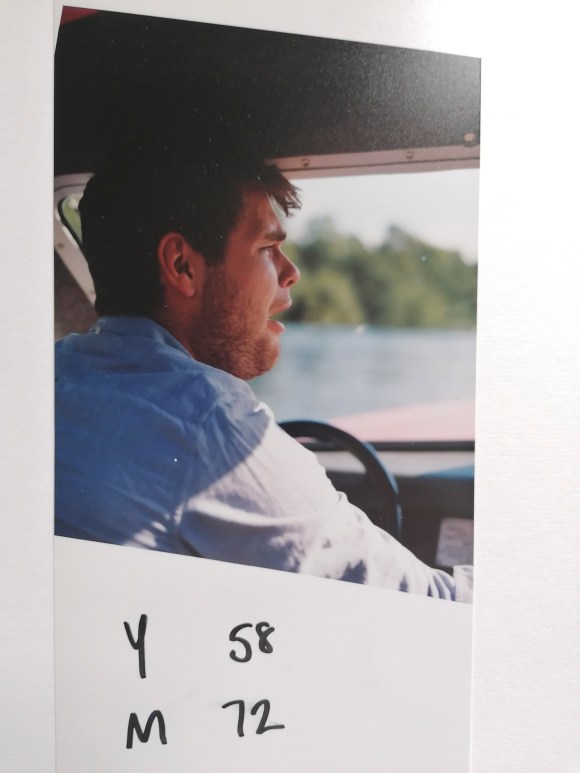
Again, it would have helped if I had the paper the right way round for this final print.
The main thing I did learn is that by using the colour enlargers, a richer contrast can be created using Black & White prints. A bit like split toning in Adobe Camera Raw or Photoshop.
At this stage, I wasn’t sure if I would involve analogue processing in my work. However, there was a nagging feeling that I could use this at a later stage. I do have a strong interest in cameraless techniques and effects. I also know how to create my own negatives digitally. My first introduction to the darkroom involved making photograms when I was at primary school and that experience has always stuck with me. A book that I started reading at the same time as the one above is Experimental Photography: A Handbook of Techniques by Marco Antonini, Sergio Miniti, Fransicso Gómez, Gabriele Lungarella and Luca Bendandi.
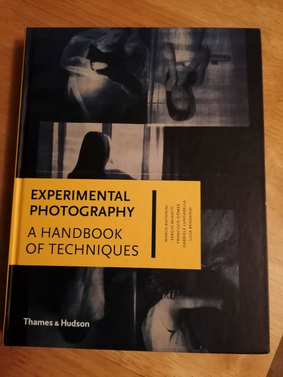
This inspiring book features a wide range of alternative techniques including cameraless, making one’s own cameras, operative hacks plus print and post-print experimentation. Again, lots more to be considered at this stage.
What I did take away from these two sessions is that it highlighted where my gaps in photographic knowledge laid. Also, I shouldn’t be too hard on myself that I didn’t understand the analogue processes as much as digital. Looking at how I used to take and process my digital images when I started compared to what I do now, it reminded me of the time, effort, mistakes and sheer hard work it took to me to get to my current stage. I also realised that this knowledge and experience could, and should, be applied to my work going forward.
